Hathway designs ordering and loyalty apps for restaurant chains. I was its design systems specialist. I set up our Figma organization from scratch, then moved years of Sketch files, one per client, per project, per redesign, into a single Figma library. Symbols became components with proper architecture, type and color became global styles, and every client’s system got a layout anyone could find their way around.
The files were half of it. I brought the whole design team over too: pairing on the new workflow, writing down the conventions, and answering the ping when a component didn’t behave. By the end, every active client lived in Figma and every designer worked there daily.
Here’s every system, one client at a time.
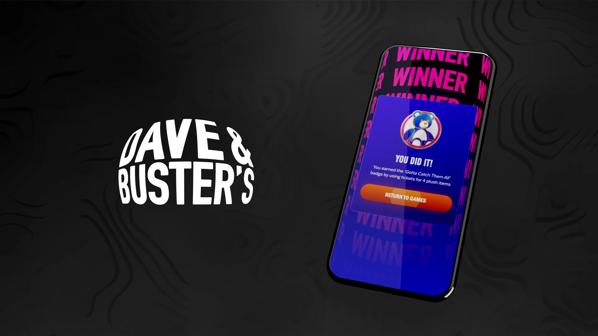
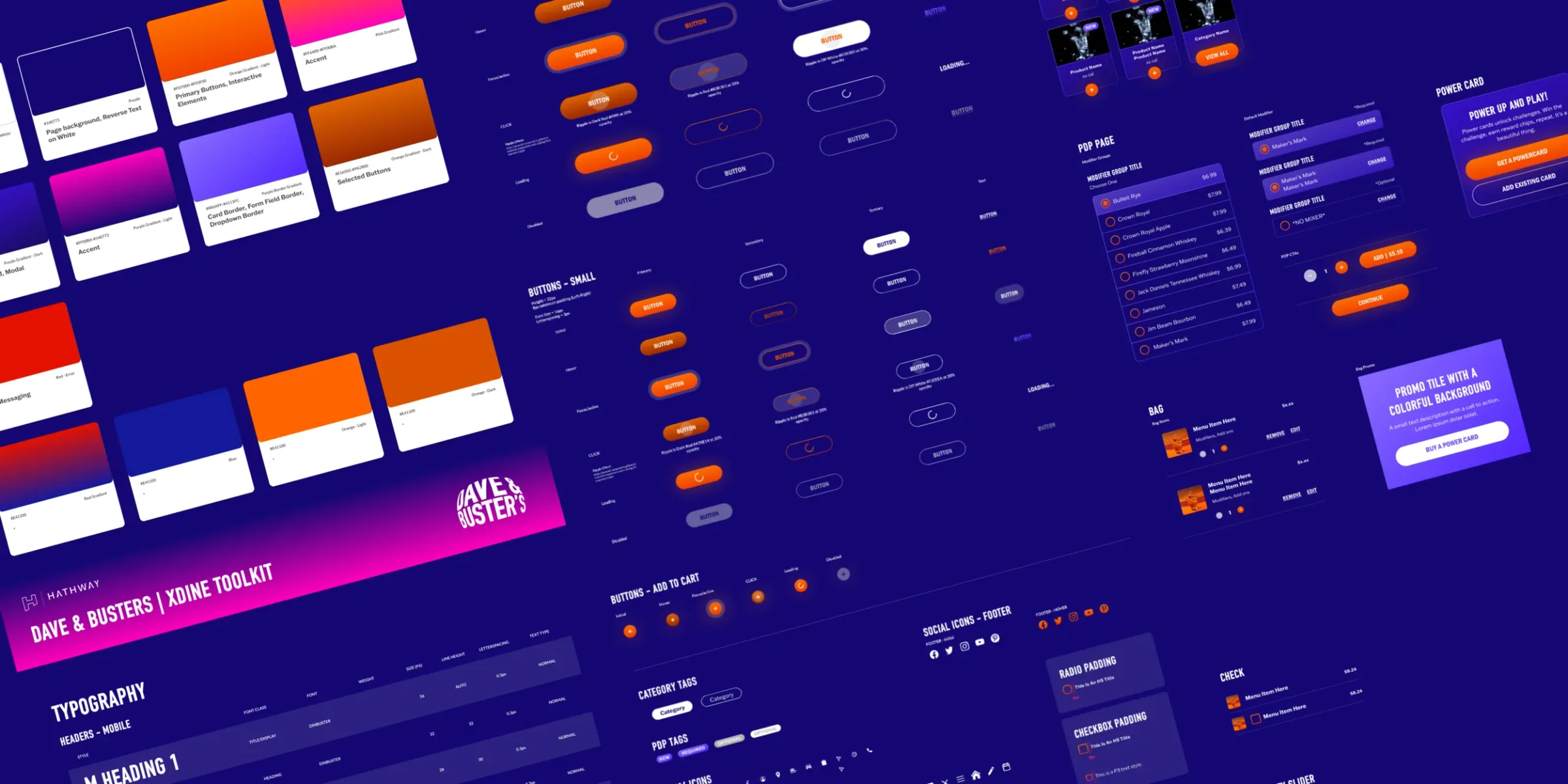
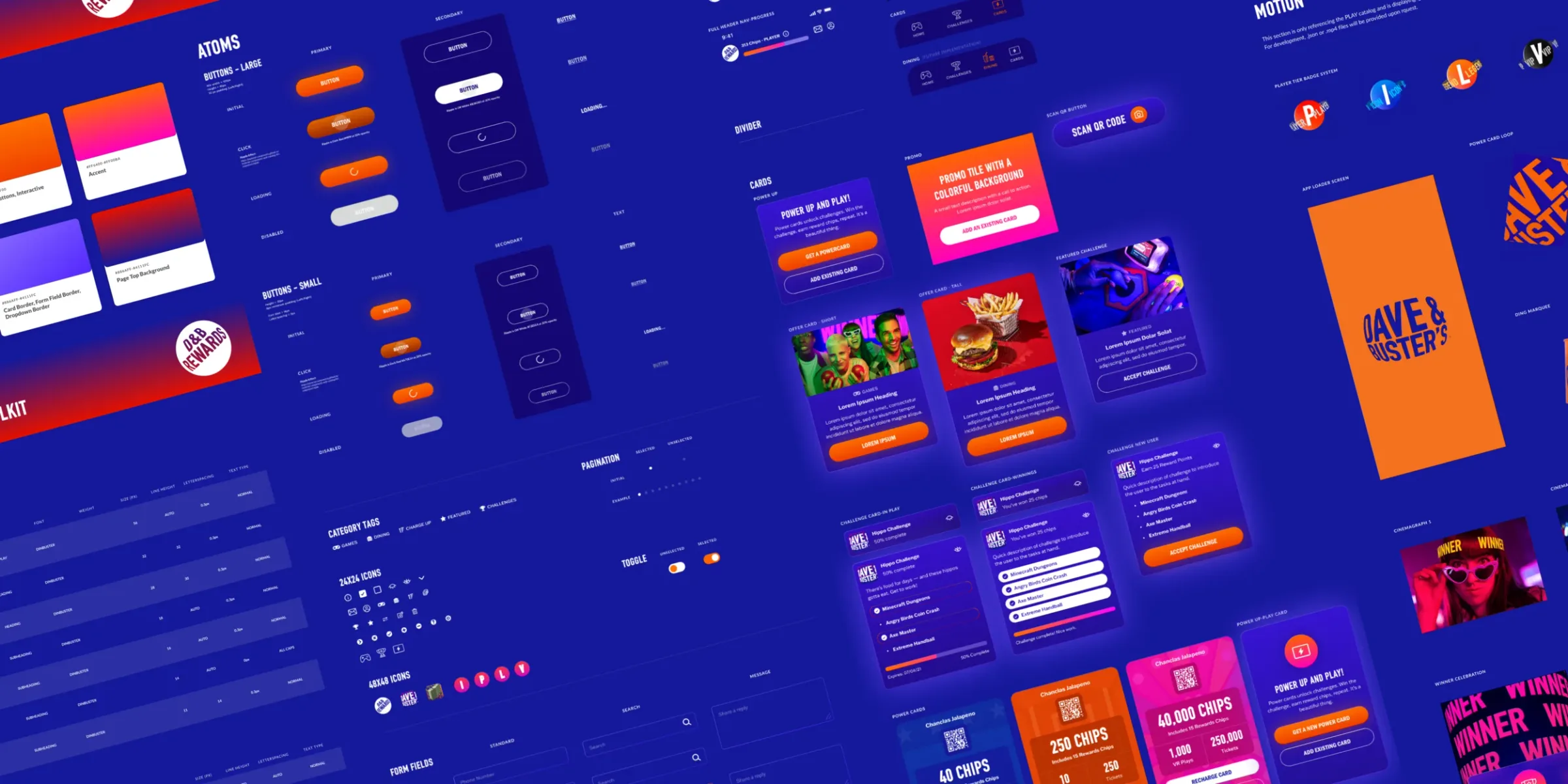
Dave & Buster’s
Two interlaced systems: xDine for ordering, up top, and Rewards for the arcade. Same colors, type and motion, so both apps feel like the same place.
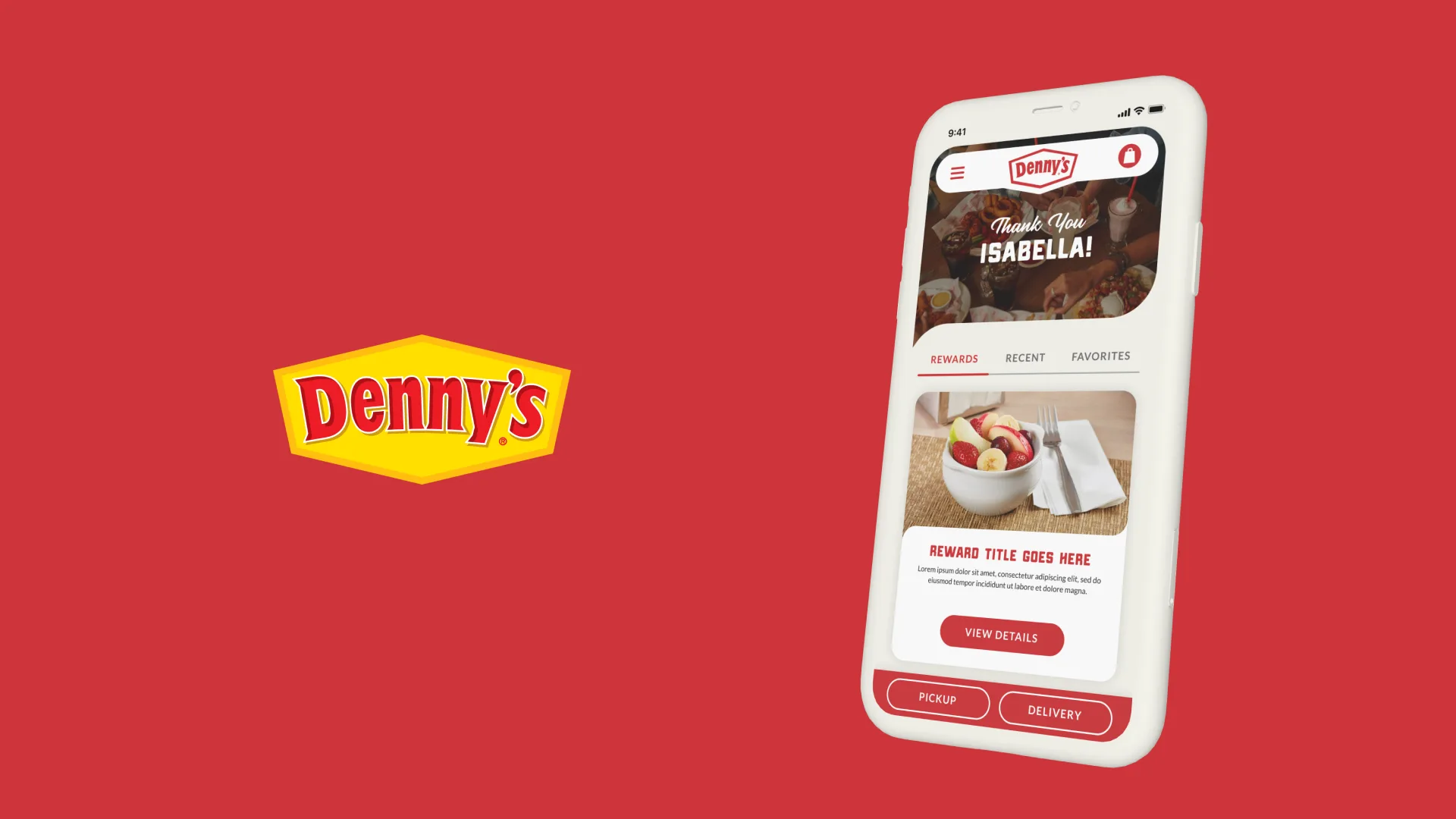
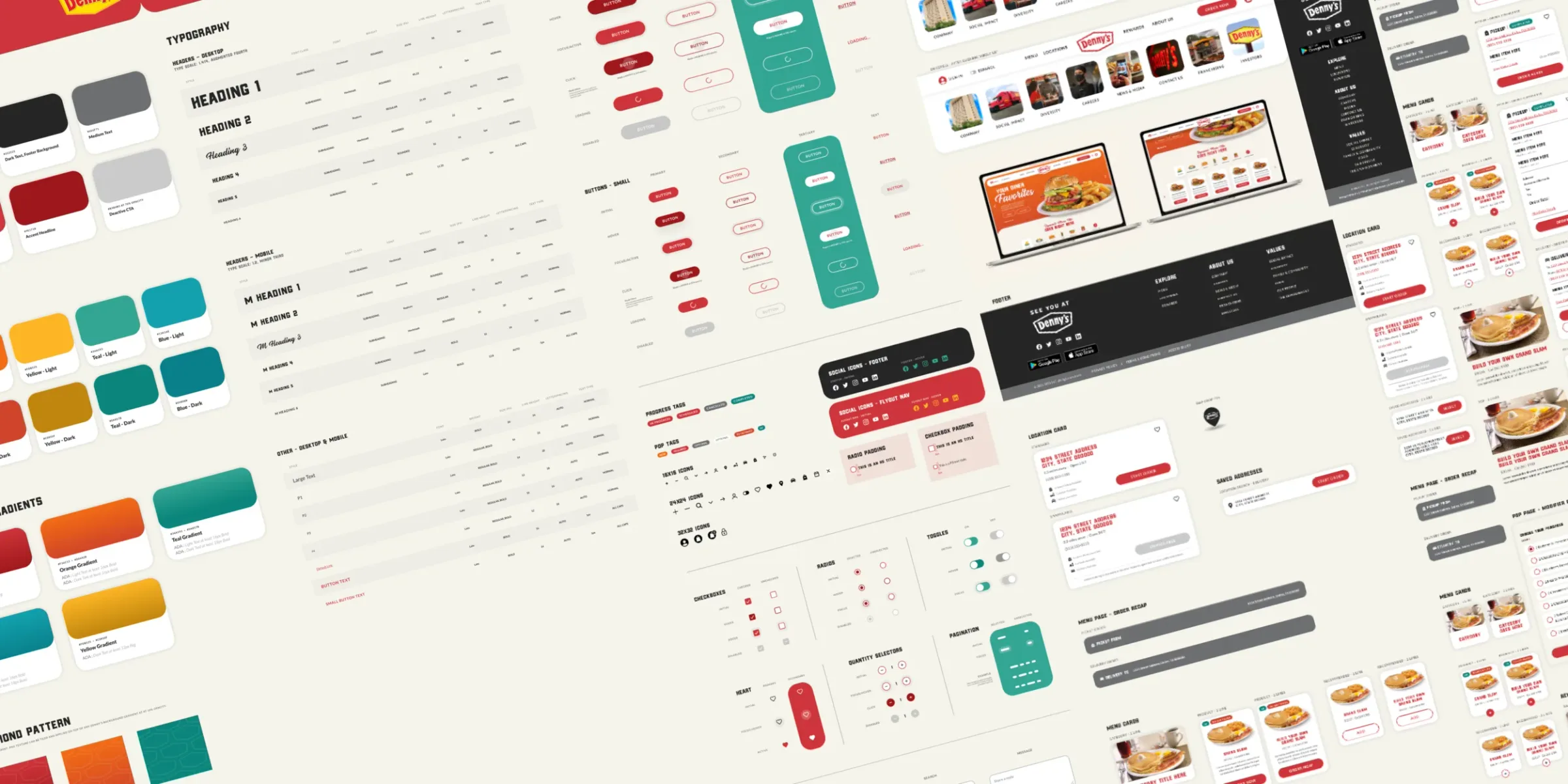
Denny’s
Palette, accent colors, gradients, the diamond pattern and type, down to the atoms. One system for the app, both ordering sites and the marketing site.
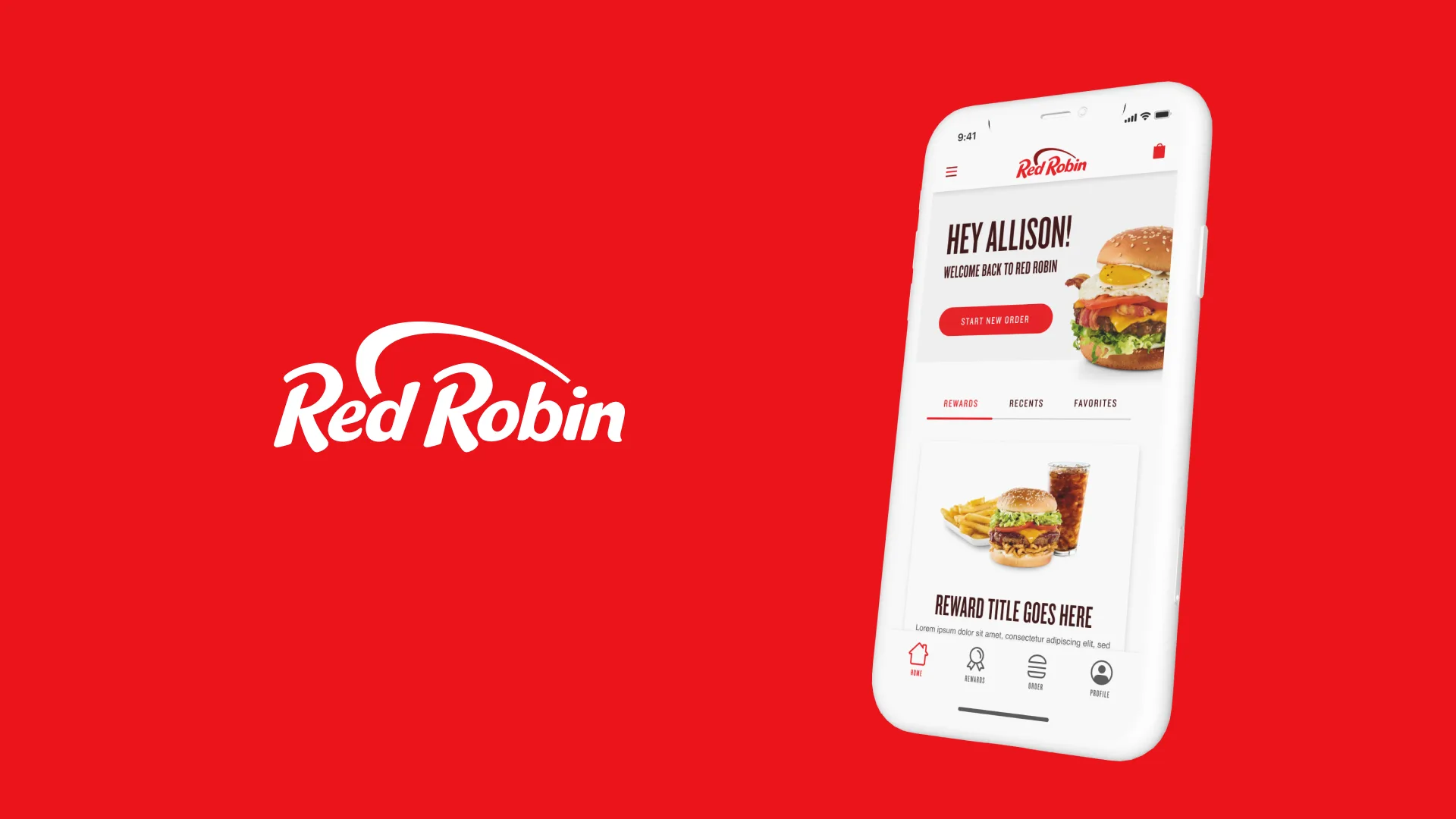
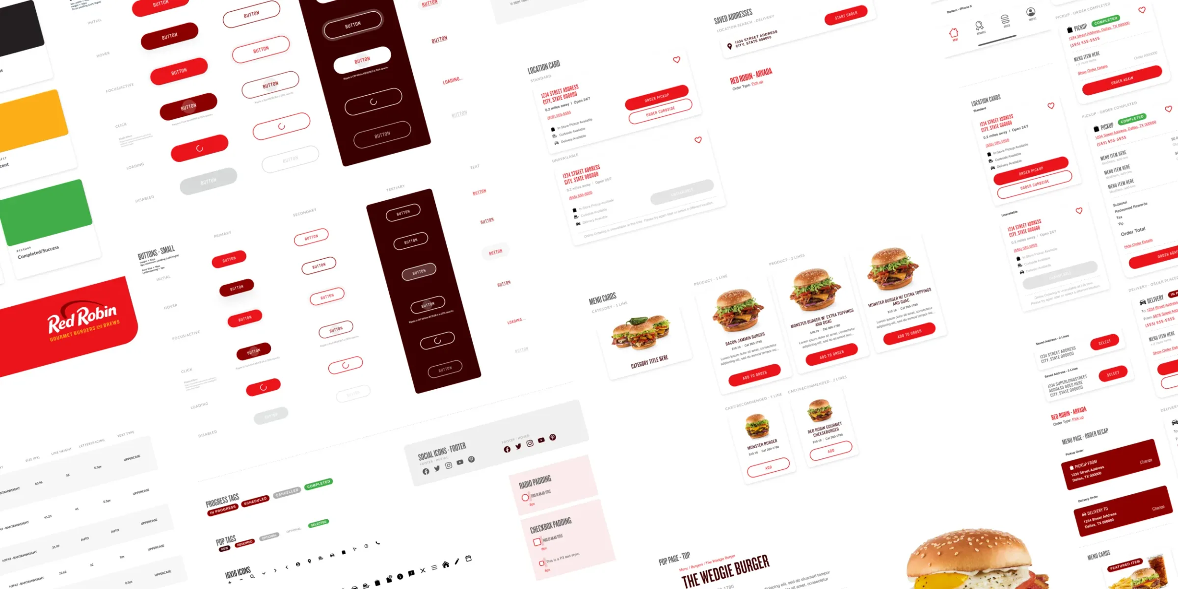
Red Robin
Brand colors and styles kept in sync across the app, mobile web and desktop, all to ADA guidelines.
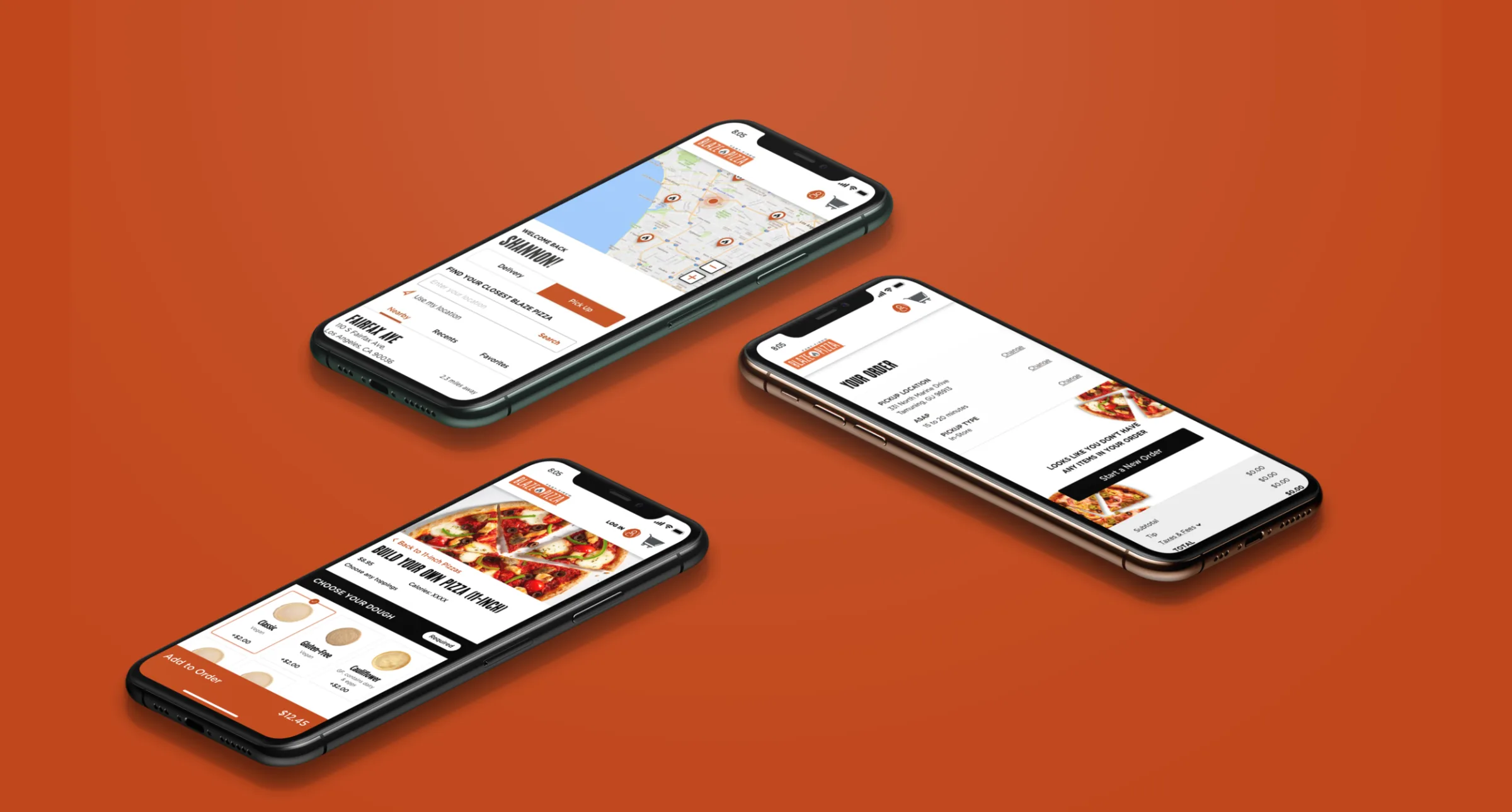
Blaze Pizza
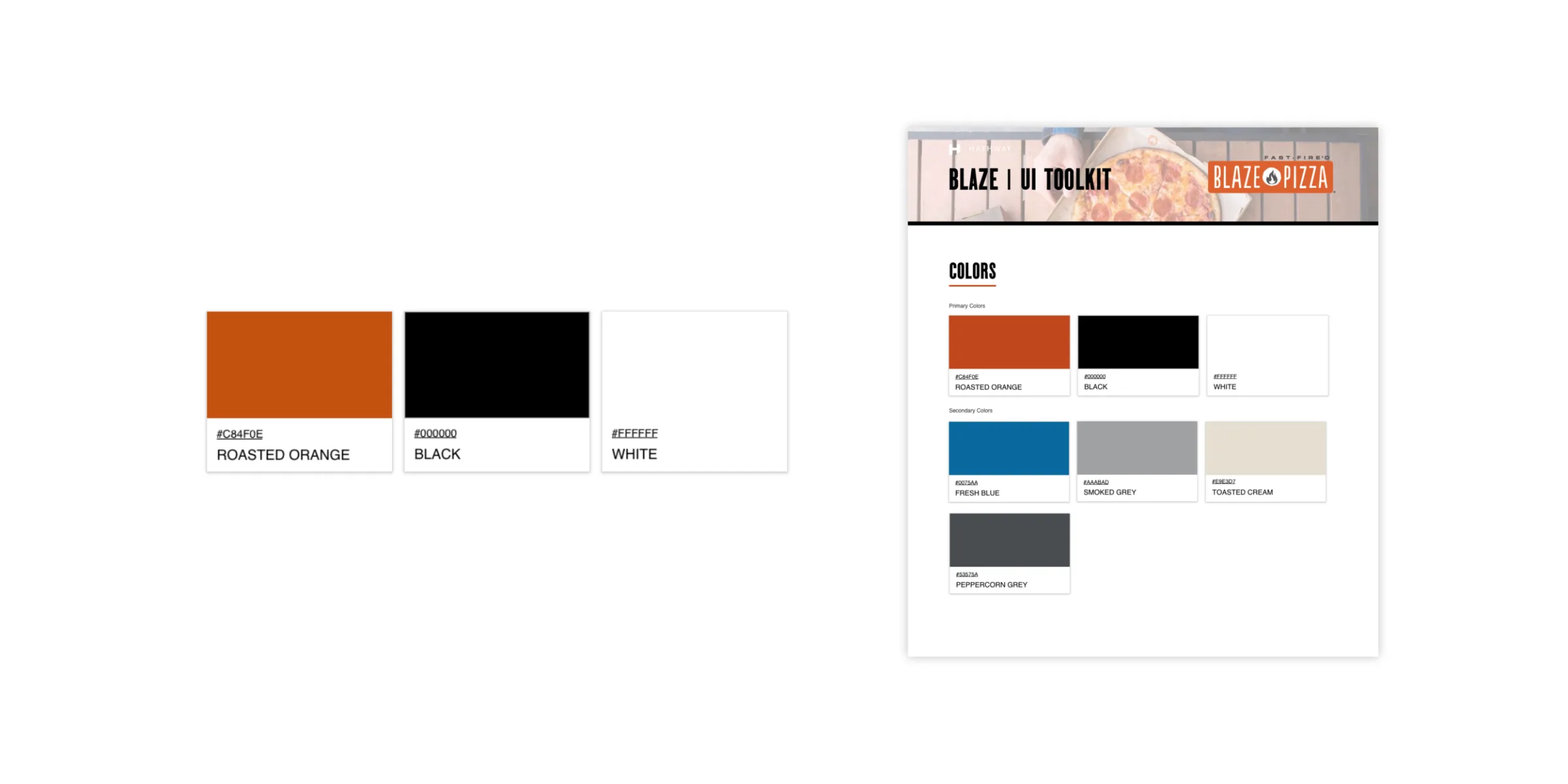
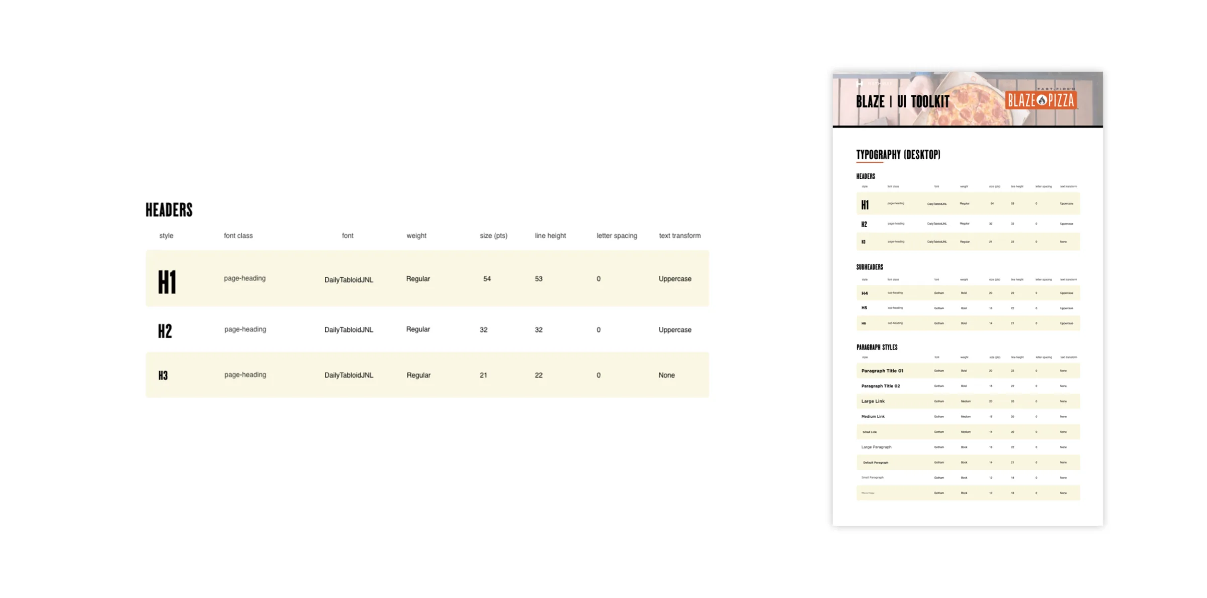
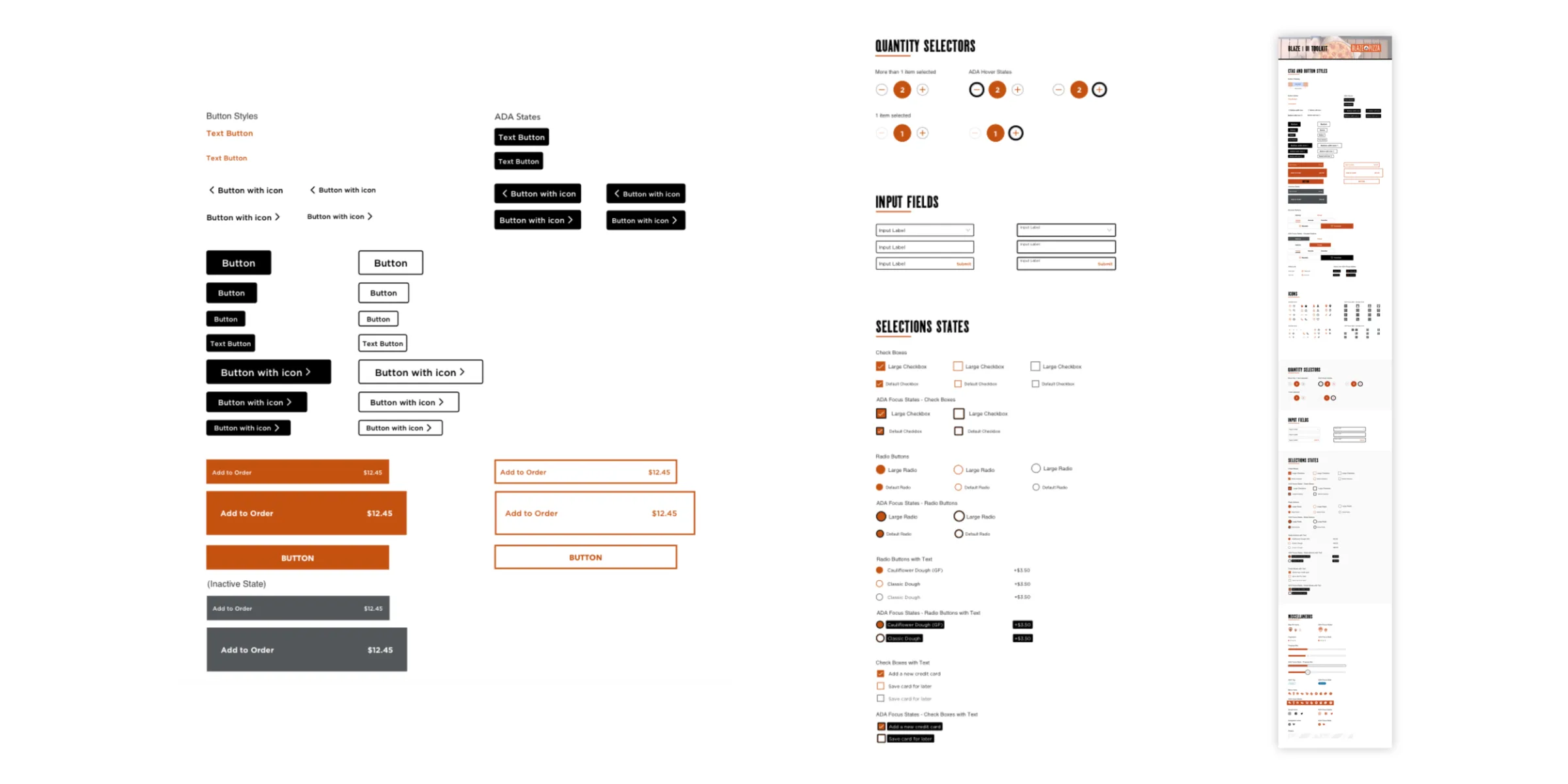
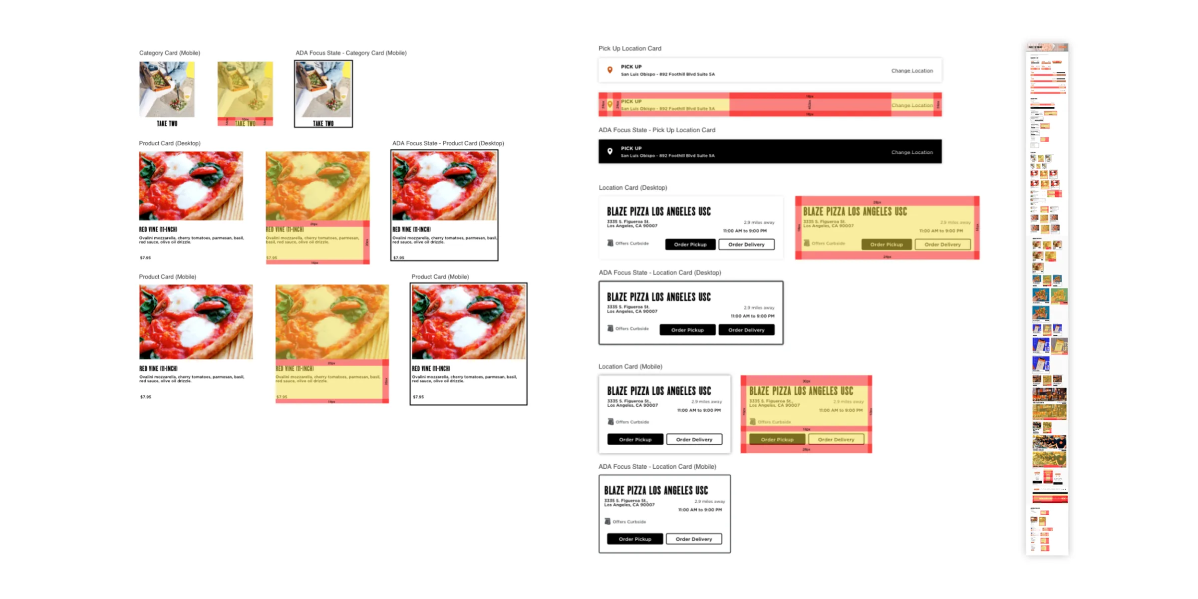
Moved from Sketch to Figma mid-project. Roasted Orange, black and white lead; headers are Daily Tabloid. Every component is drawn default, redlined and in its ADA focus state.
Dutch Bros
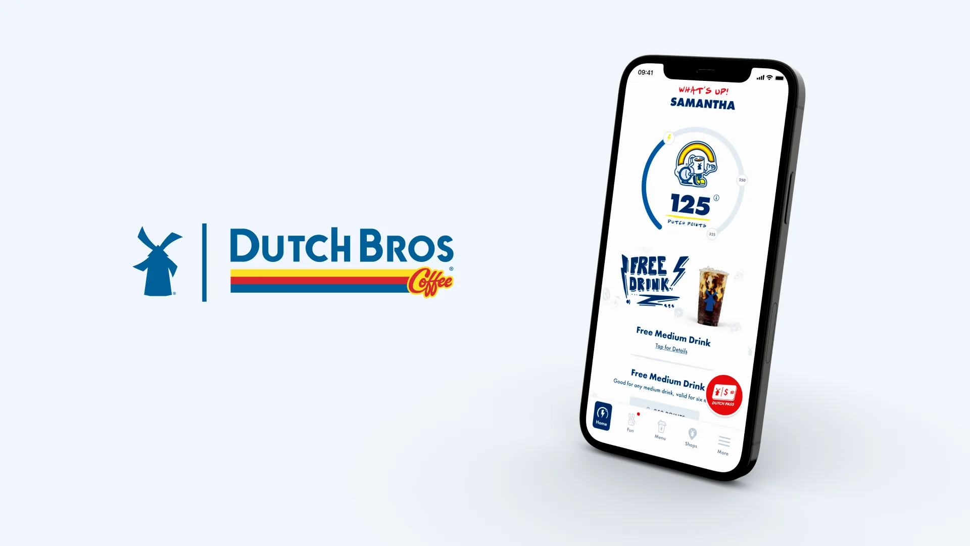
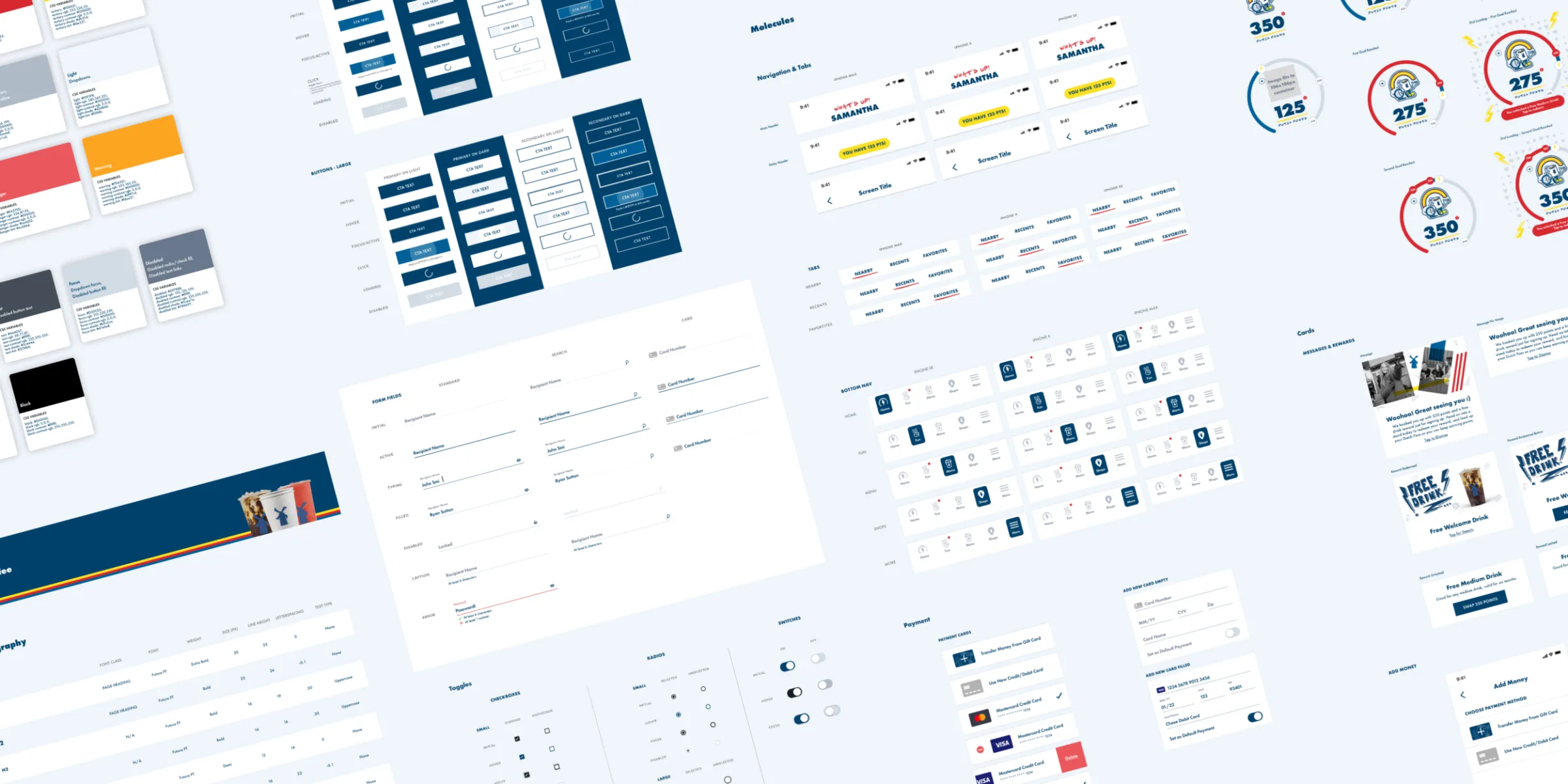
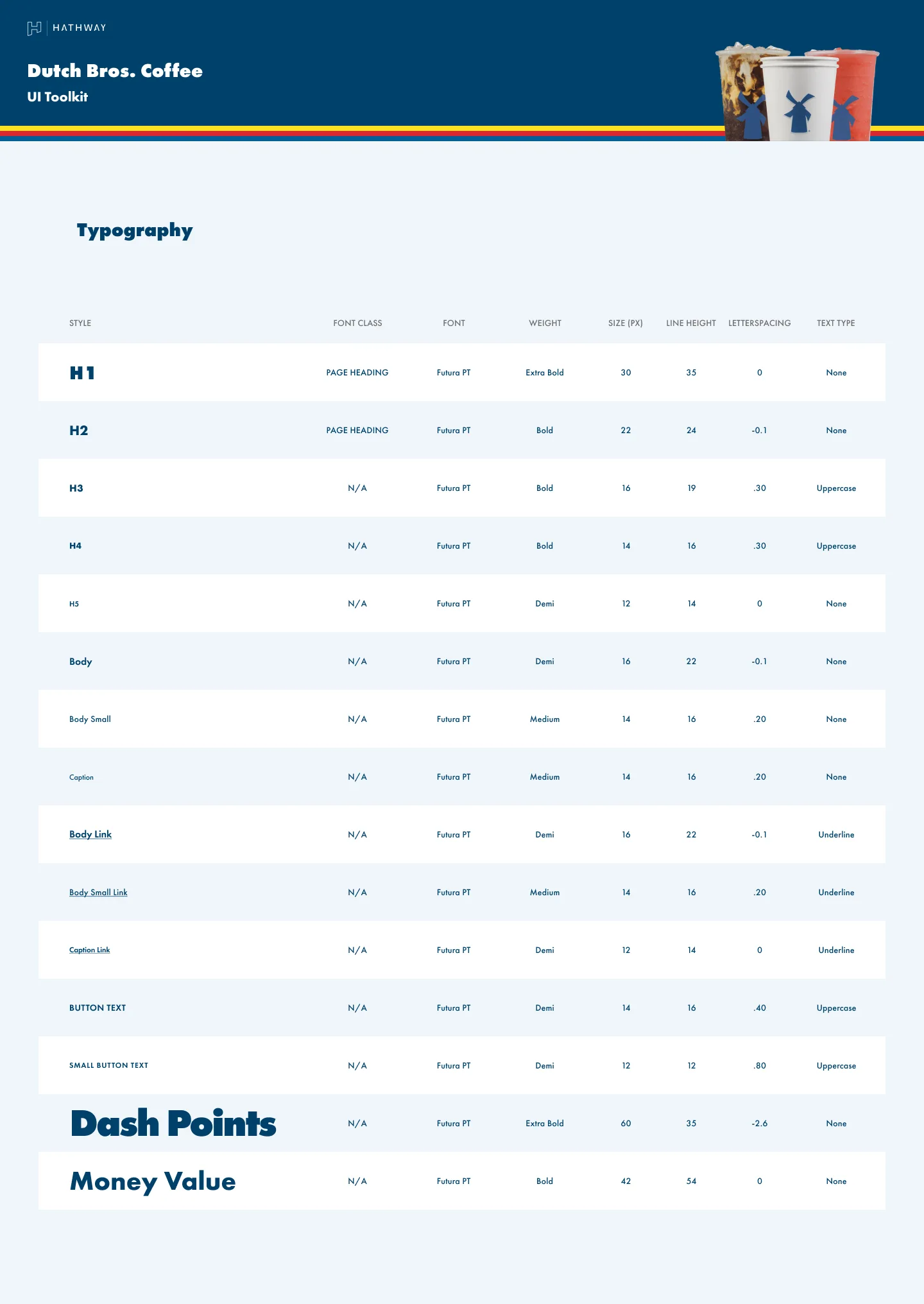
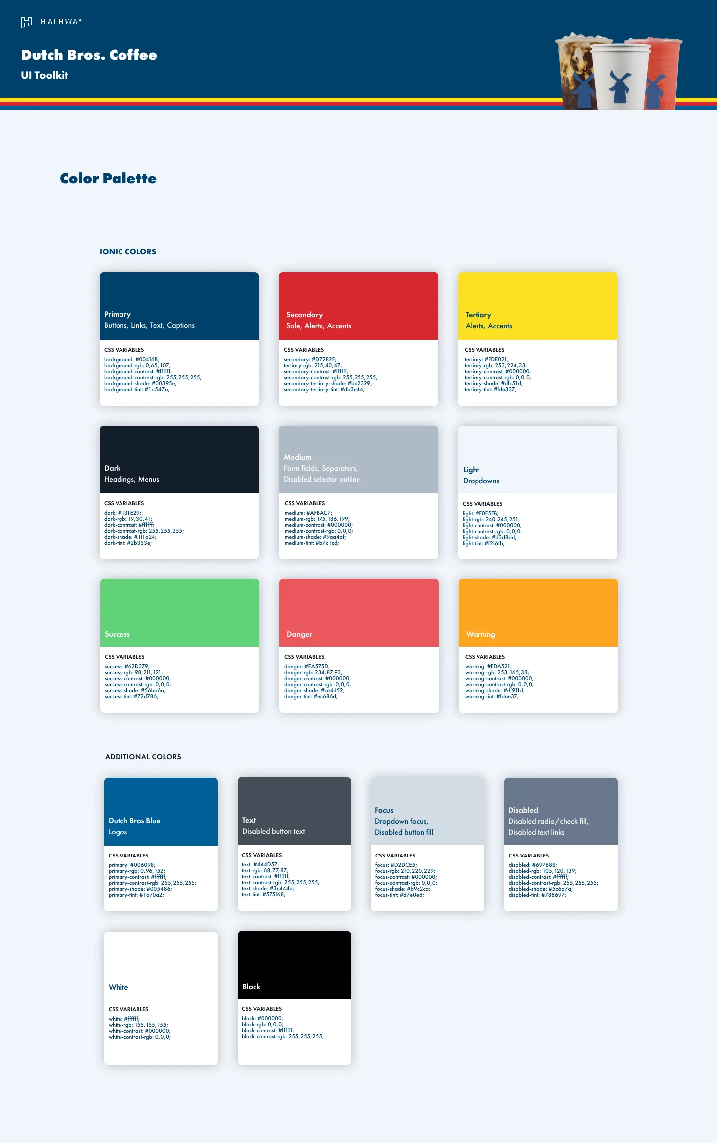
Futura PT top to bottom, global color, and a layout that builds from atoms to molecules to organisms.
Pieology
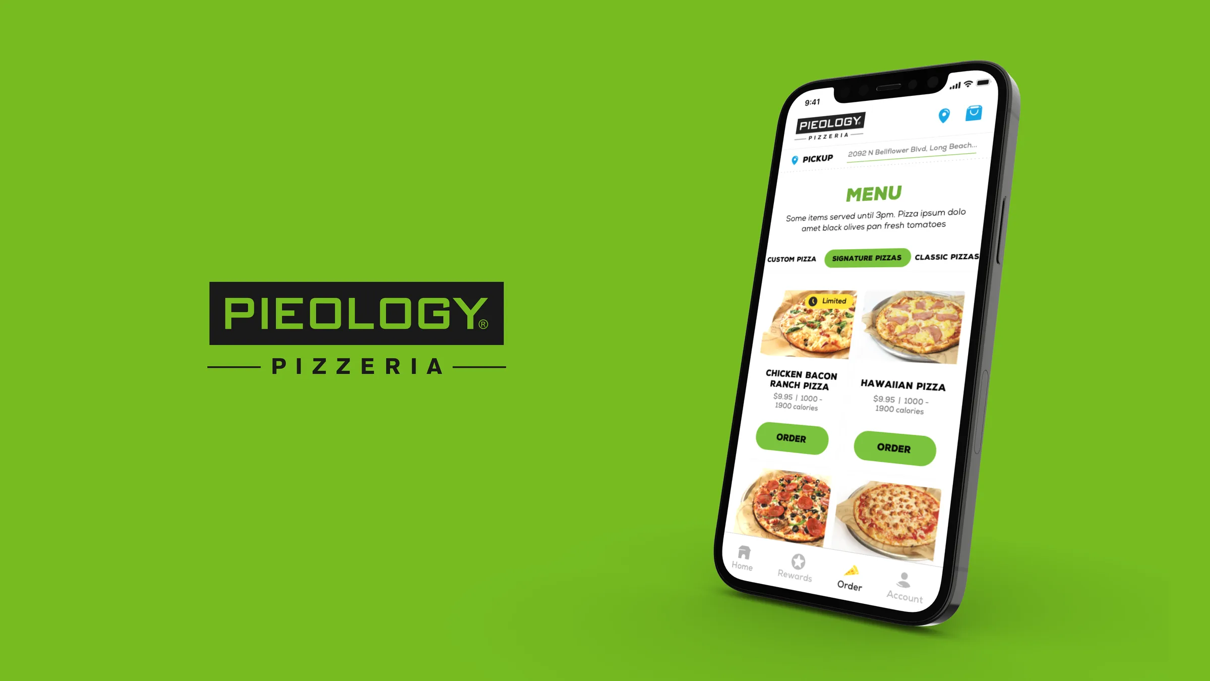
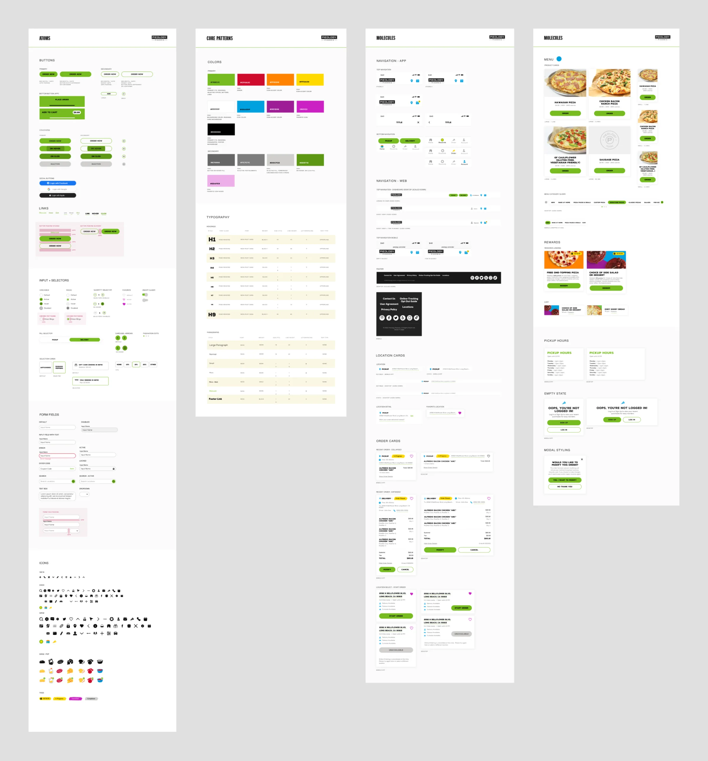
Clean UI, with hand-drawn icons carrying the brand.

The clients
Each one has its own post, with the screens built on these systems. Panda Express and Arby’s were motion work.