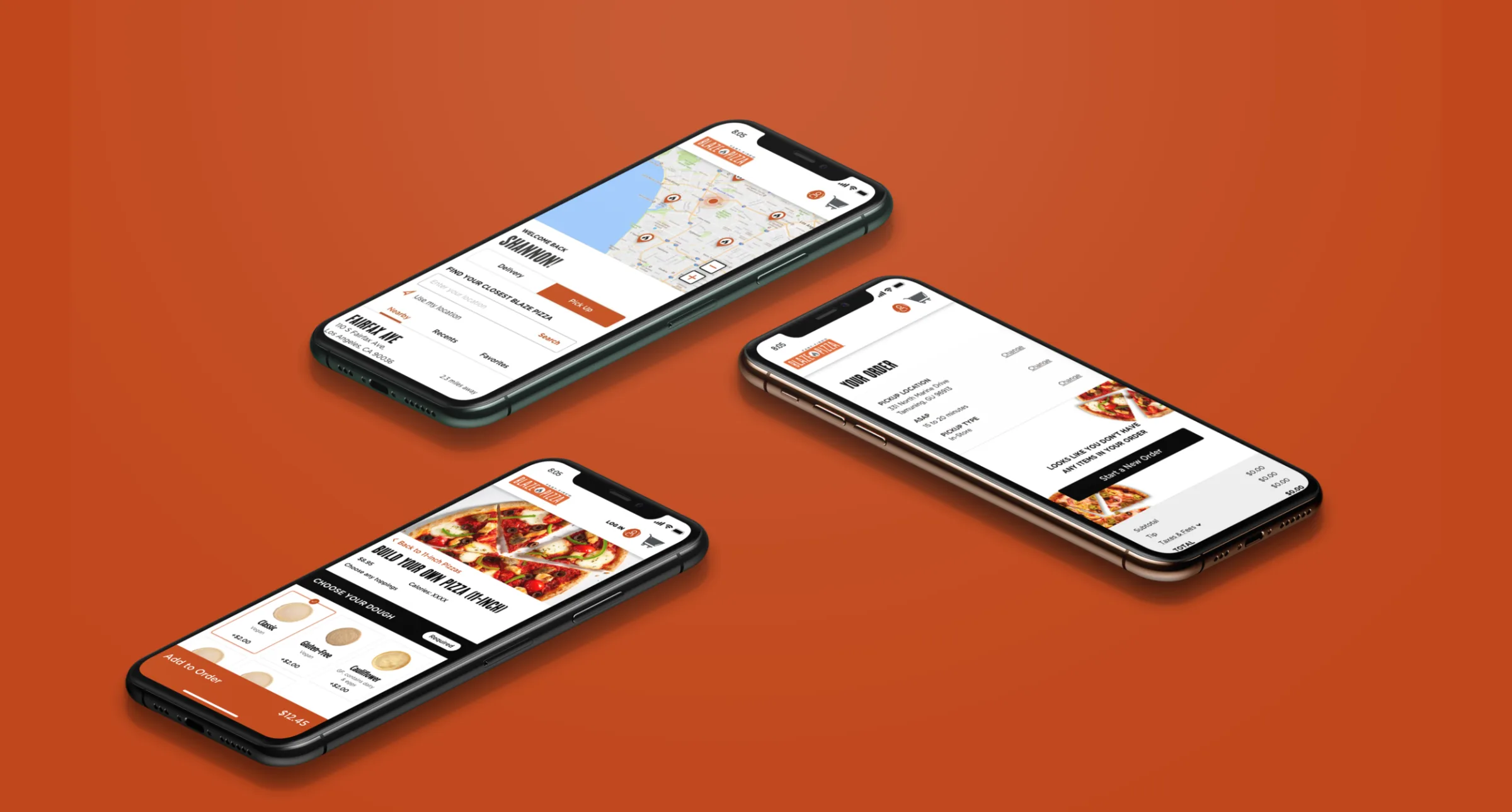
Blaze Pizza came to Hathway for an ordering and loyalty app, with web ordering to match. When I took the project over, it was still running on a white-label design. The refresh swapped that for bold black buttons and vibrant food photography, plus a new product page, CTAs and type that improved the UX and ADA compliance along the way. I presented the work to the client myself and stayed with it through development.
Product page
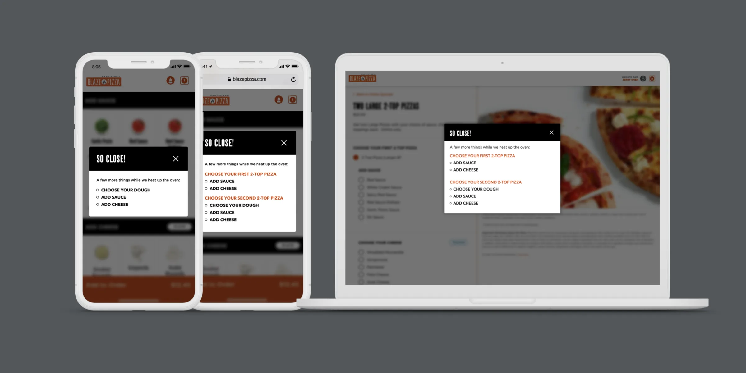
Build a pizza, miss a step, and a “So close!” sheet lists what’s left, pizza by pizza, before anything goes in the bag. The same pattern works in the app, on mobile web and on desktop.
Locations
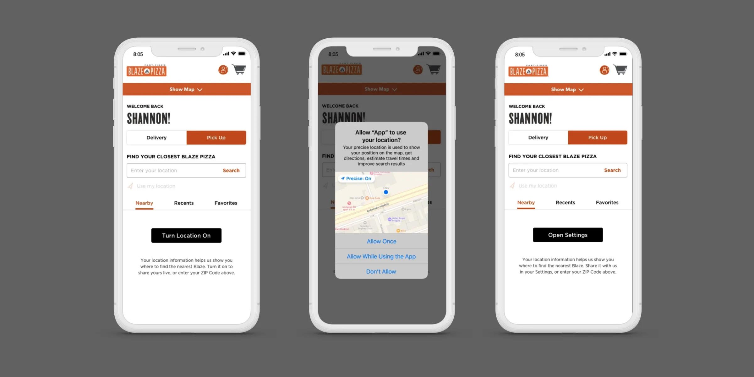
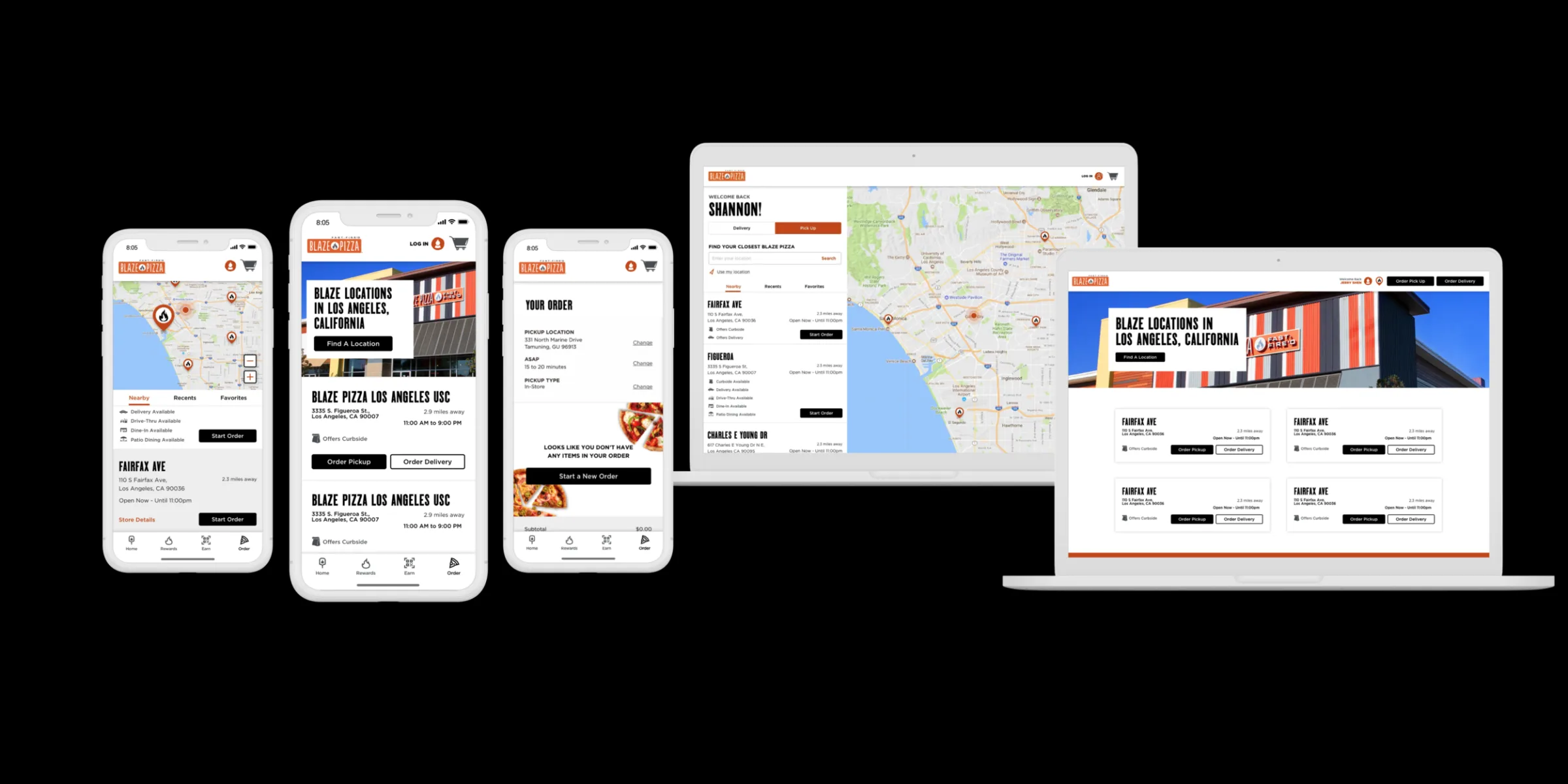
Location gets asked for in context, with the reason right there. Say no and ZIP search still works, with a way back to Settings. Either way you land on the nearest Blazes, with pickup and delivery a tap apart.
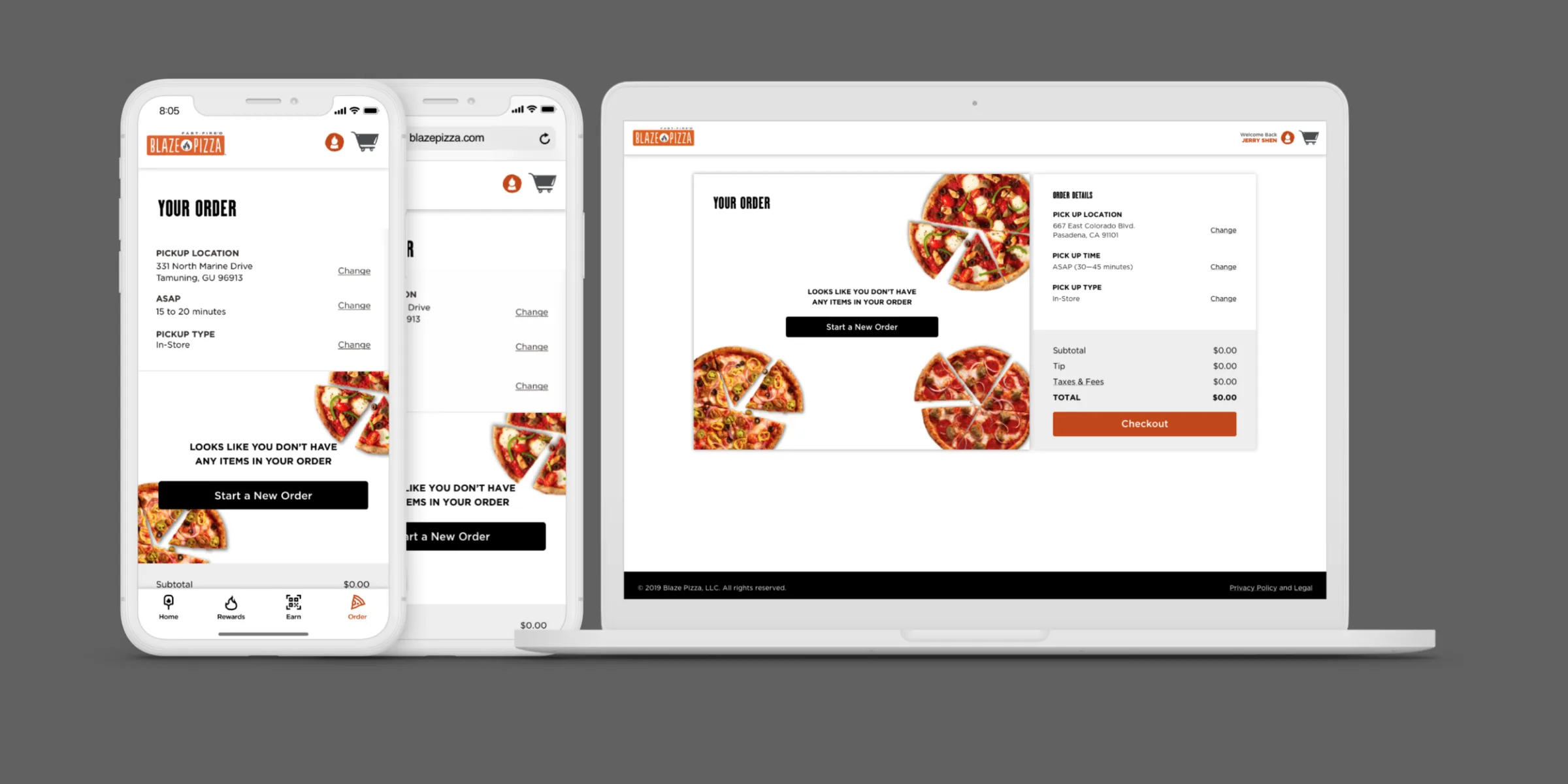
Empty cart
An empty bag shouldn’t be a dead end. Now it’s pizza and one clear button, Start a New Order, styled like the rest of the app and built to get people clicking.
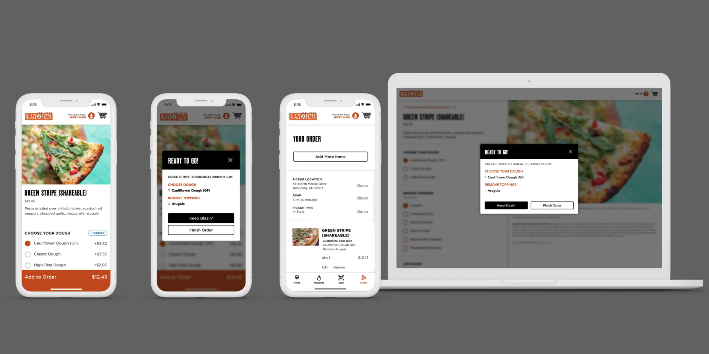
Add to cart
Add a pizza and a “Ready to go!” sheet confirms what you built, then gives you the choice: Keep Blazin’ or Finish Order.
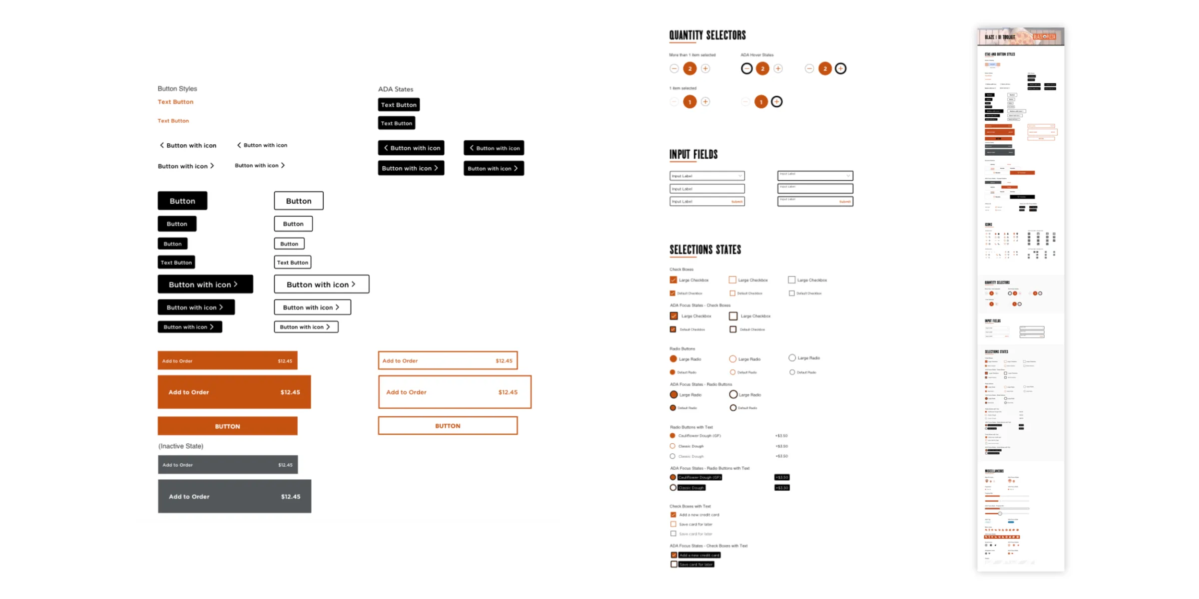
UI toolkit
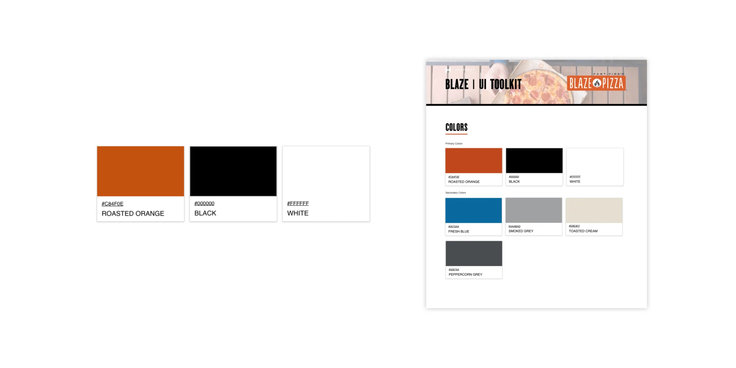
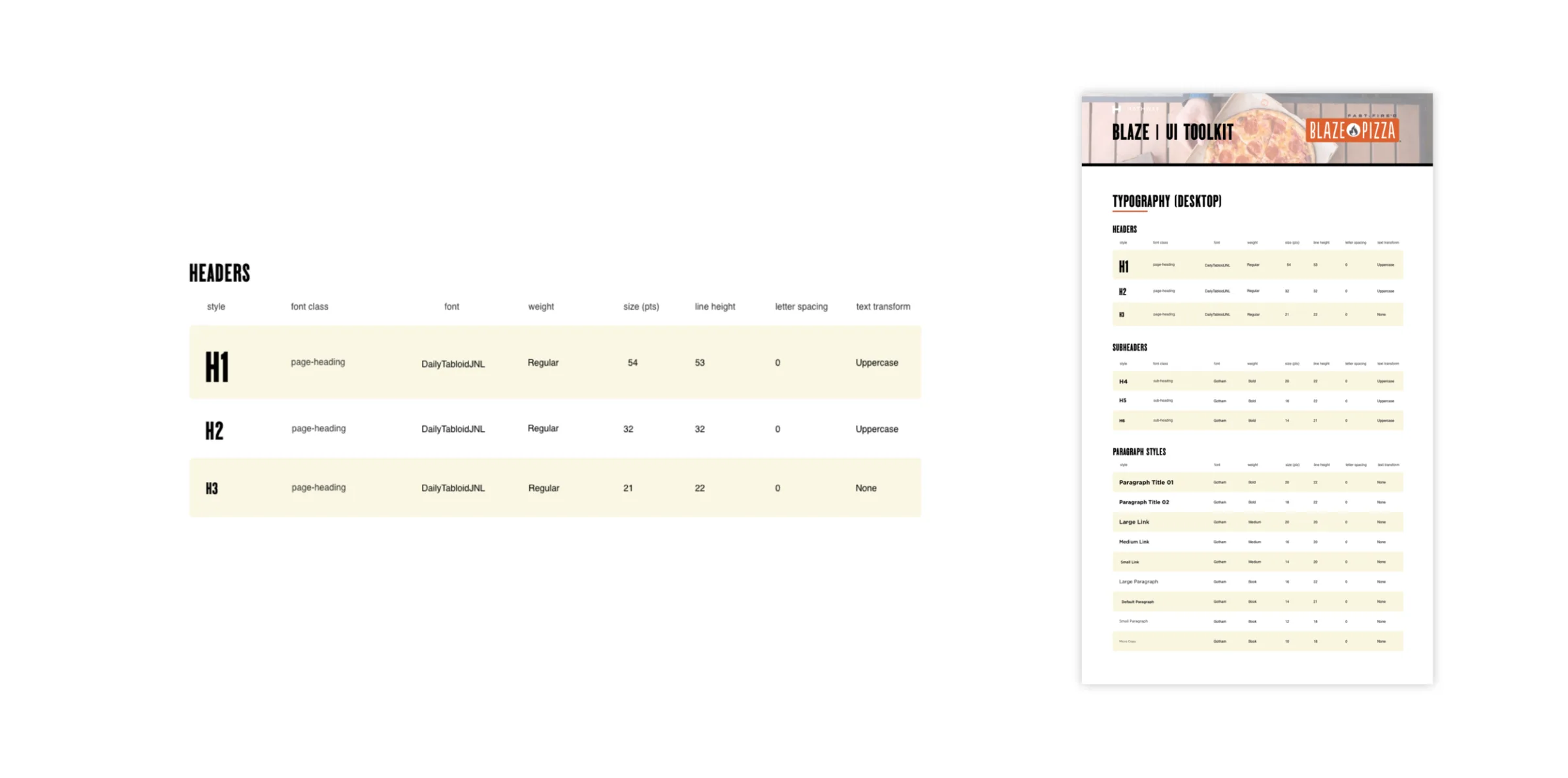
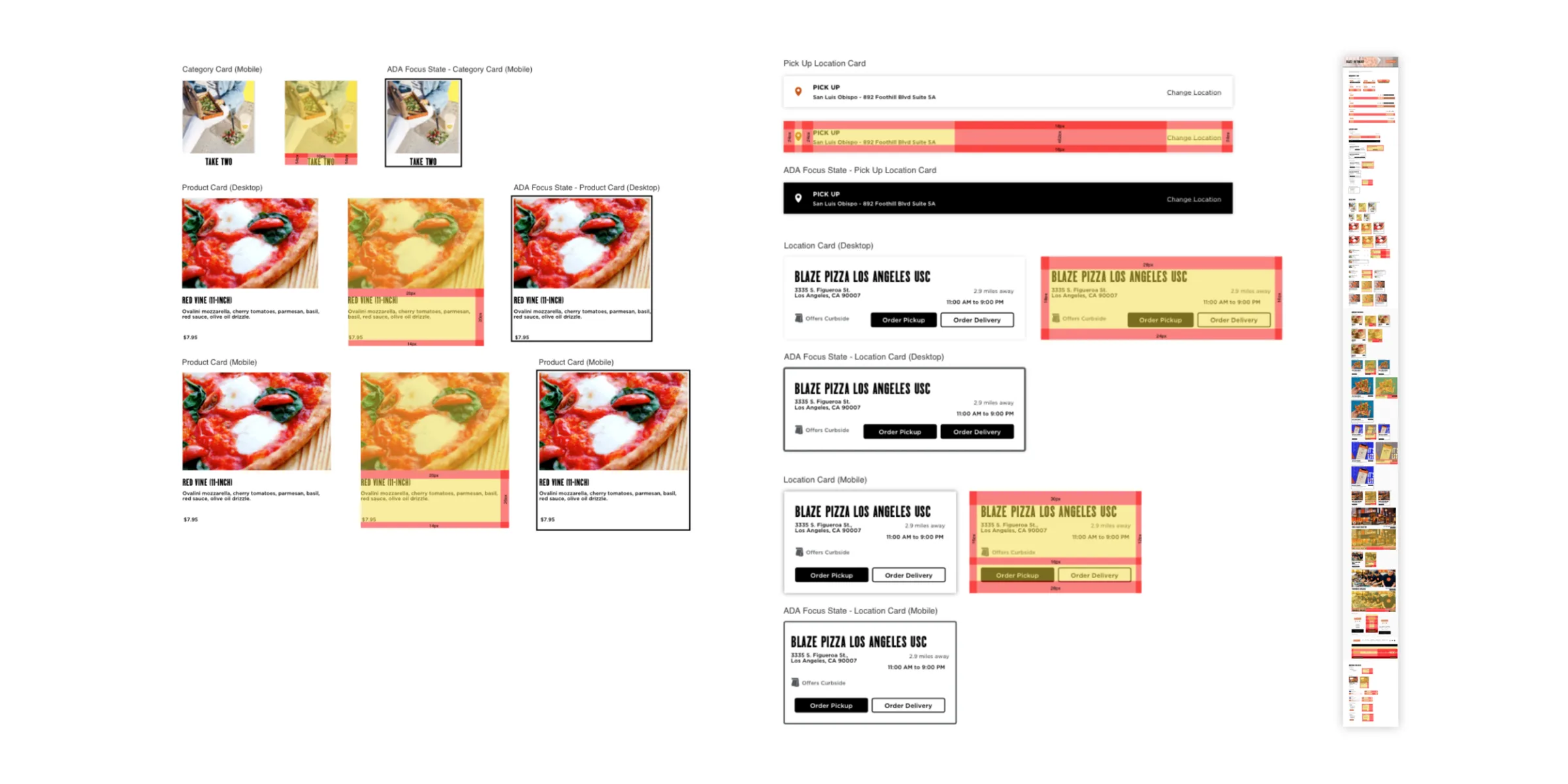
I managed the toolkit and then moved it from Sketch to Figma. Roasted Orange, black and white lead, with Fresh Blue, Smoked Grey, Toasted Cream and Peppercorn Grey in support. Headers are set in Daily Tabloid. Every button, field and card is drawn three ways: default, redlined for spacing, and in its ADA focus state.
Order at blazepizza.com. One of eight clients from my time at Hathway.