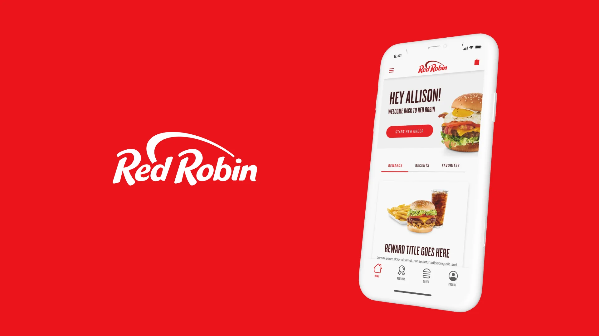
Red Robin came to Hathway to make online ordering better. We built three products for it: a mobile ordering app, a mobile ordering site and a desktop ordering site. We used a lot of whitespace and kept the happy path short, to cut down on bounces. I was on the UI team shipping pixel-perfect screens on a tight timeline, and I managed the design system underneath.
Three surfaces
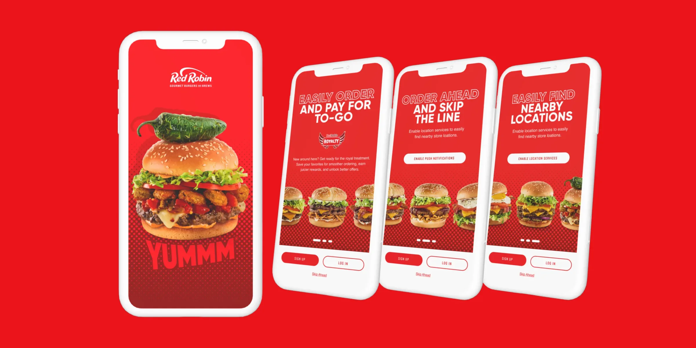
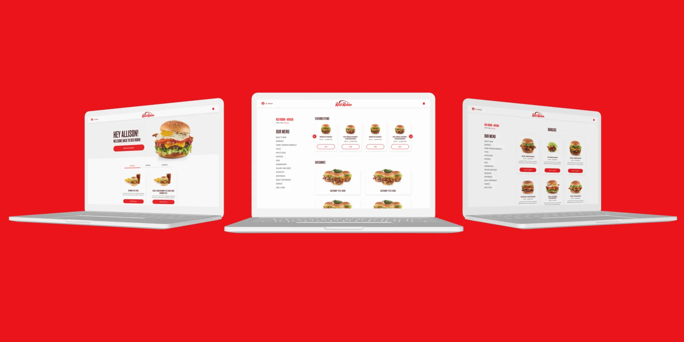
The app opens on a burger and three promises: order and pay for to-go, order ahead and skip the line, find the nearest Red Robin. The desktop site tells the same story on a bigger screen.
Menu
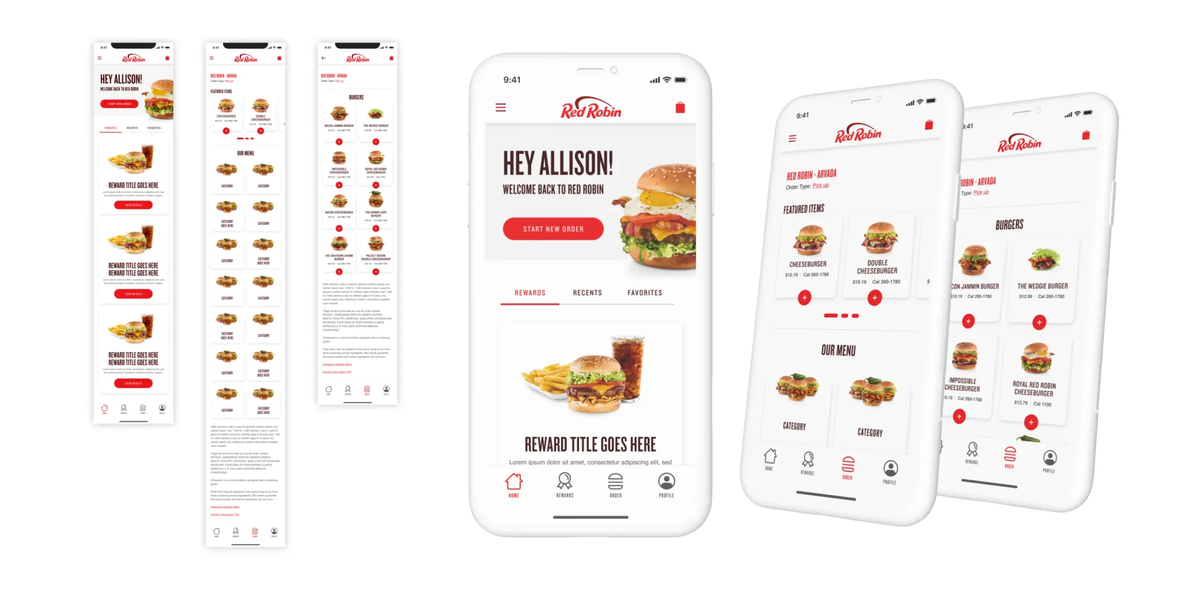
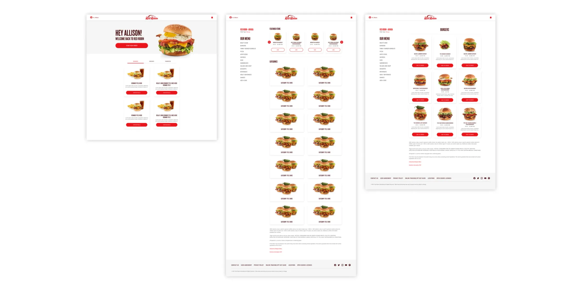
The home screen opens on a “Hey Allison!” welcome and your rewards. The menu is big burgers on white, with nothing else in the way.
Product page
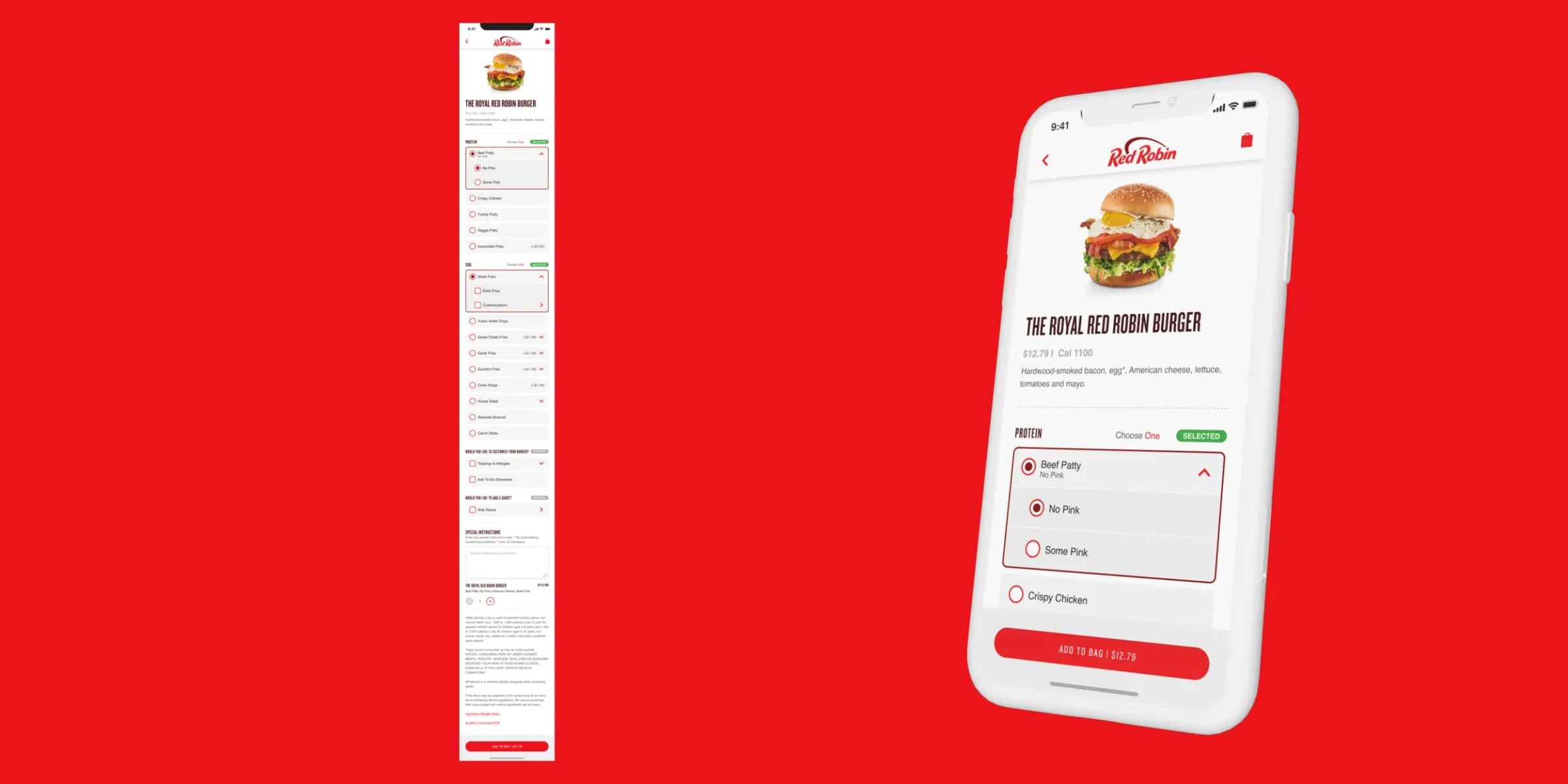
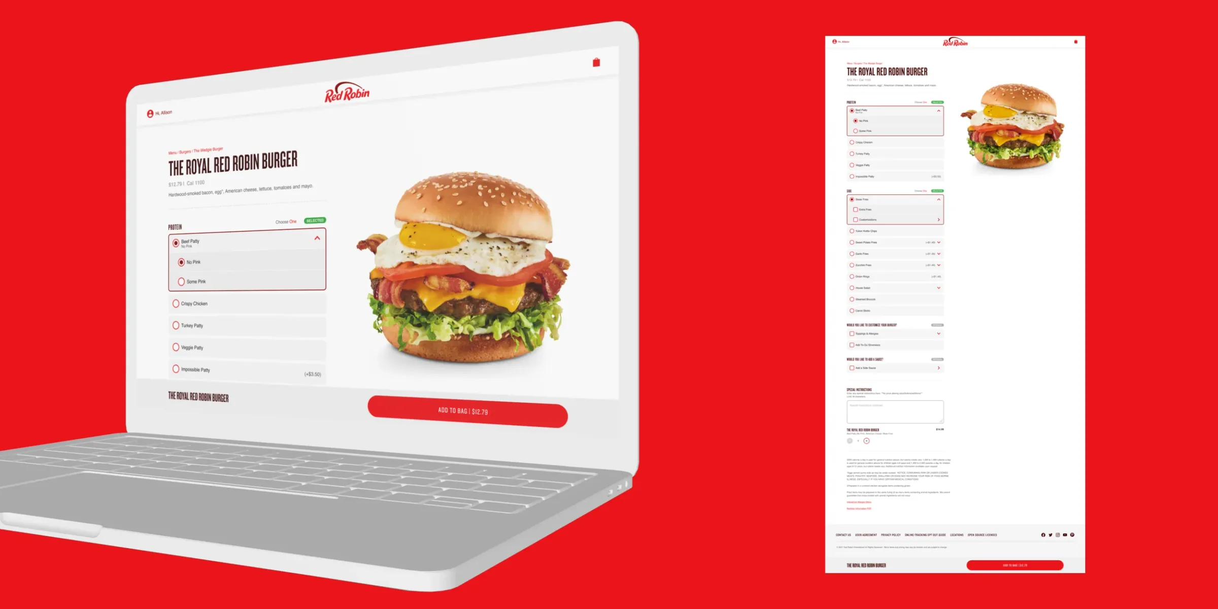
The Royal Red Robin Burger, and every way to build it, kept on one page.
Checkout
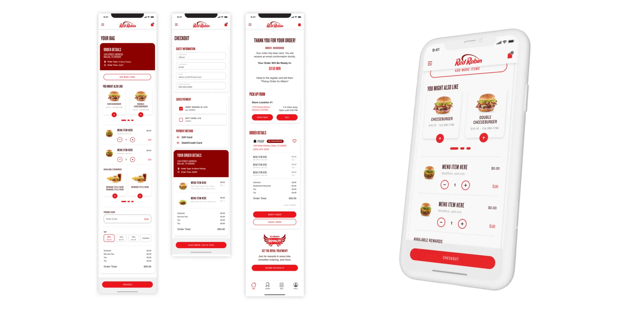
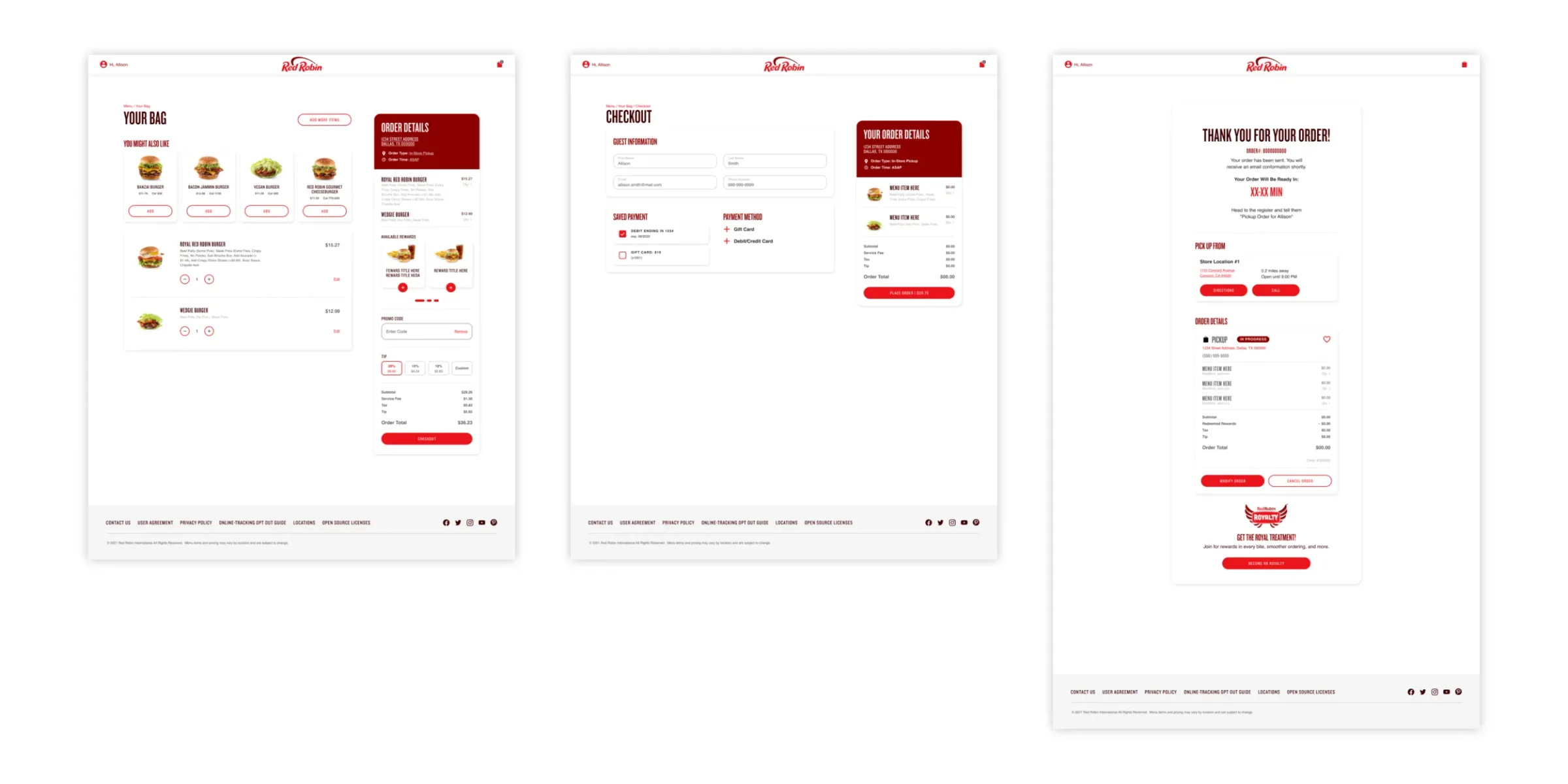
Bag, checkout, thank you. Three steps, the same on every screen size.
Royalty
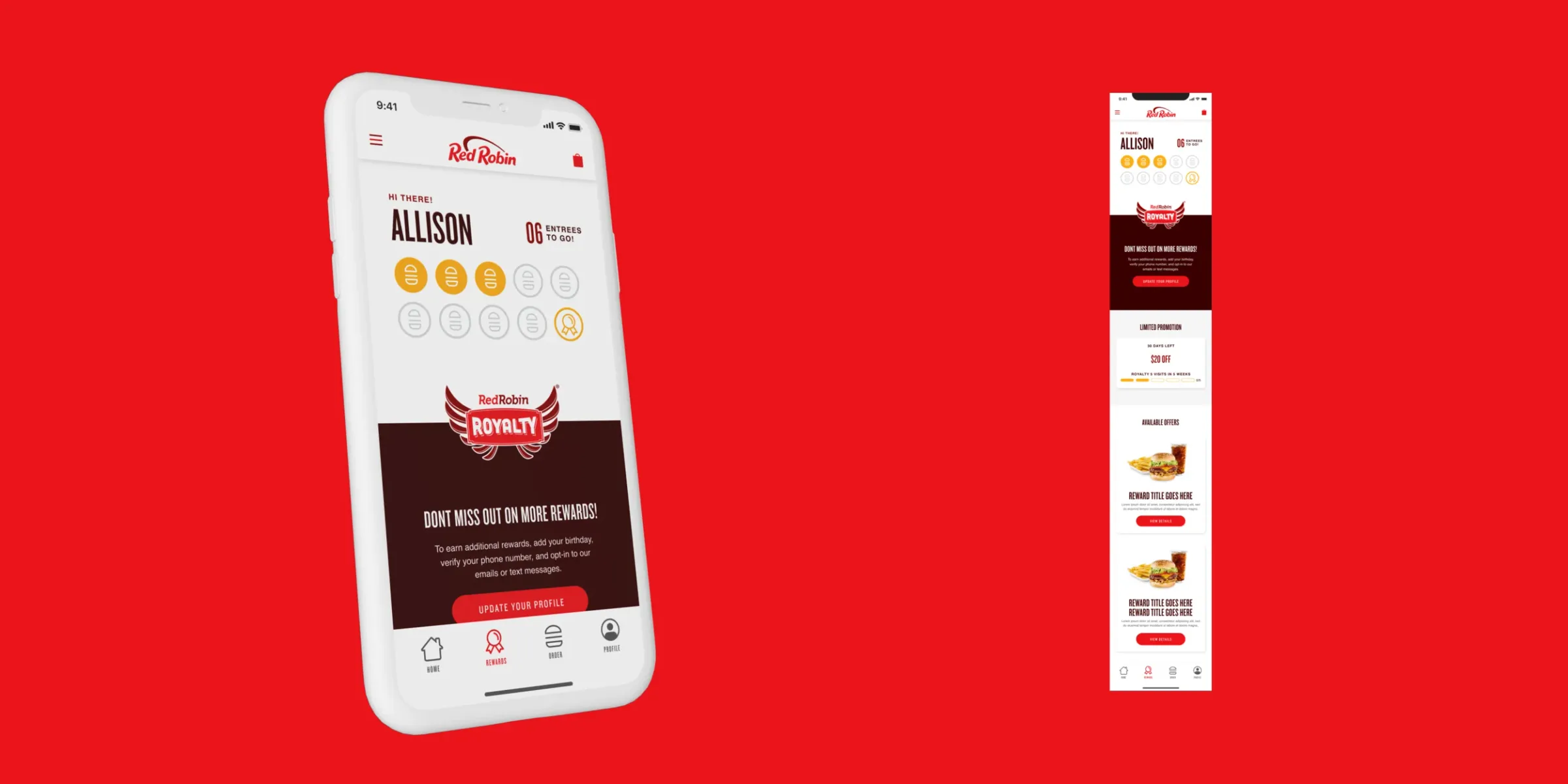
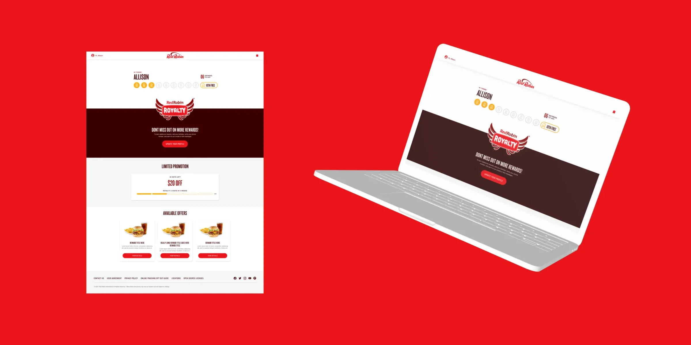
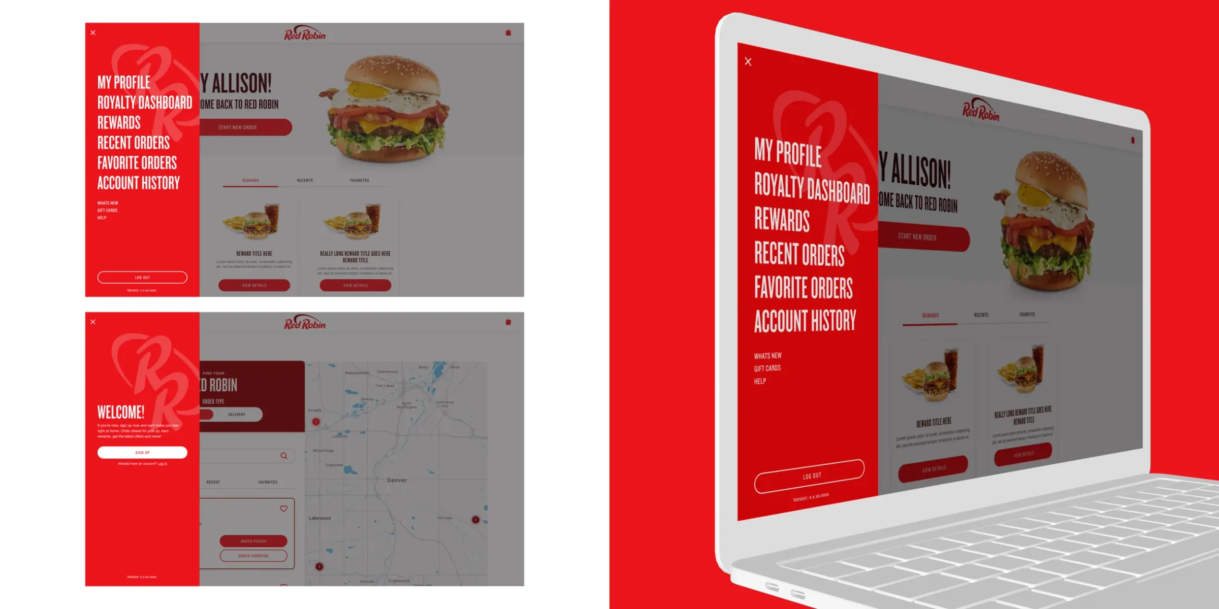
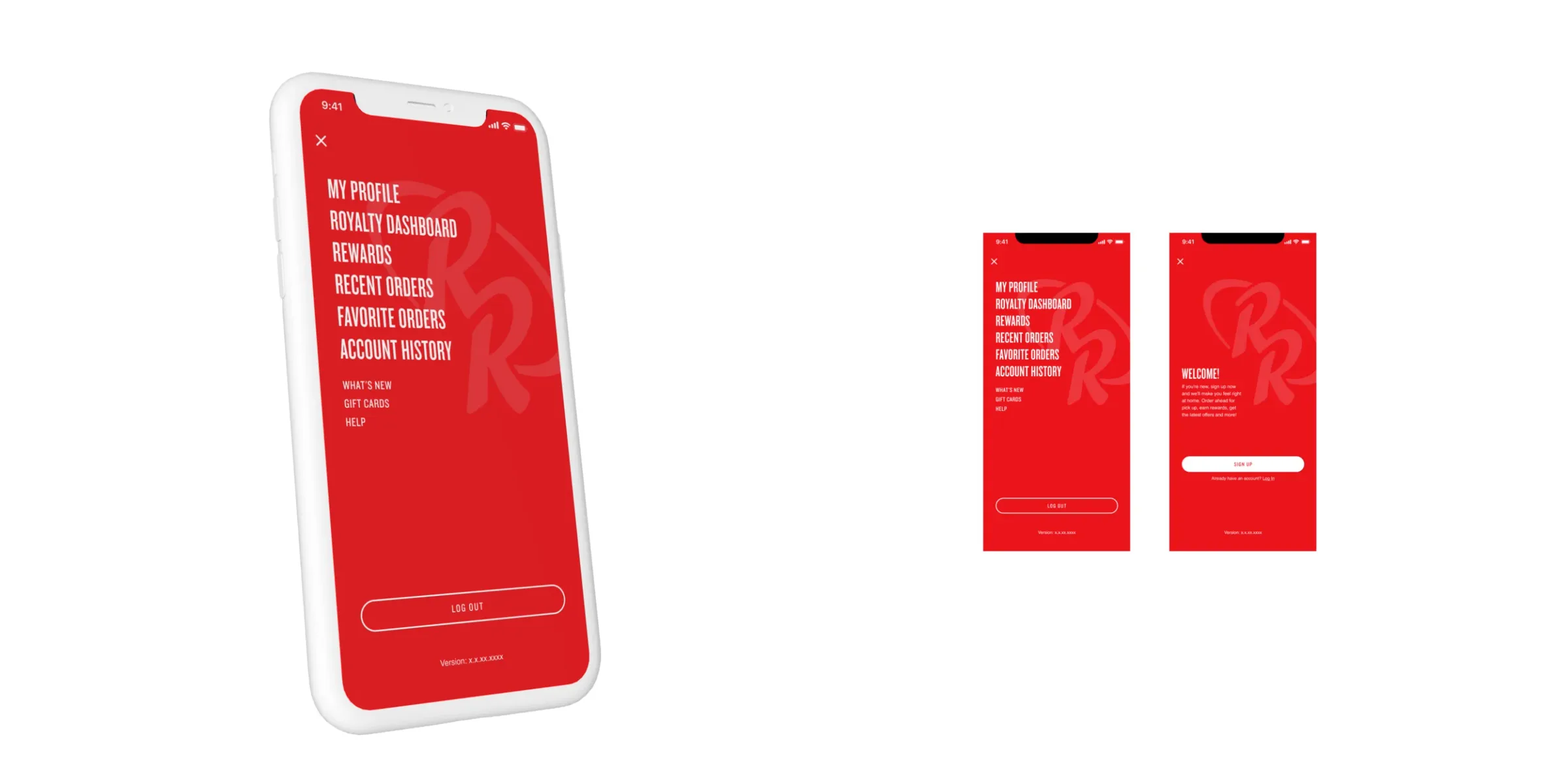
Red Robin Royalty works like a punch card for burgers: every entrée earns a stamp, and the last stamp is a reward. Your profile, rewards, recent and favorite orders all live in one red menu.
Design system
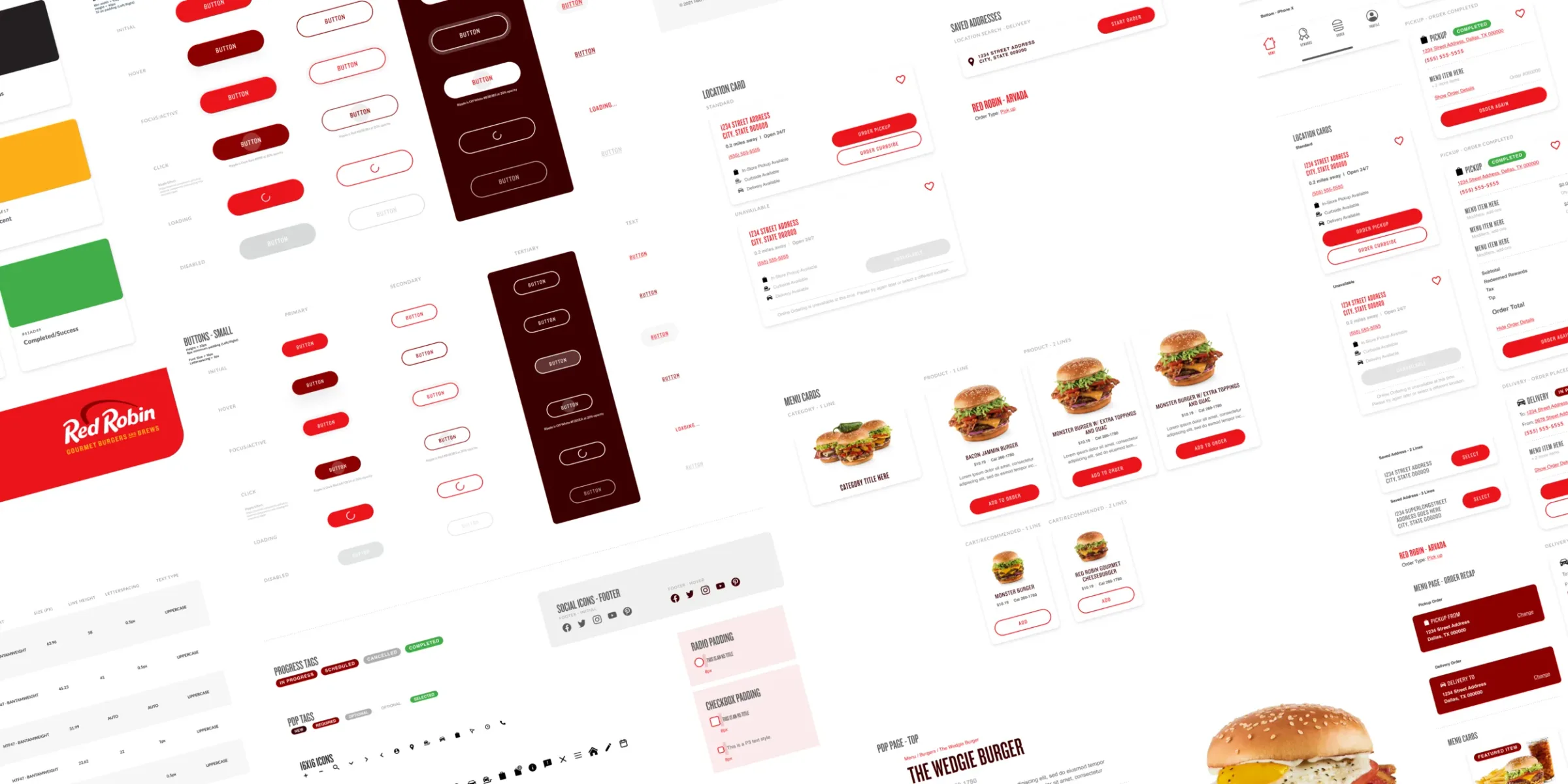
One system for all three products. I kept the brand colors and styles in sync across them, watched the details that decide whether it scales, and made sure everything met ADA guidelines.
One of eight clients from my time at Hathway.