Okay, this is a bit of an epic. I’ve been working on this brand (in spurts) for about a decade. Here are all the rebrands and redesigns I’ve done for them. Doing design work for your dad is no easy feat… haha, but I’m glad about where we ultimately ended up, all these years later!
Paine Pacific is a Portland firm that has been doing M&A, consulting and investment banking since 1998. Visit painepacific.com.
Before
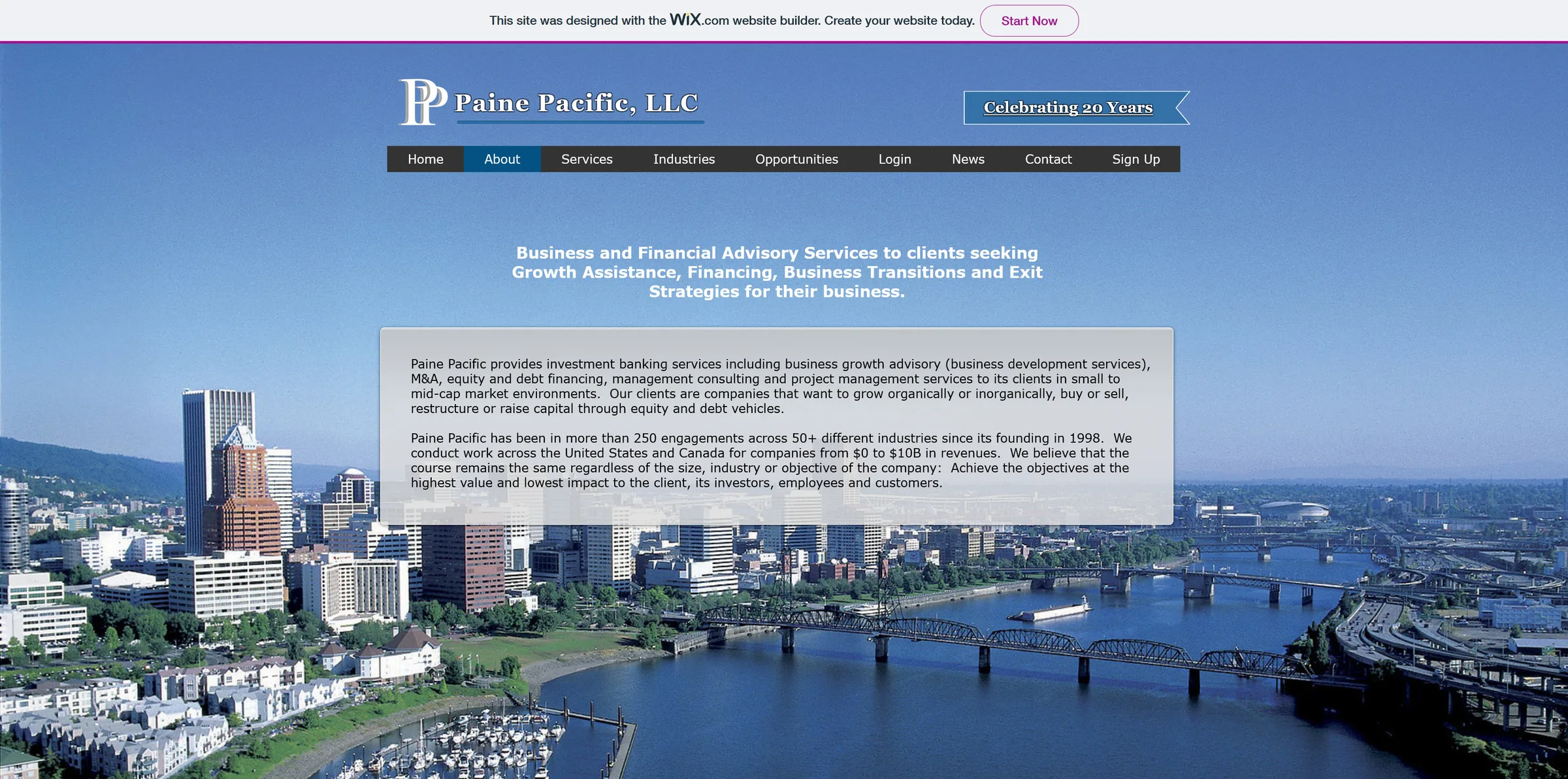
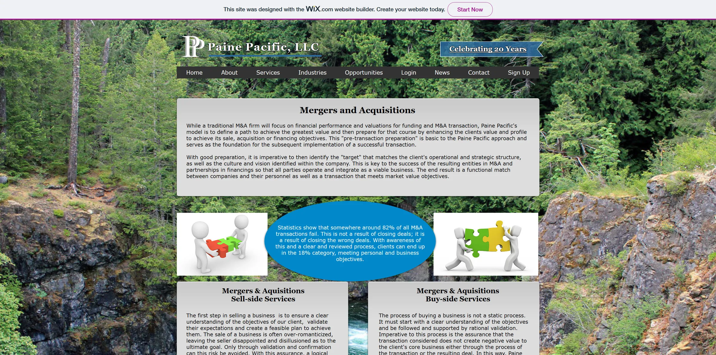
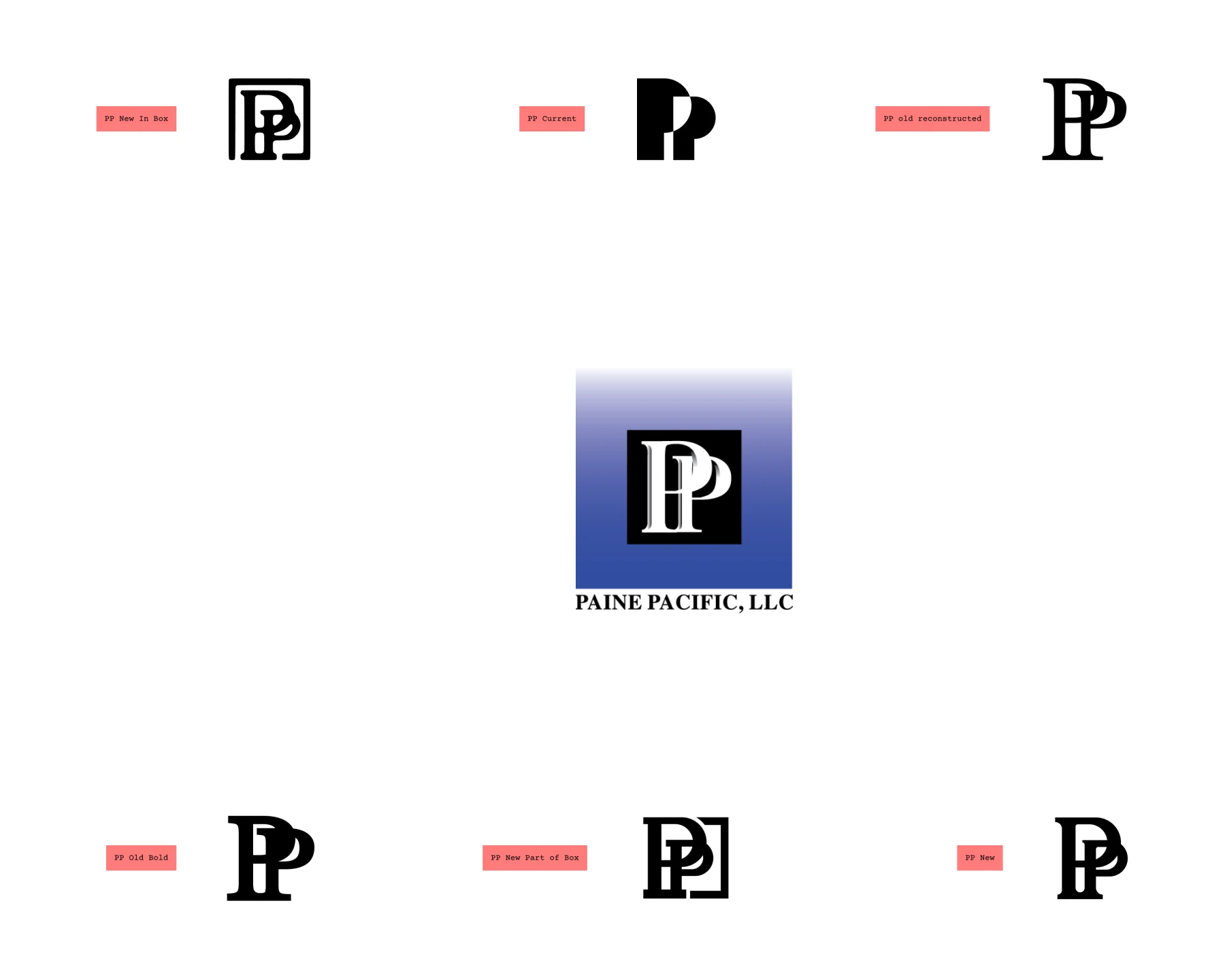
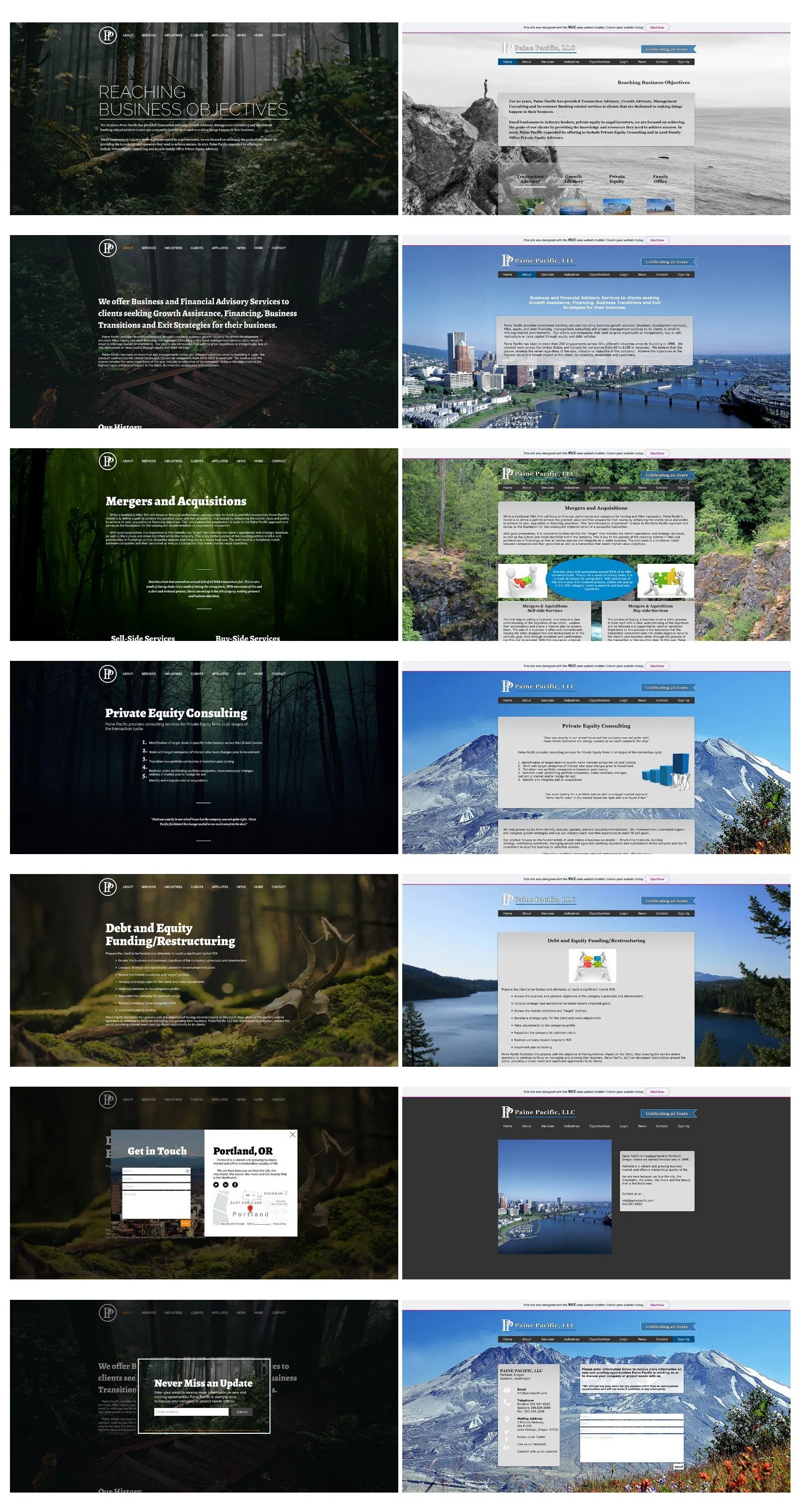
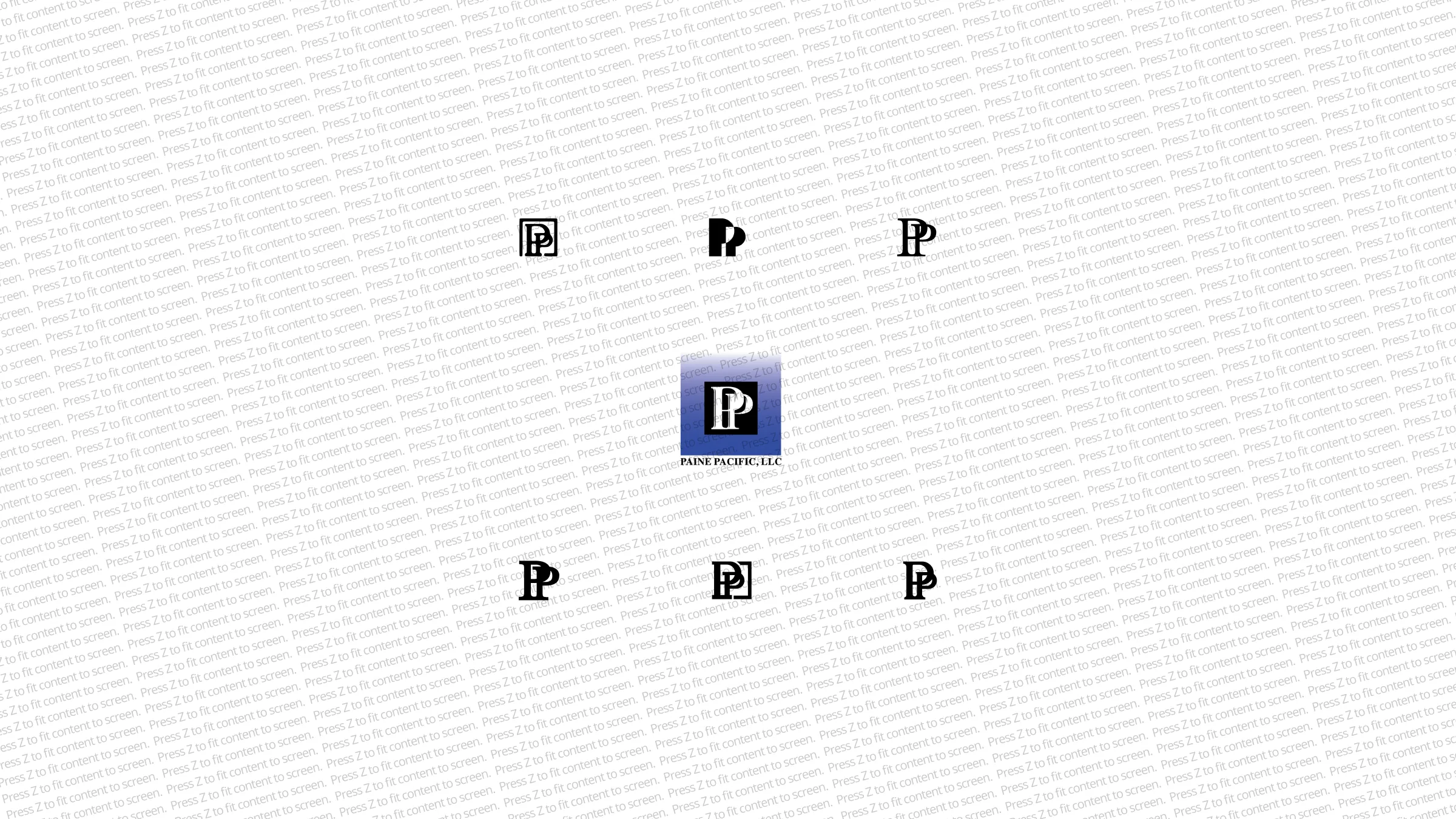
When I first came on, their site was built on Wix, with an outlined PP logo and a different stock photo behind every page.
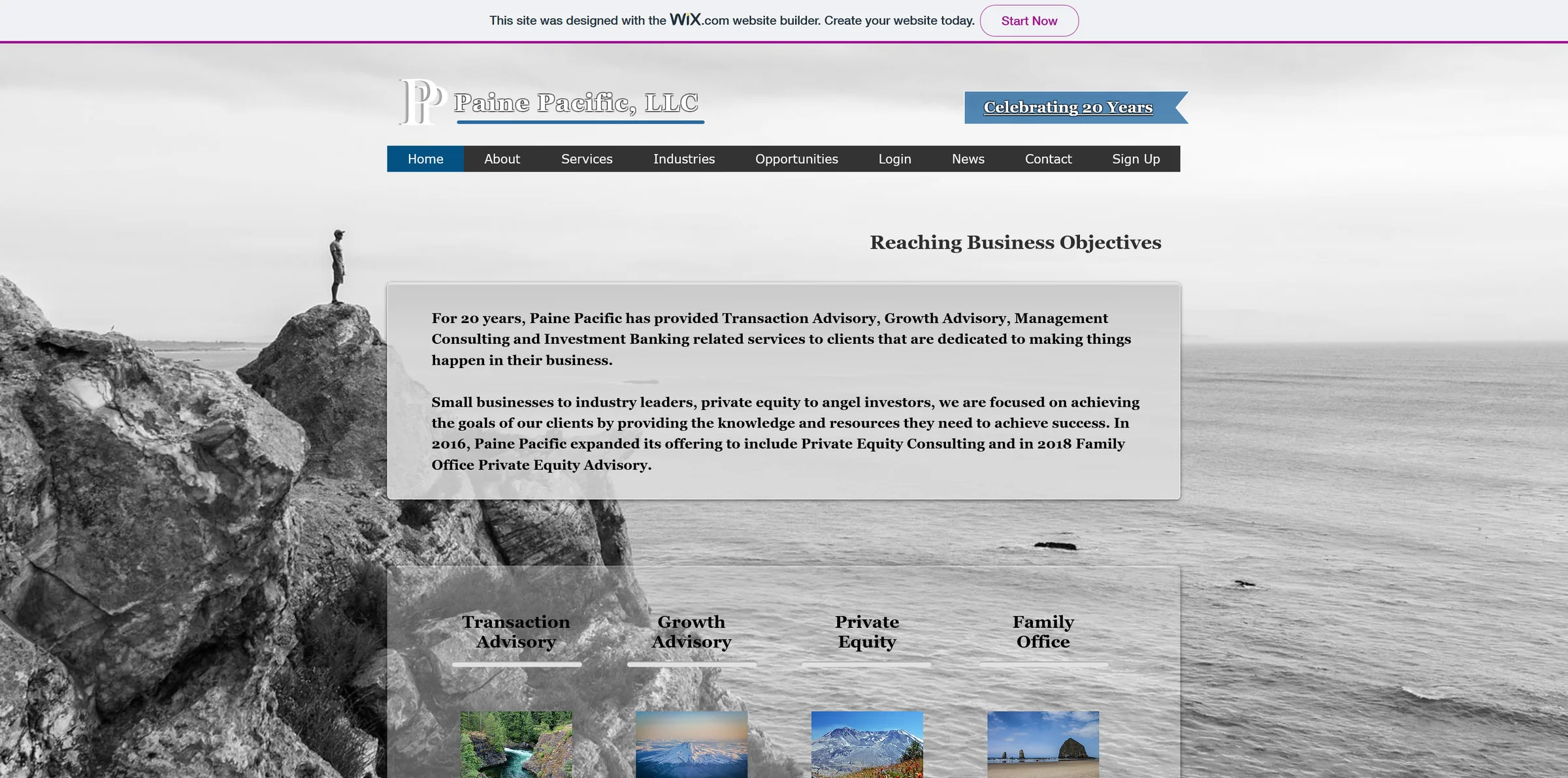
The whole Wix site
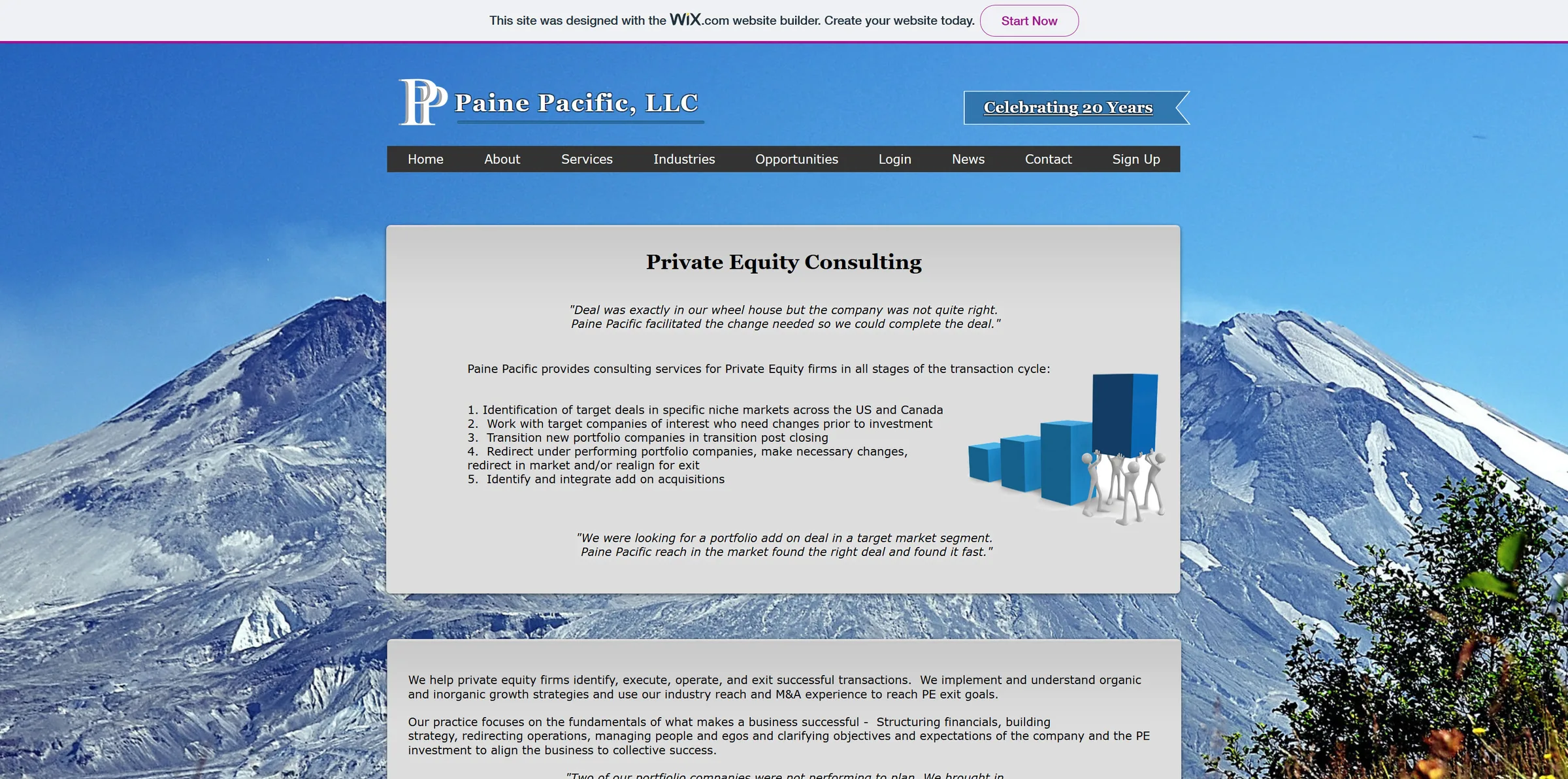
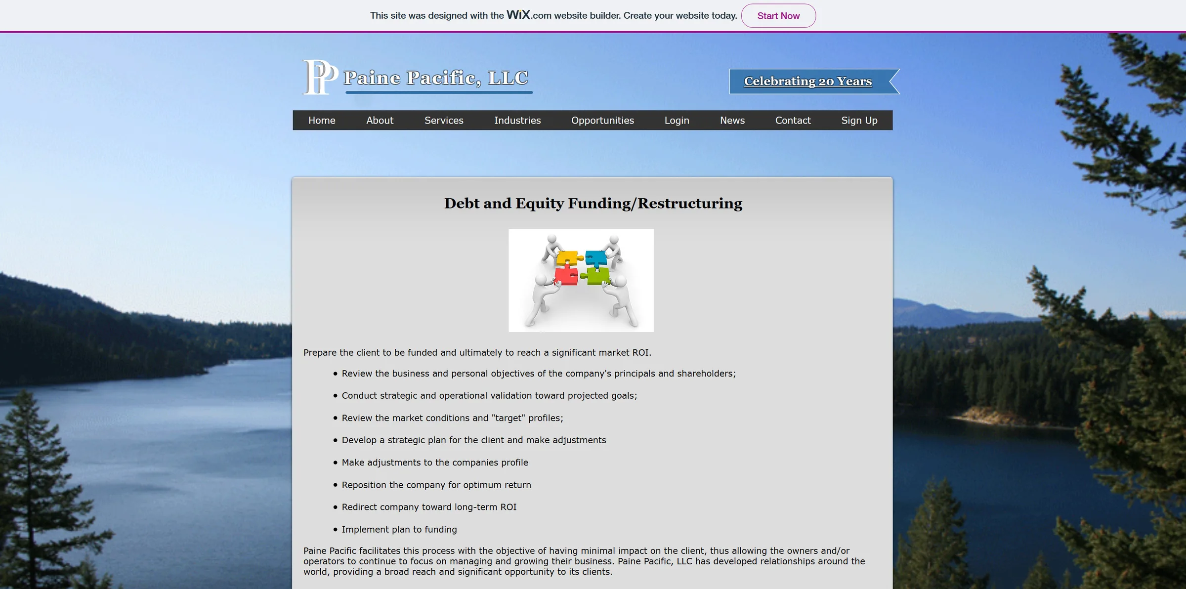
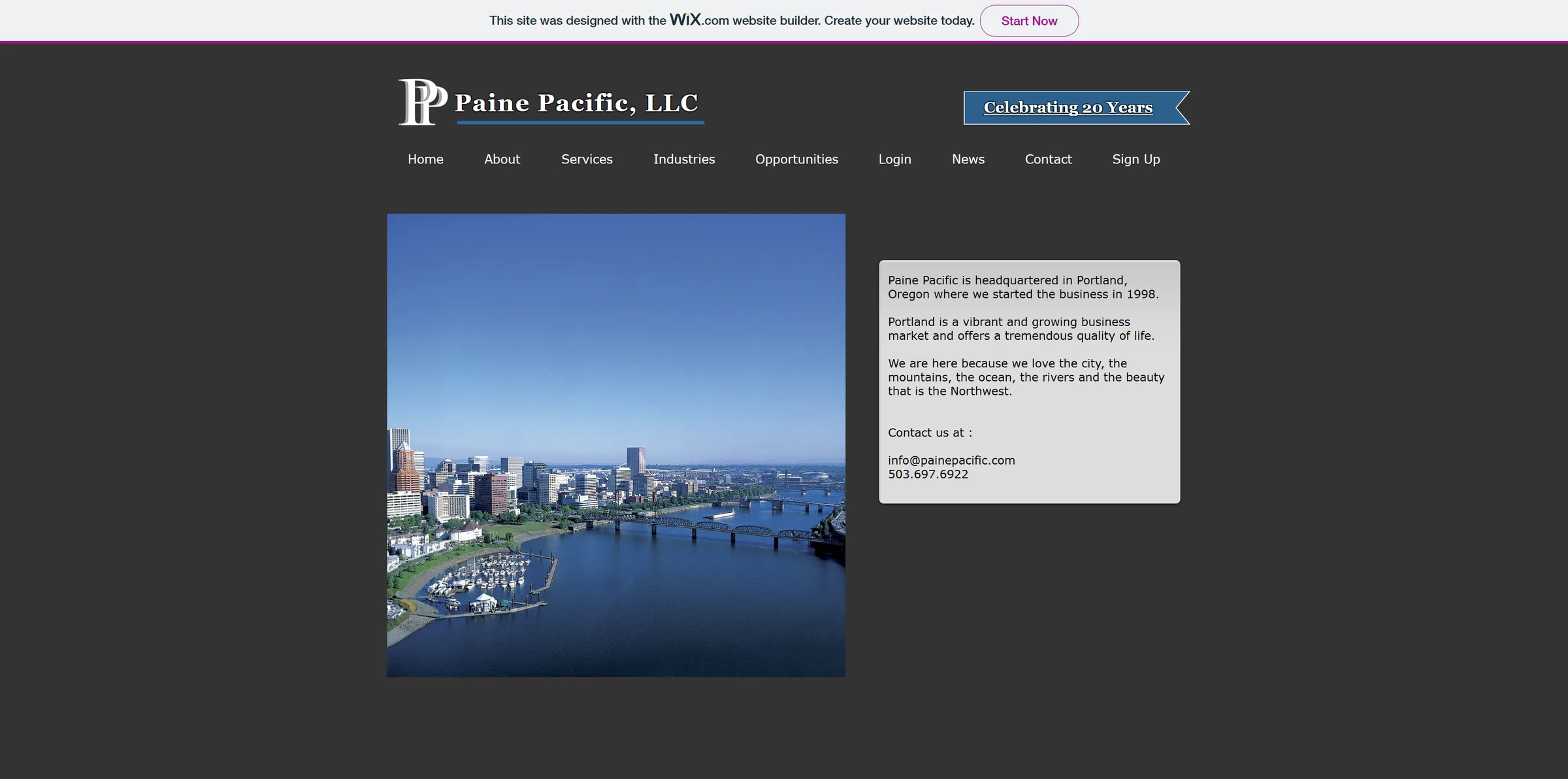
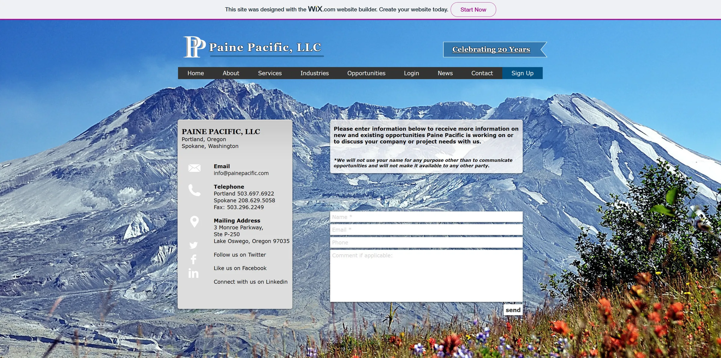
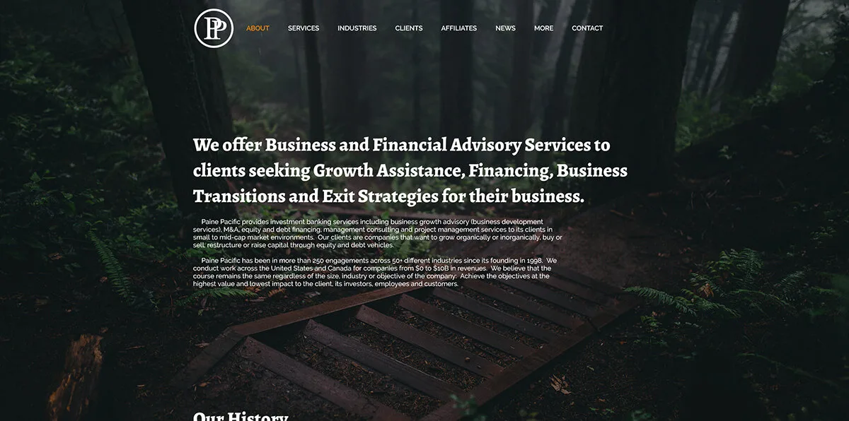
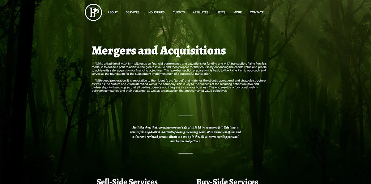
In 2019 I redrew the original logo, gave it a circle to anchor the leaning P shapes, and redesigned the website. The client was very connected to the nature photos on their old site, so we leaned into it and set the new one in the forest.
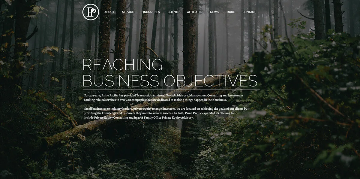
The whole forest site
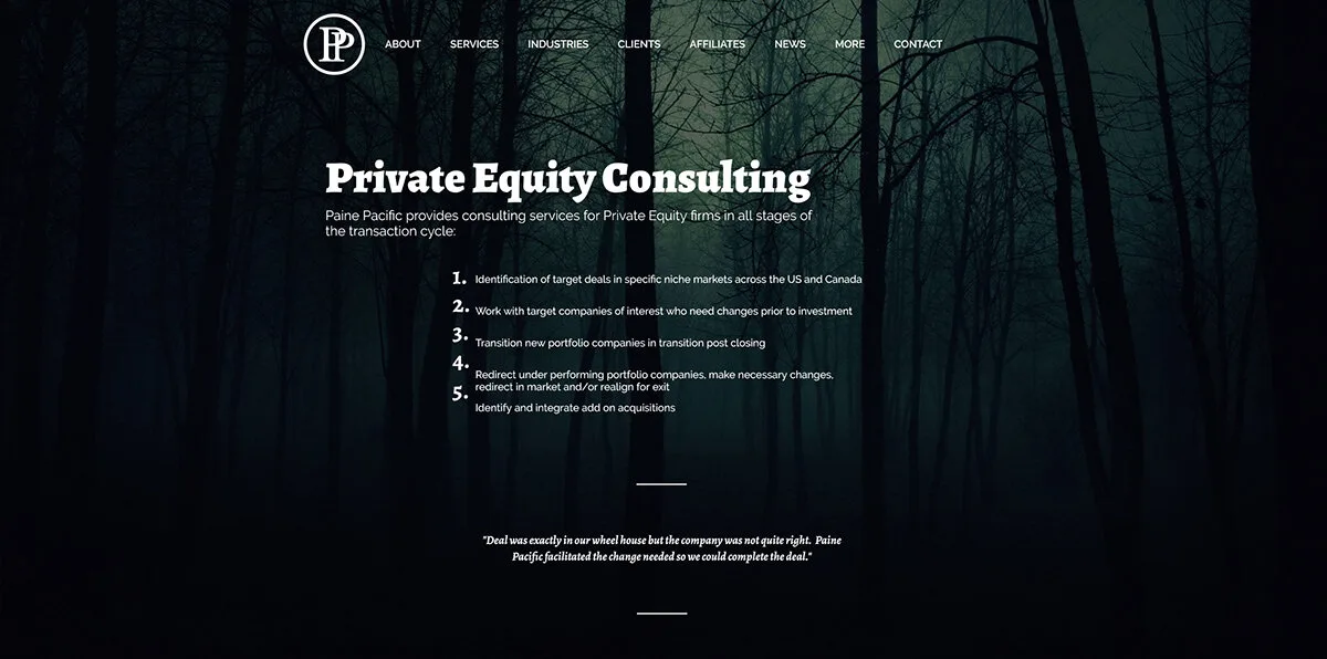
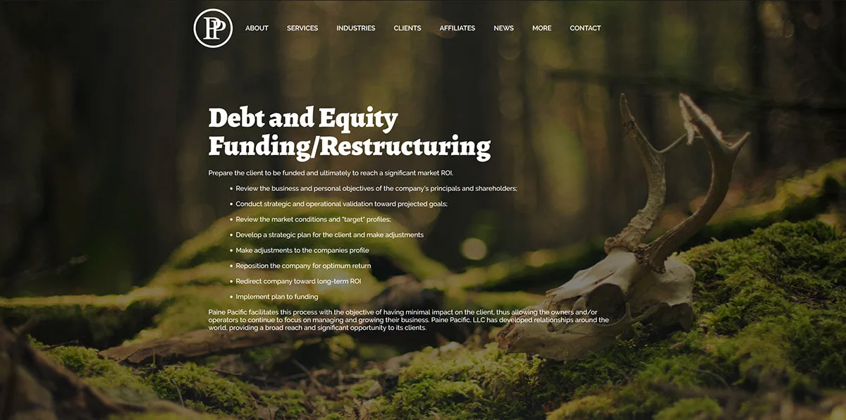
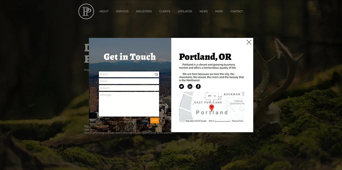
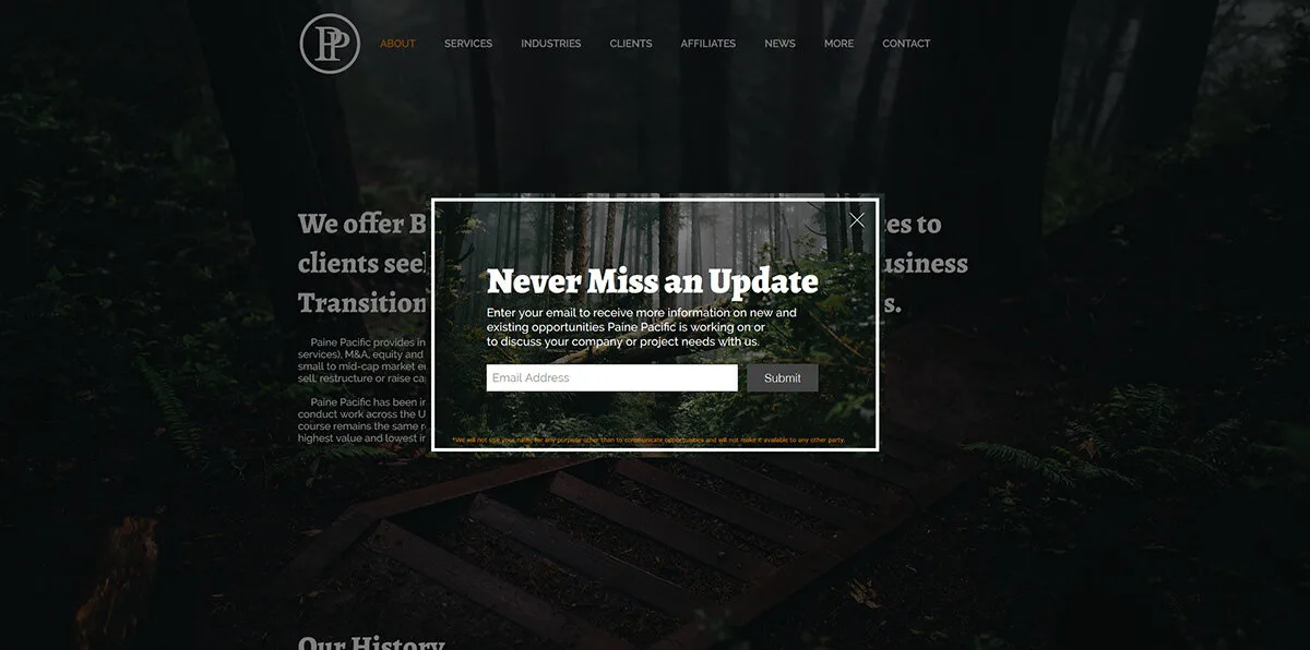
A bolder PP
After that we redesigned the logo itself. It became a more modern and bold take on the overlapping PP, with a sans-serif logotype.
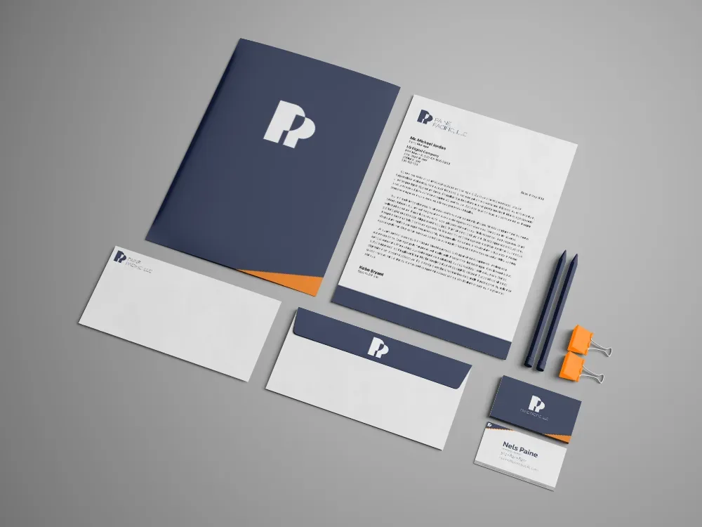
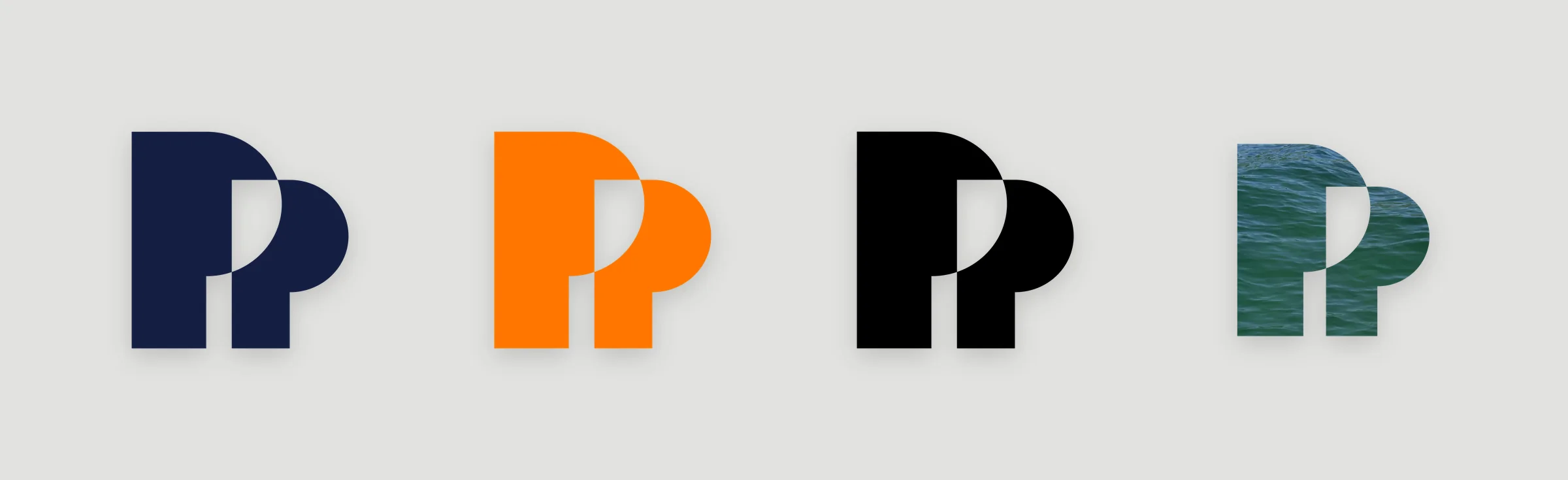
The rest of the bold PP
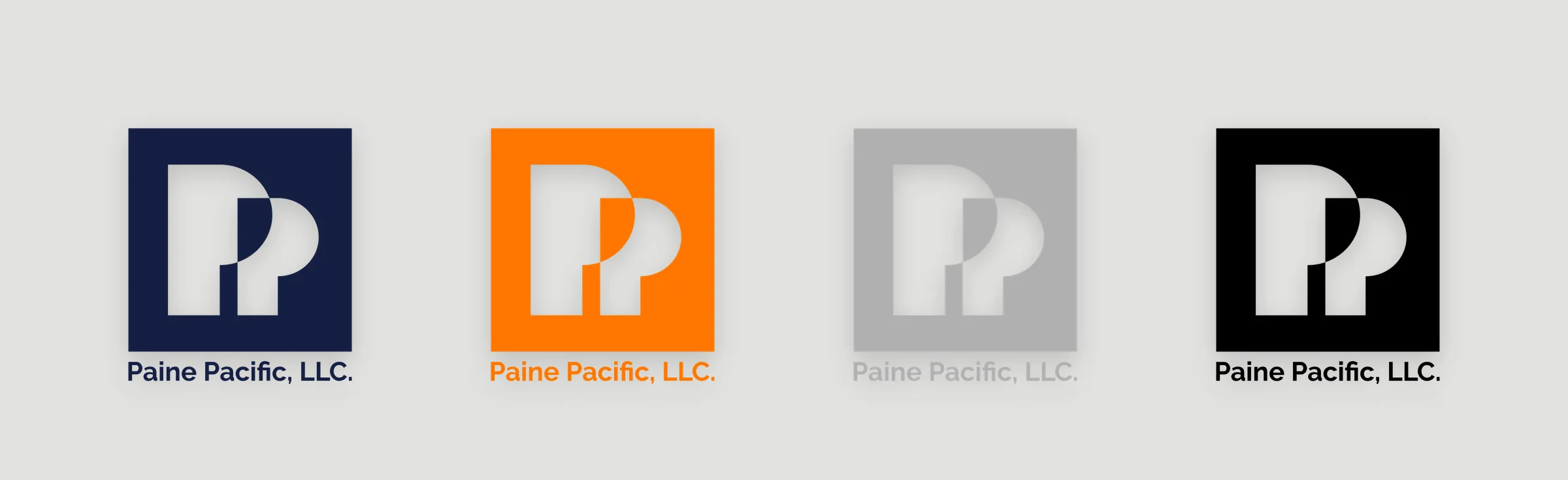
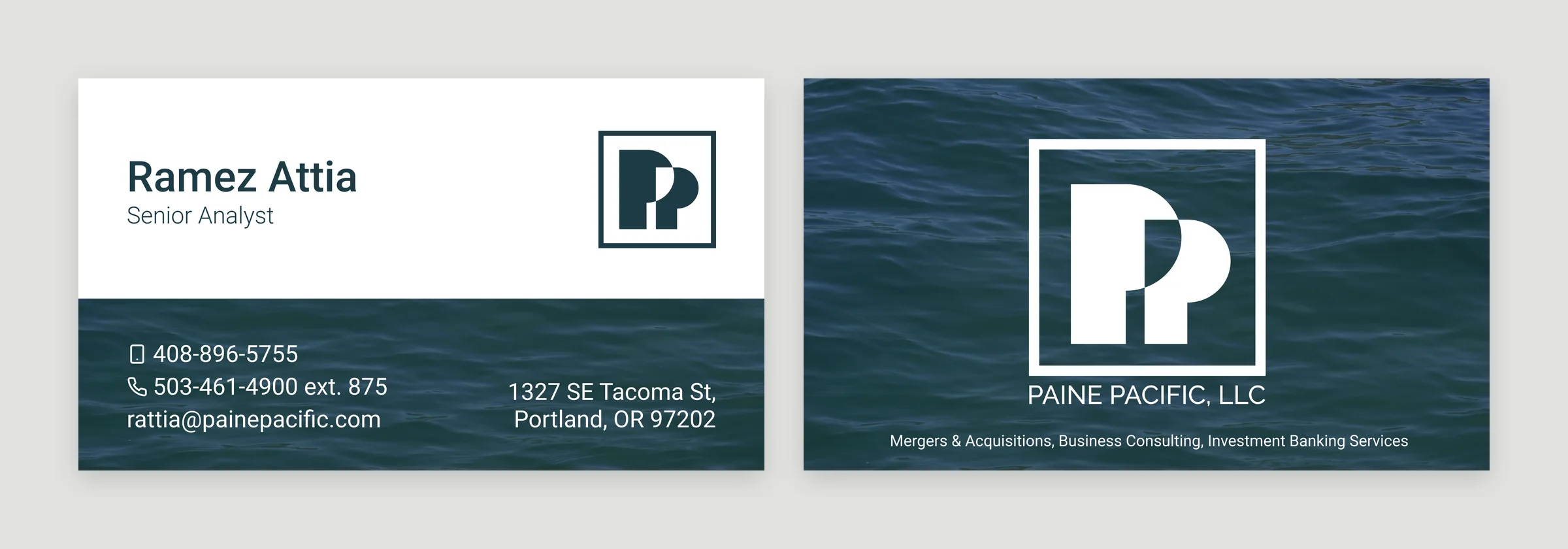
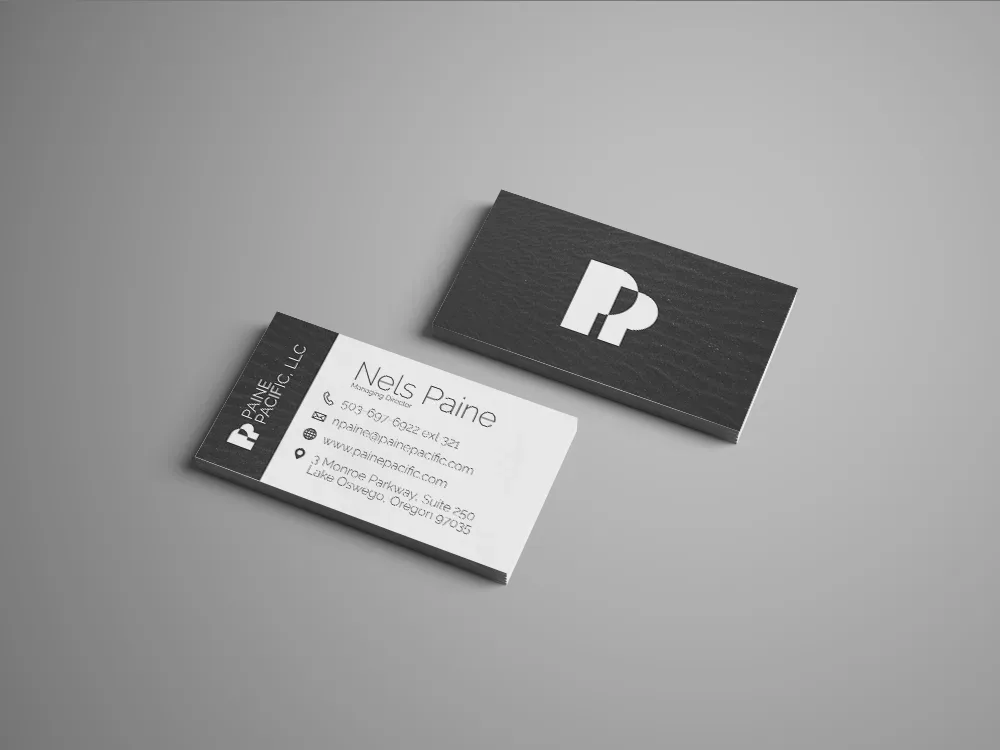
Keeping the PP
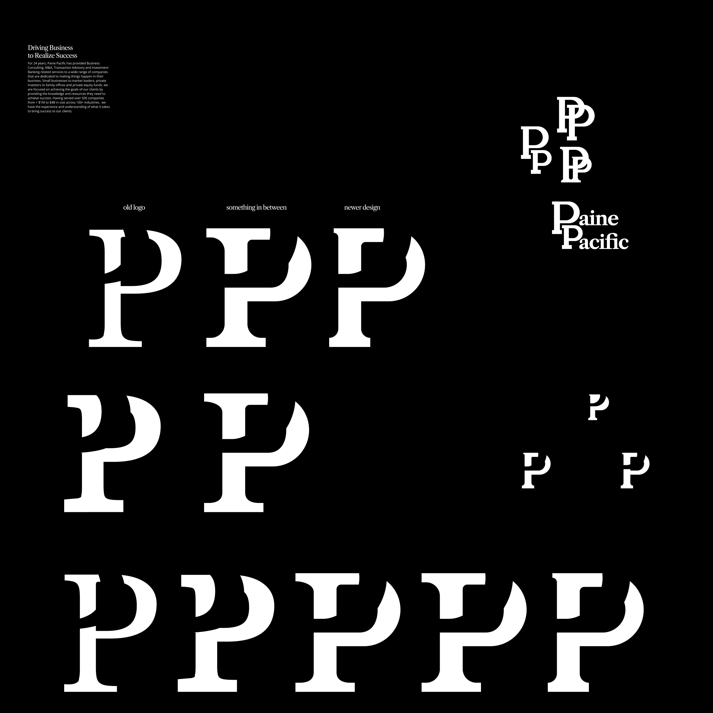
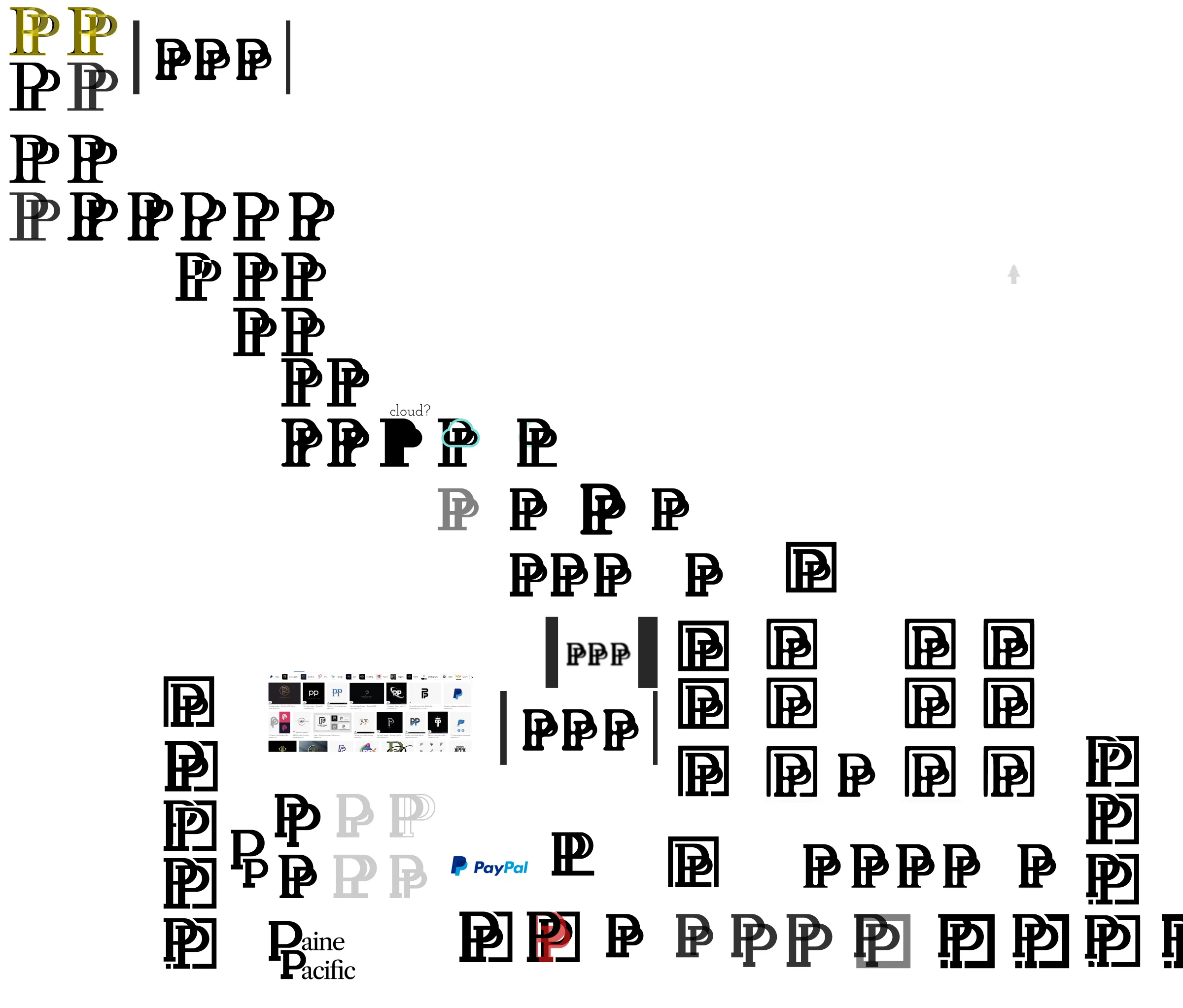
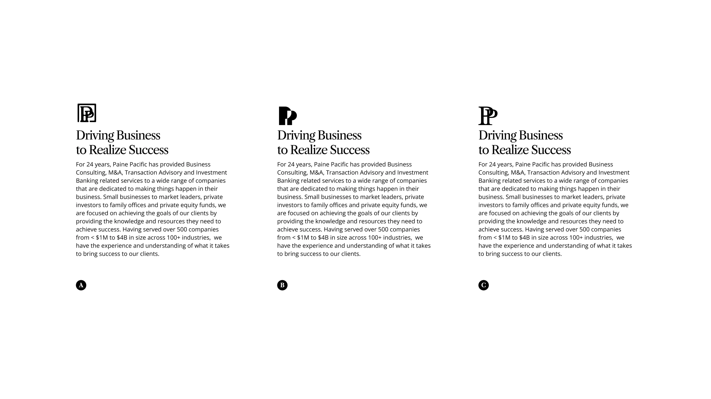
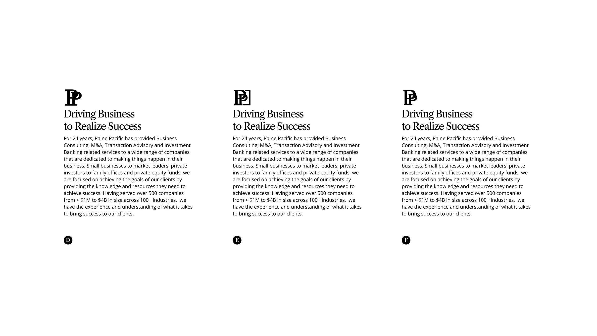
In 2022 it was time to mature the brand and website. I went back to a serif for the brand typeface to give it a more refined, human and trustworthy look. The PP had been with them a long time, so we started there, with serif versions of the original logo, a few in between, and a stacked wordmark.
The presentation
Dropping the letters
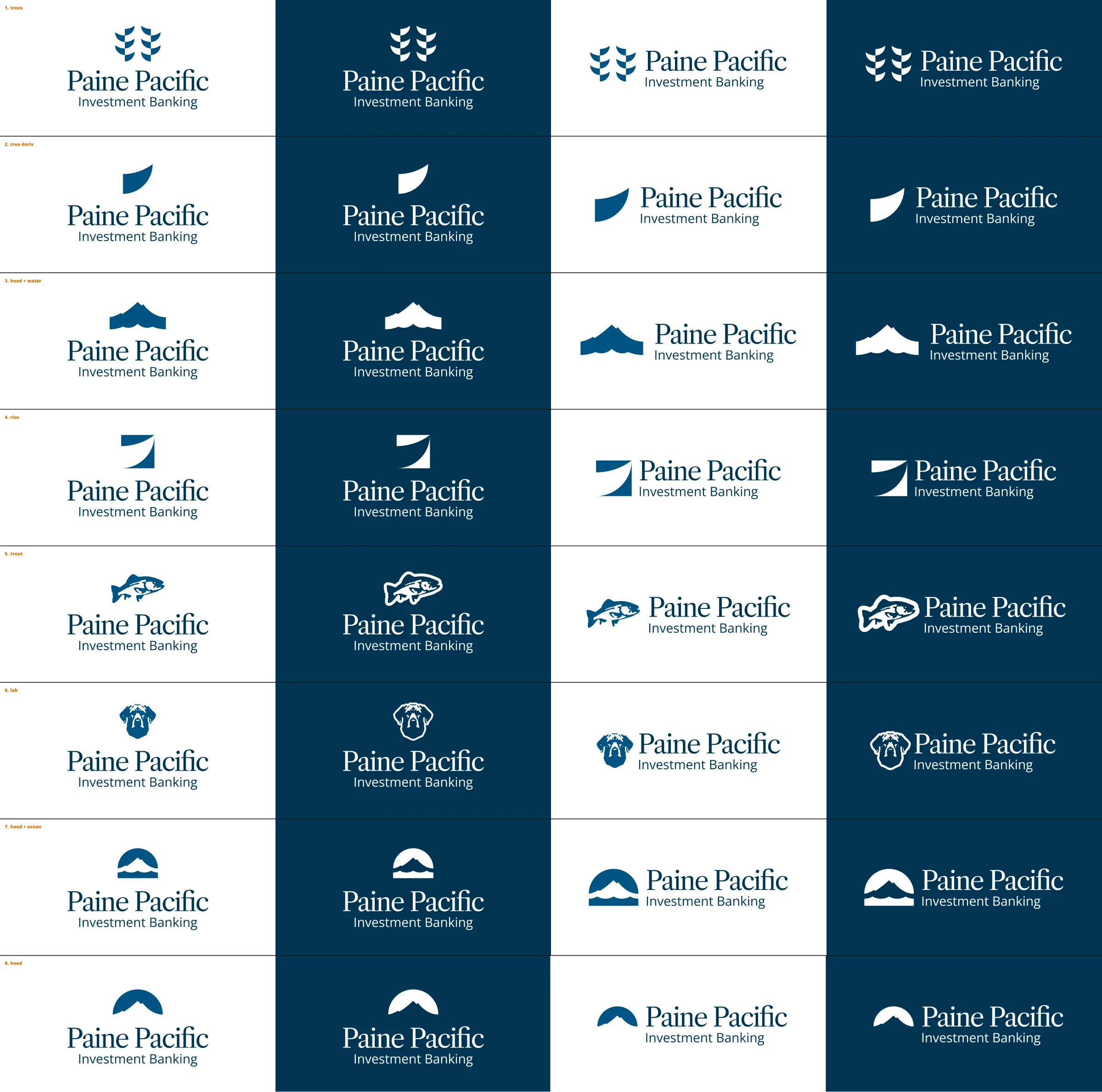
None of the PP versions felt like enough of a step forward, so I tried marks without the letters. I put together eight directions on light and dark backgrounds, including trees, a leaf, a trout and a few takes on Mt. Hood.
Mt. Hood
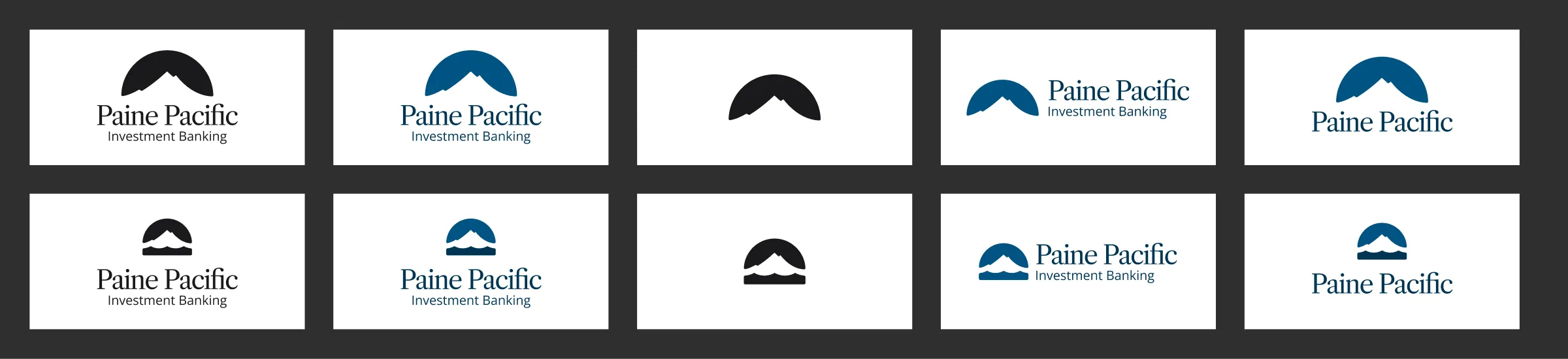
We went with Mt. Hood. I tried it as a simple dome, with and without water, and inside a square and a circle.
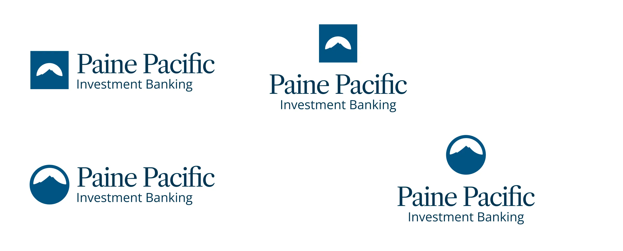
More lockups
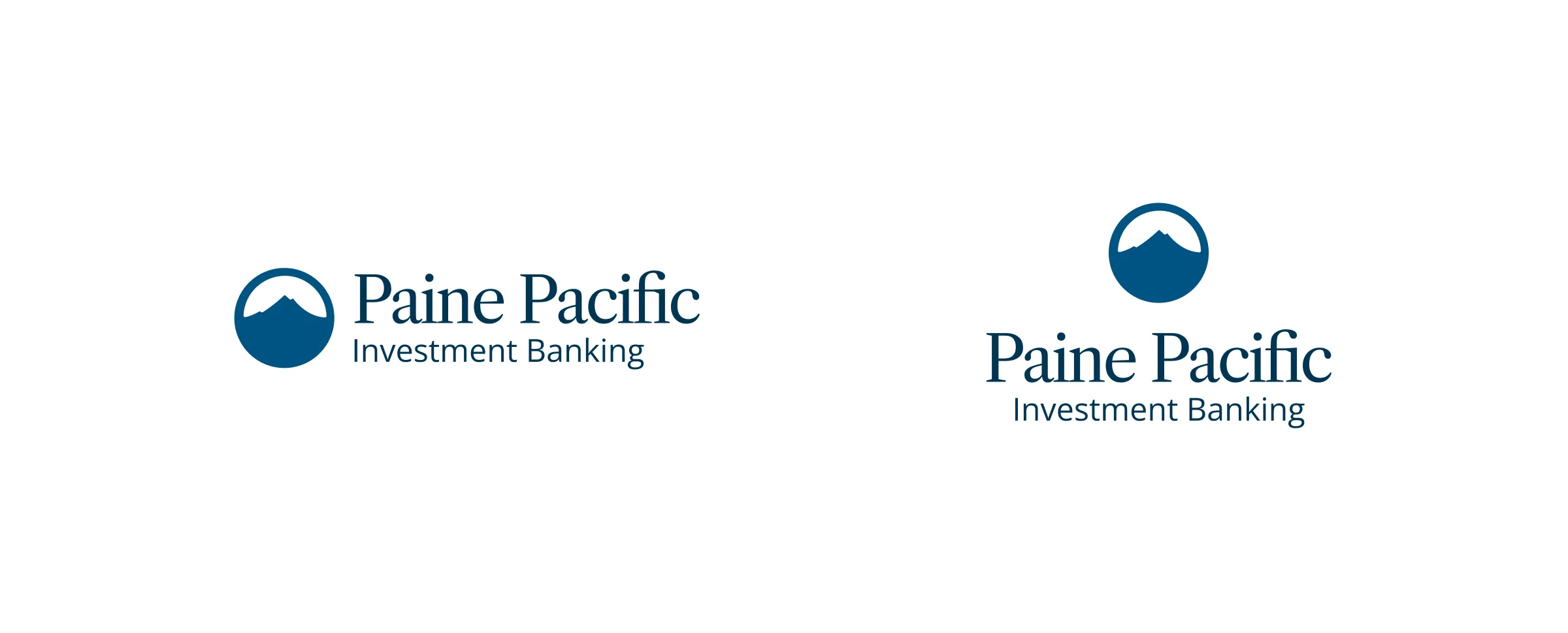
For the final we put the water back under the mountain, since Portland sits right between Hood and the Pacific.
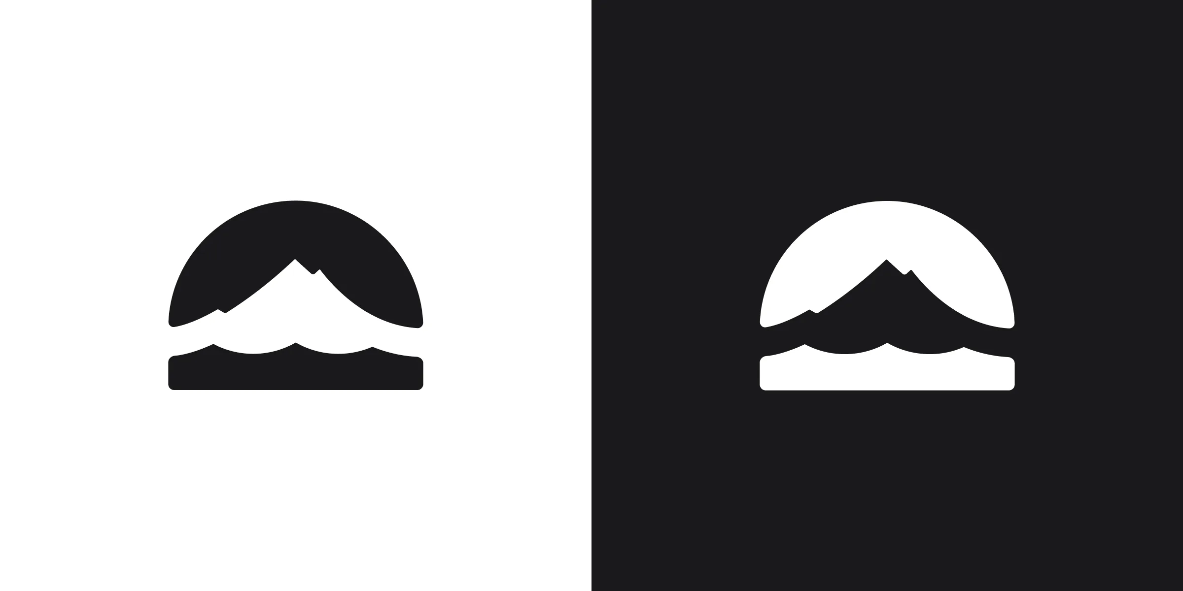
System
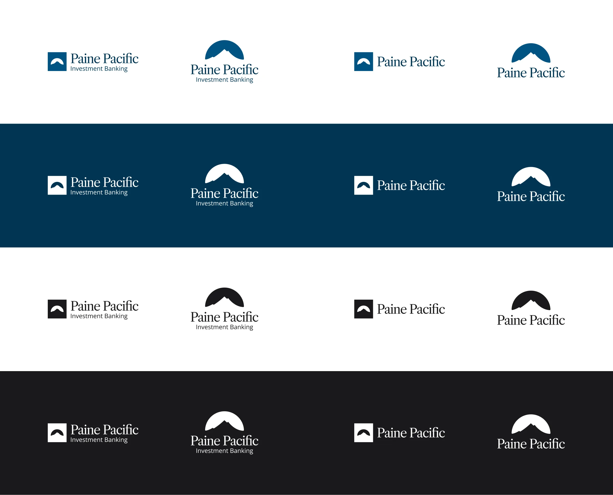
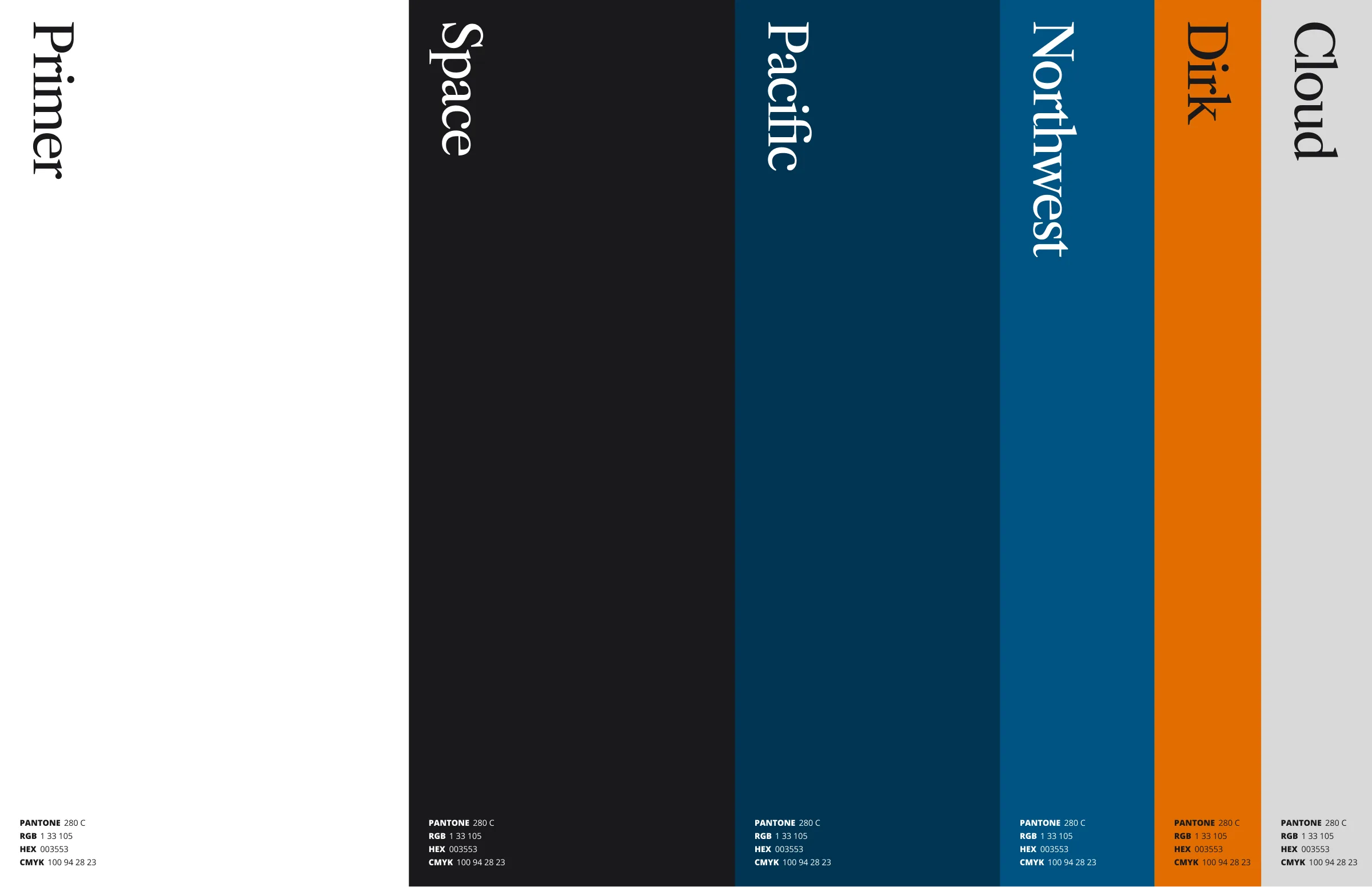
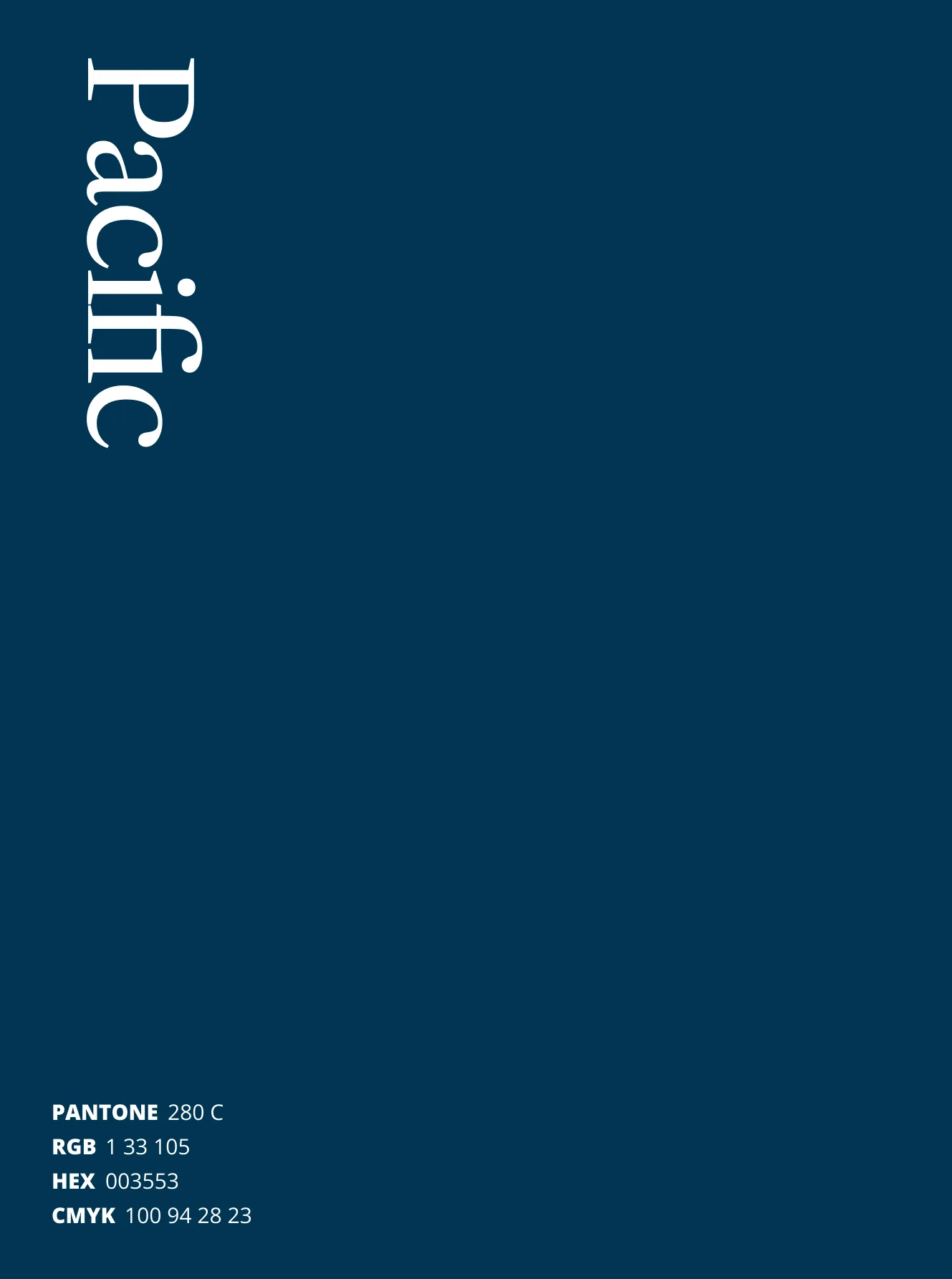
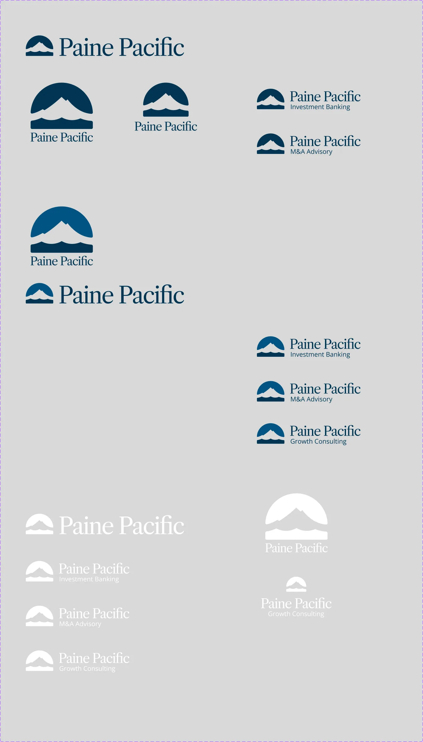
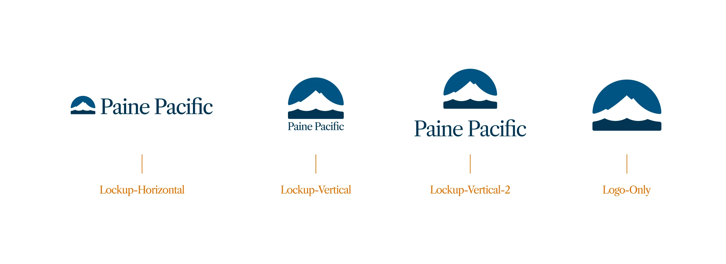
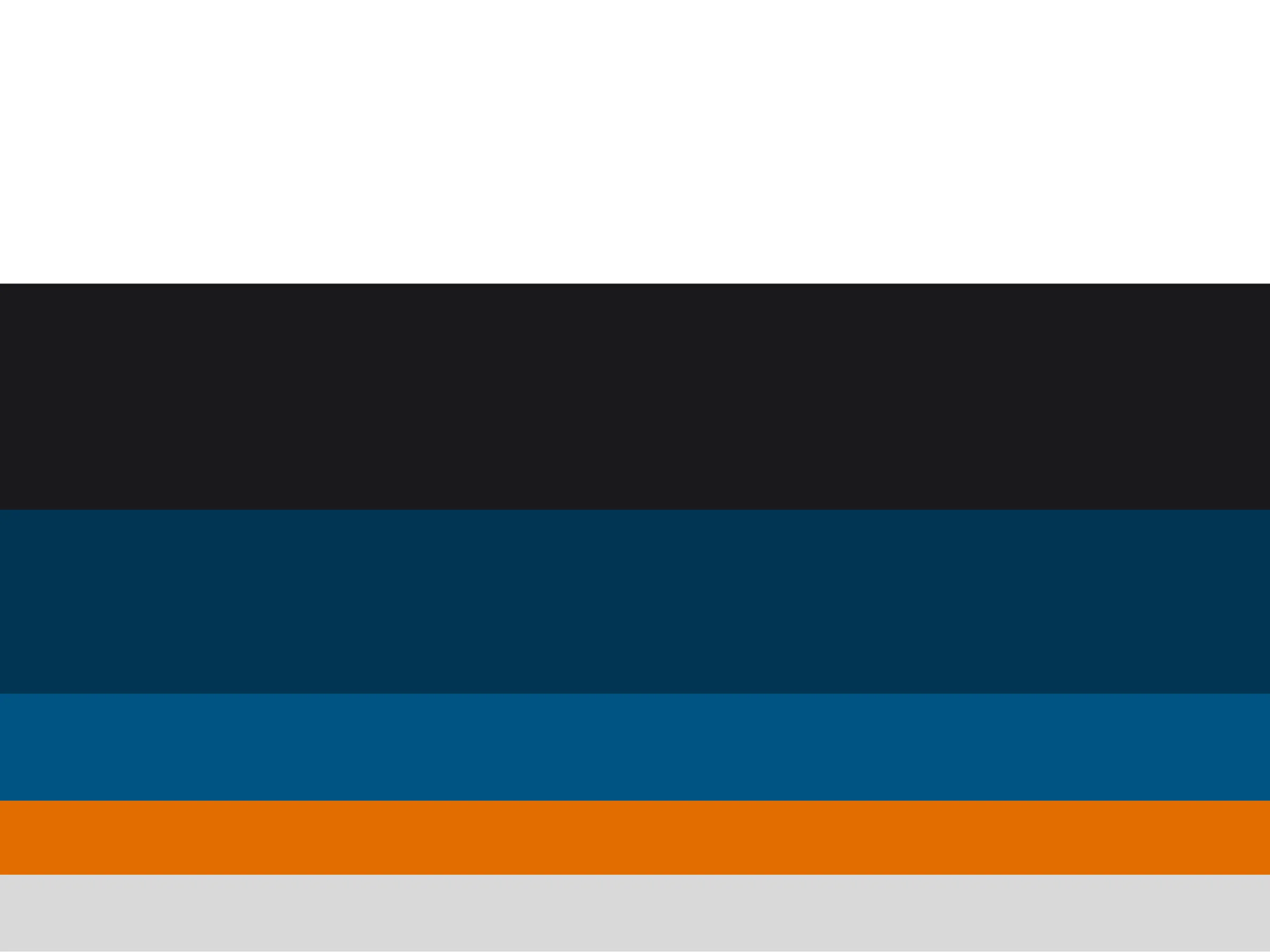
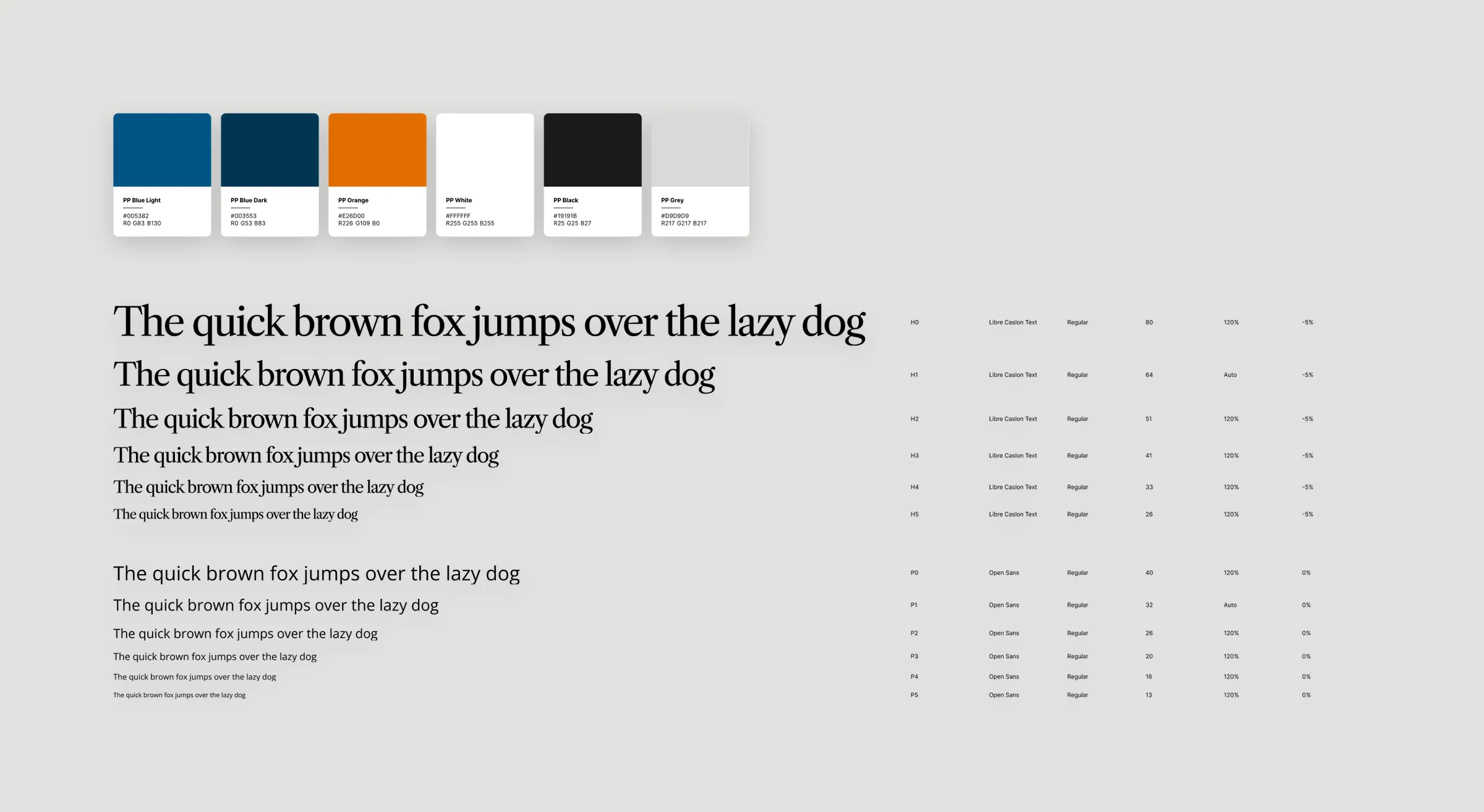
The palette has six colors, called Primer, Space, Pacific, Northwest, Dirk and Cloud. Headlines are set in Libre Caslon Text and everything else is in Open Sans. The logo comes in horizontal and stacked versions, plus one with a line underneath for each part of the business.
Specs
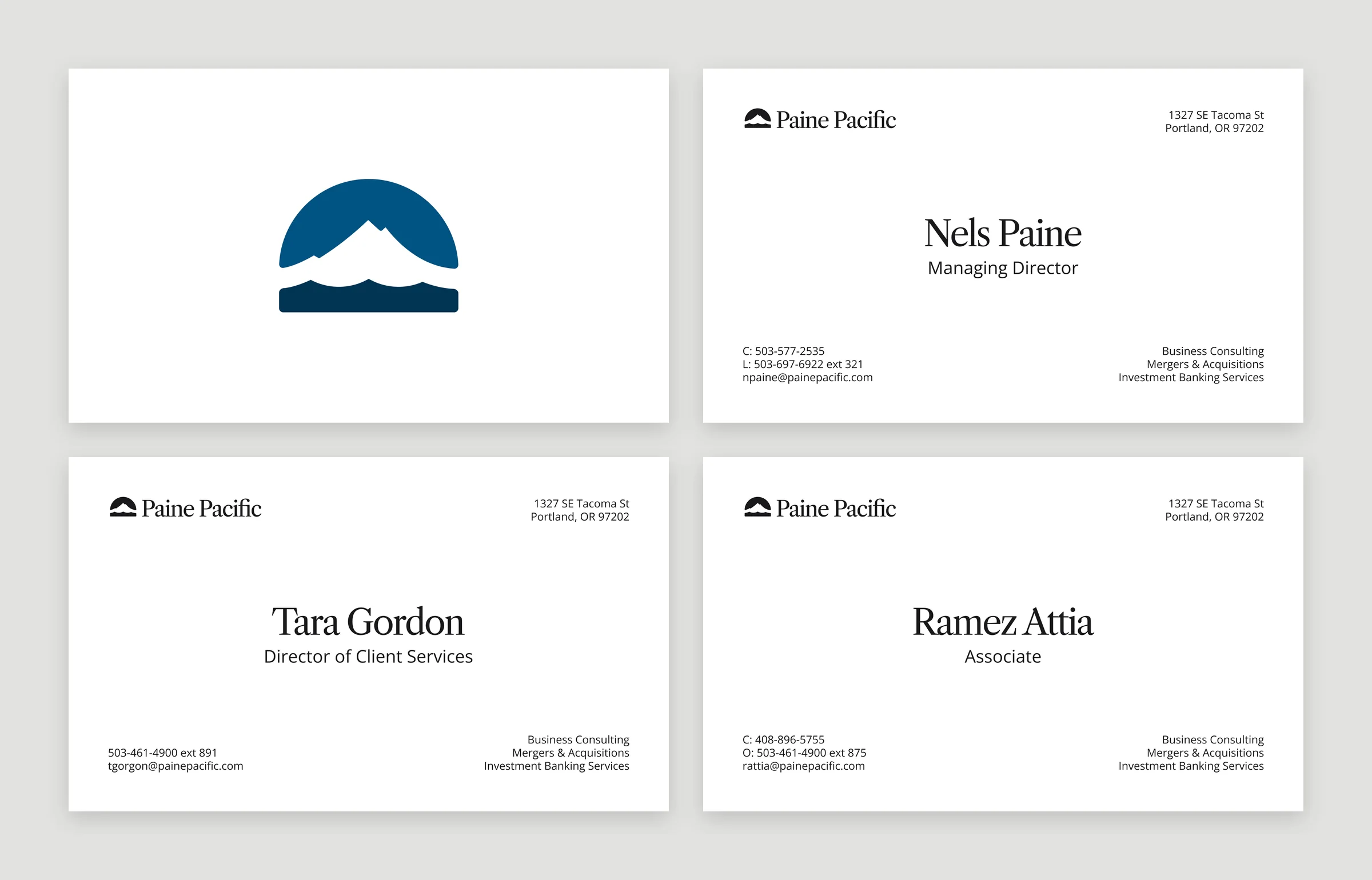
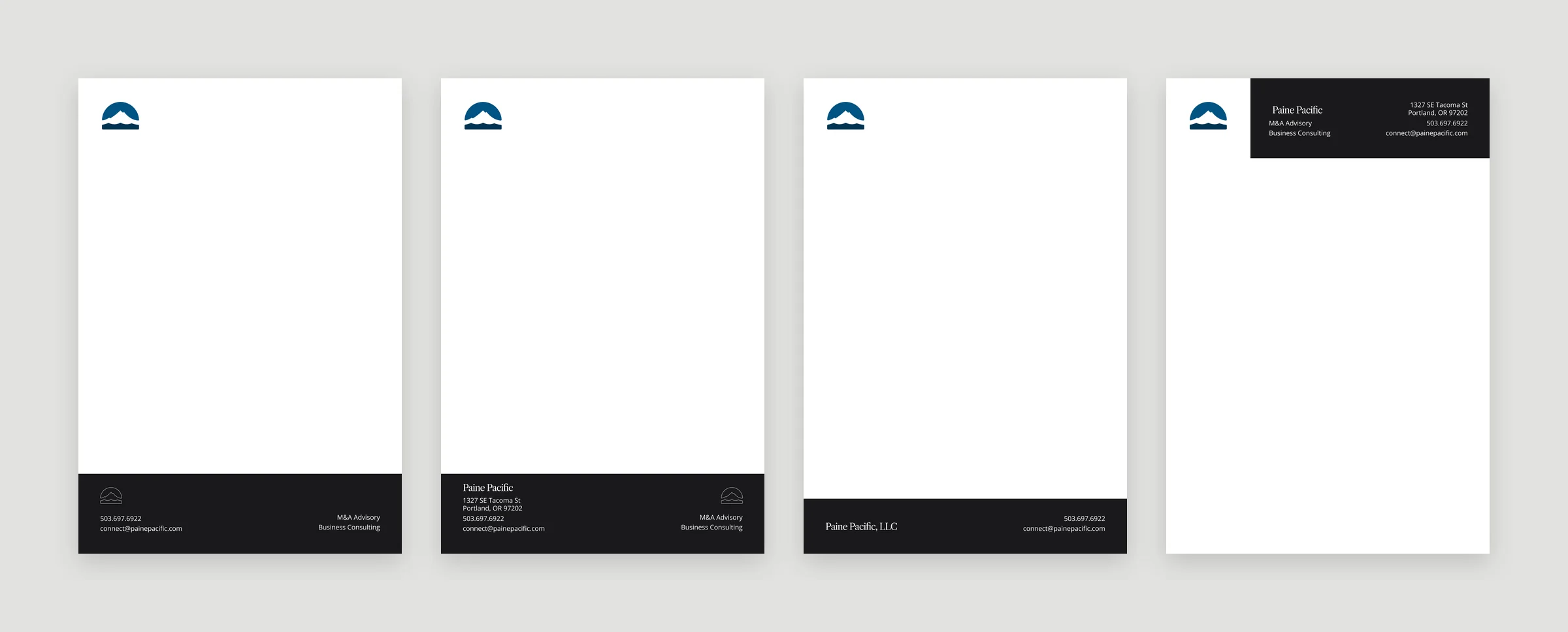
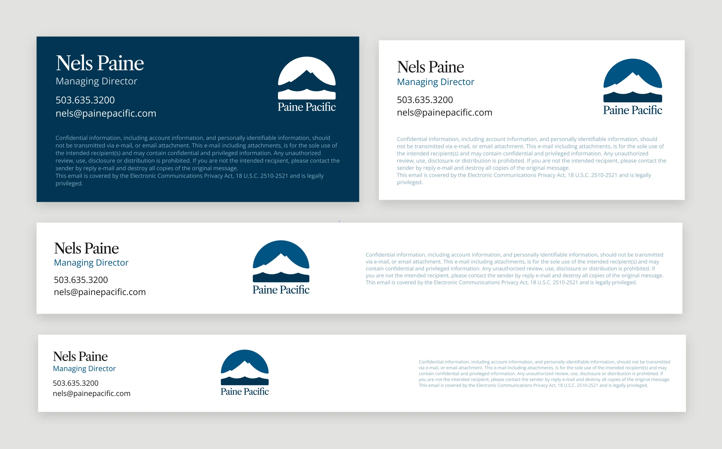
I designed business cards for the team, letterhead notepads, an envelope and an email signature.
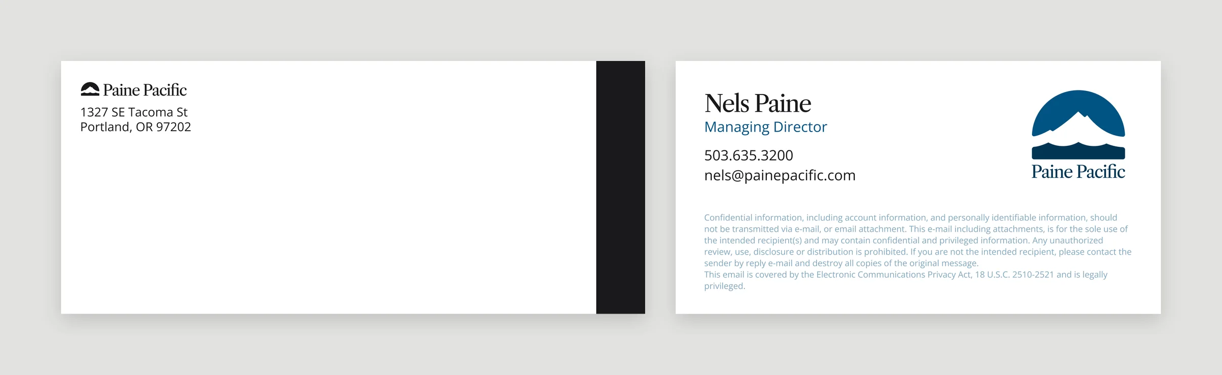
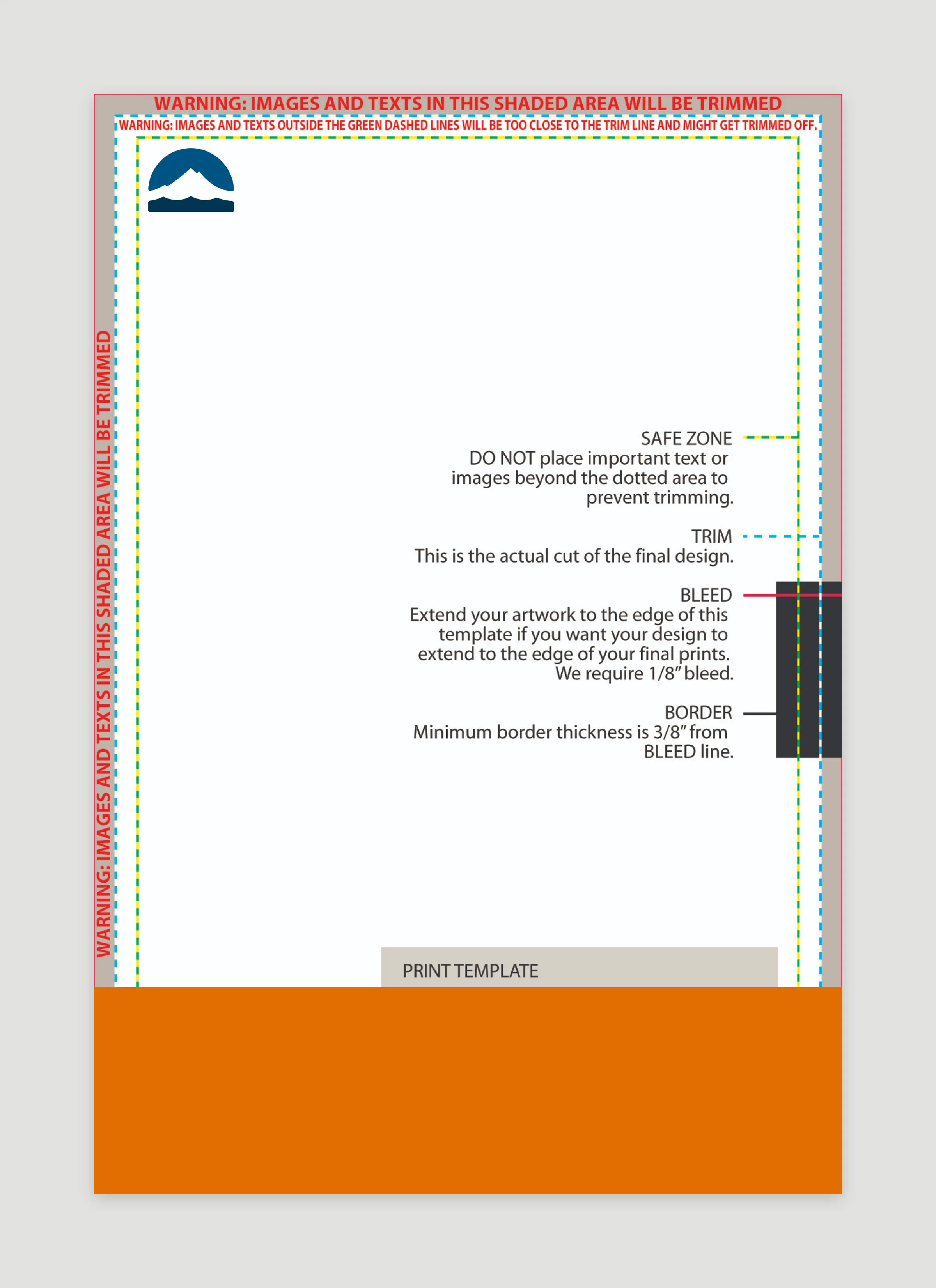
More signatures and the print template
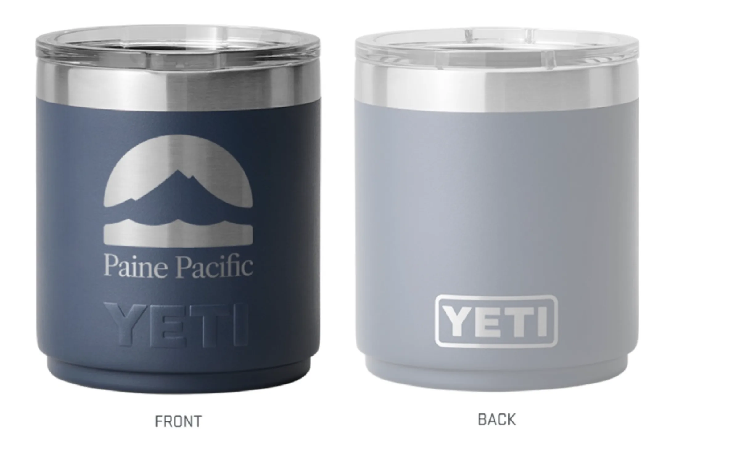
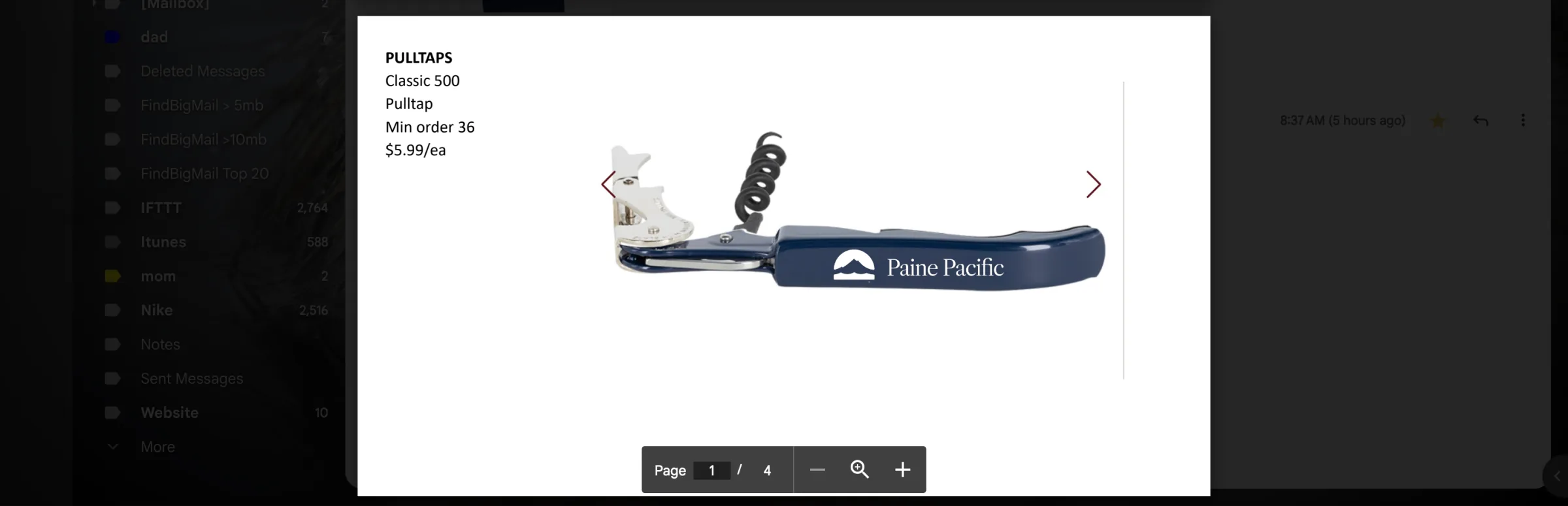
We also made some merch, like Yeti tumblers and matchbooks.
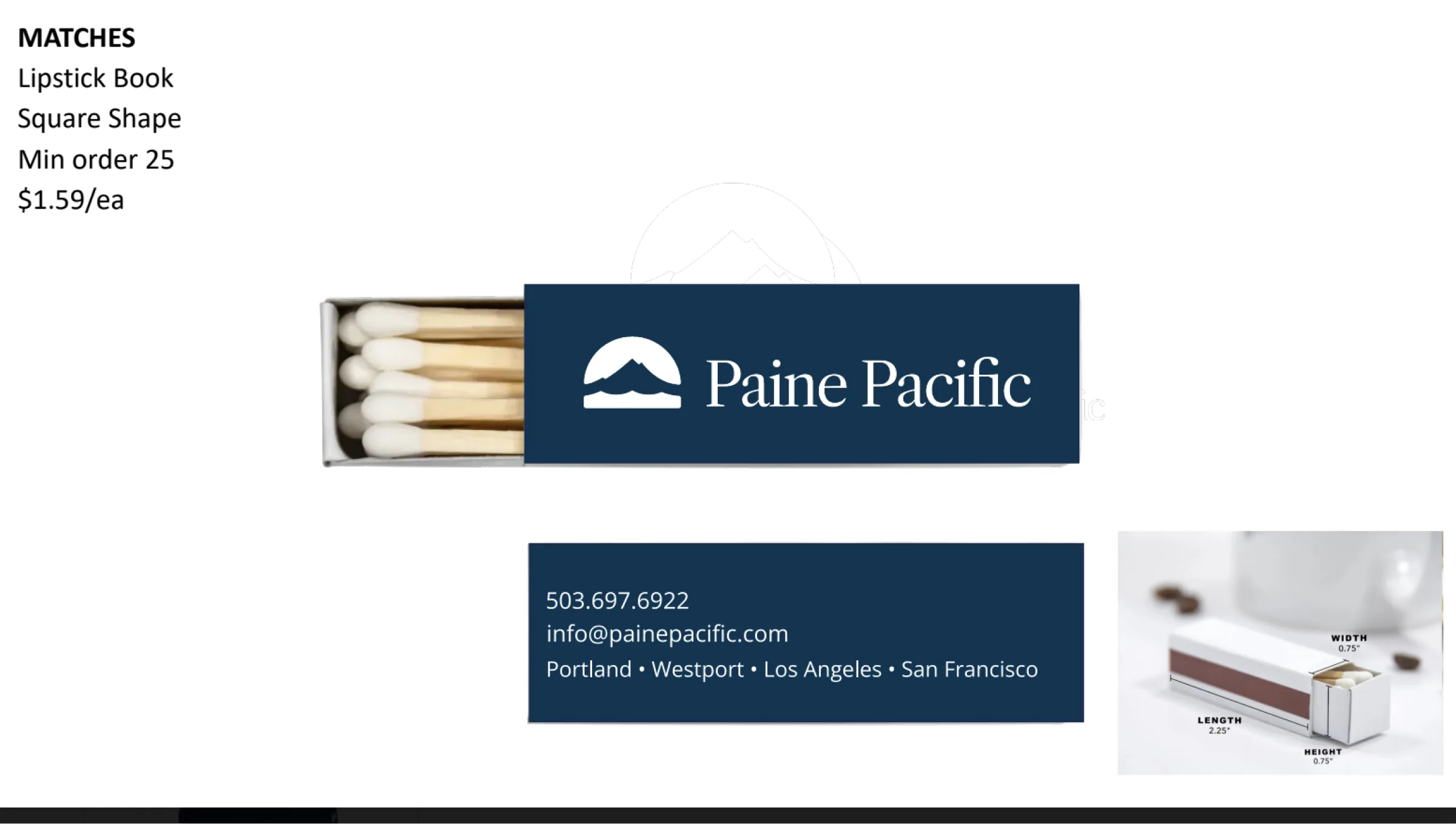
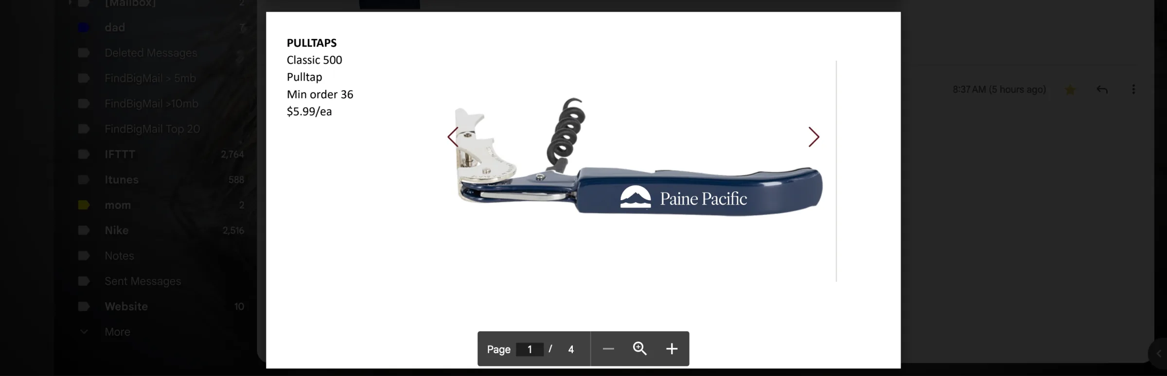
Matchbook art and corkscrew proofs

Social
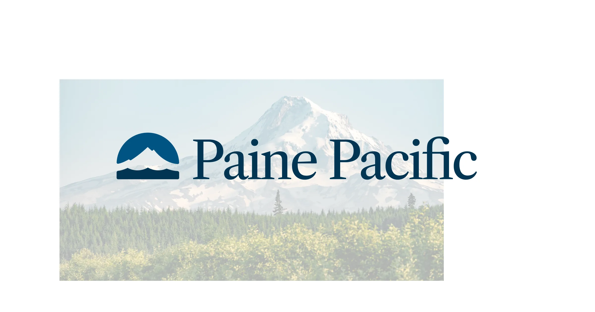
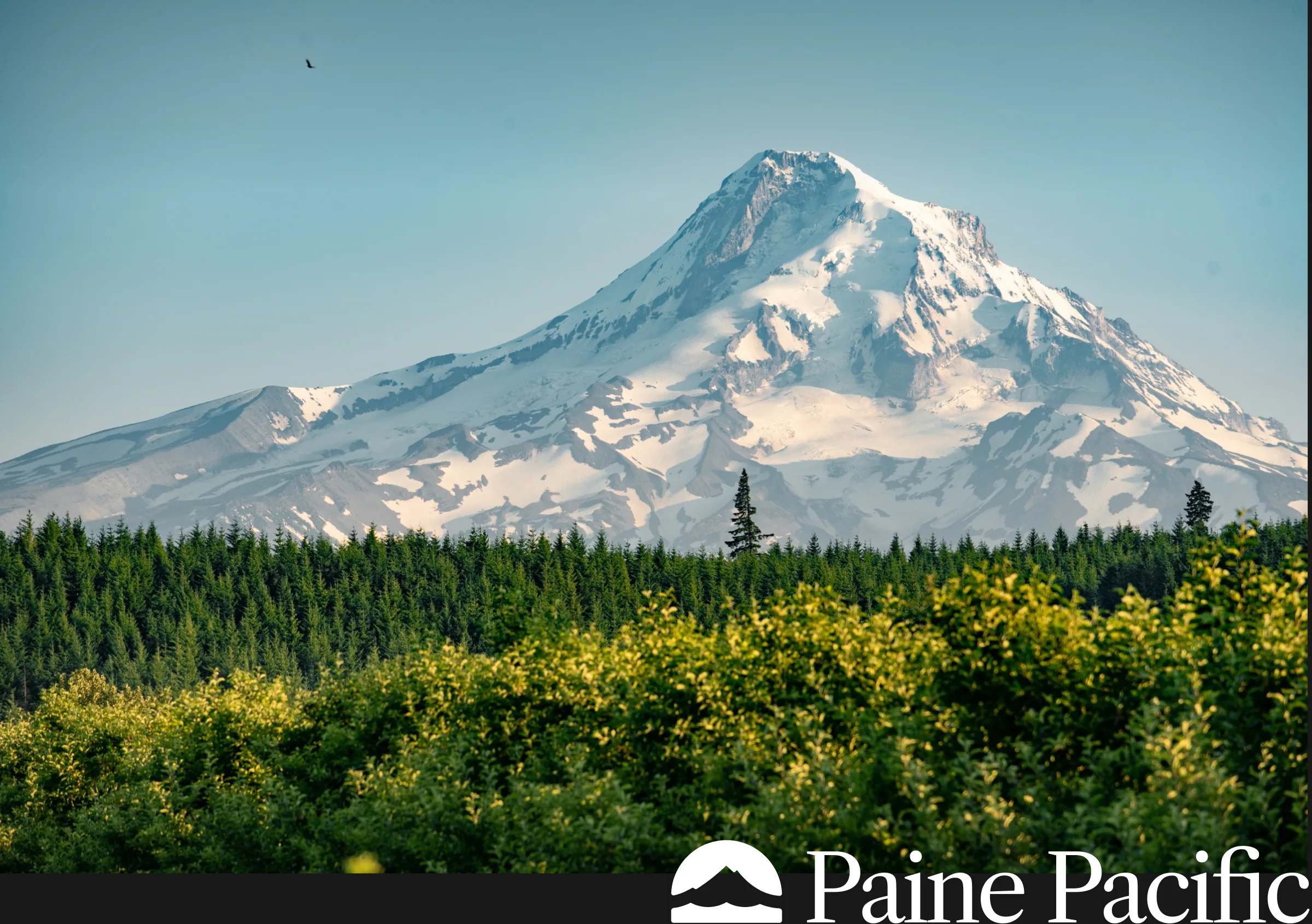
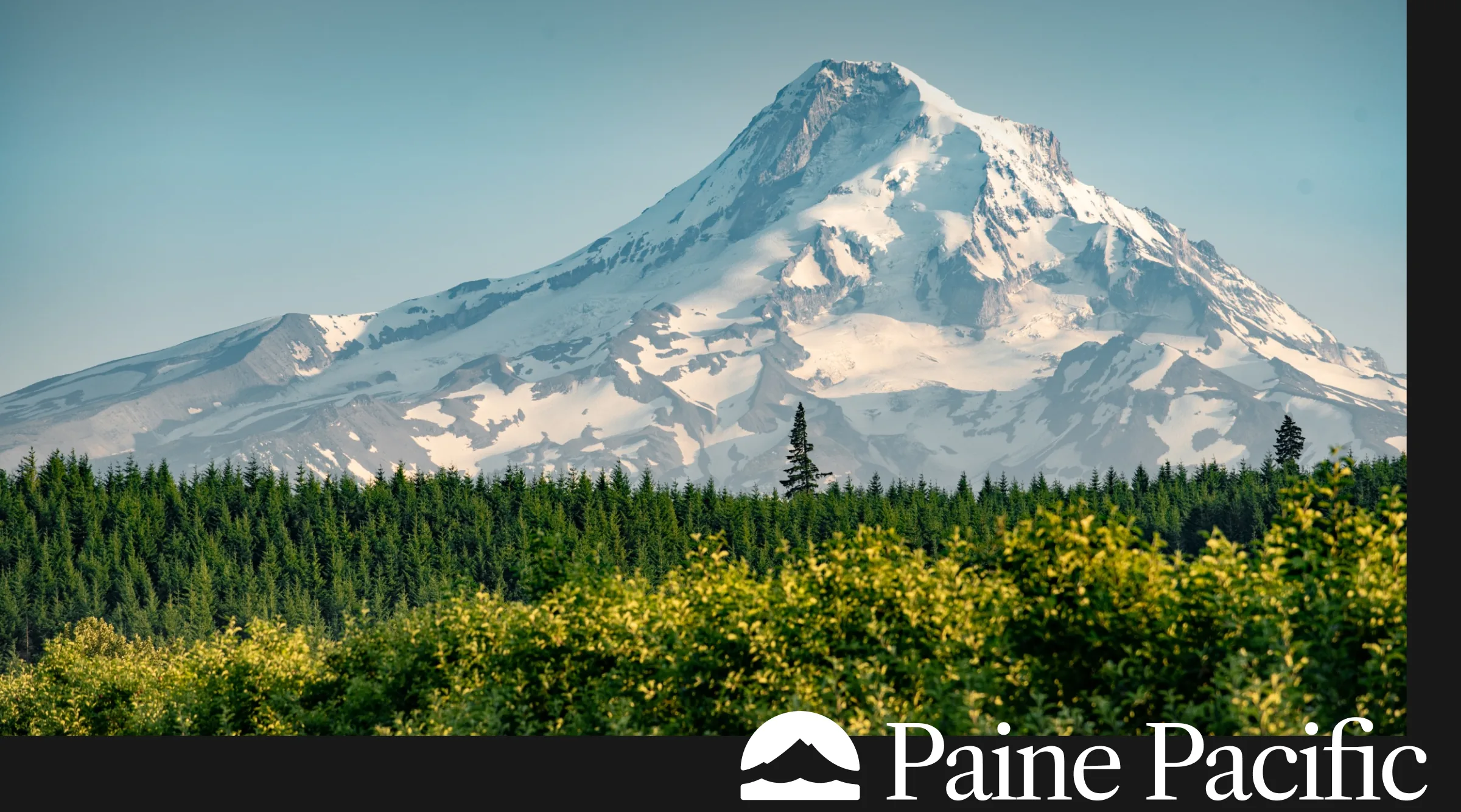
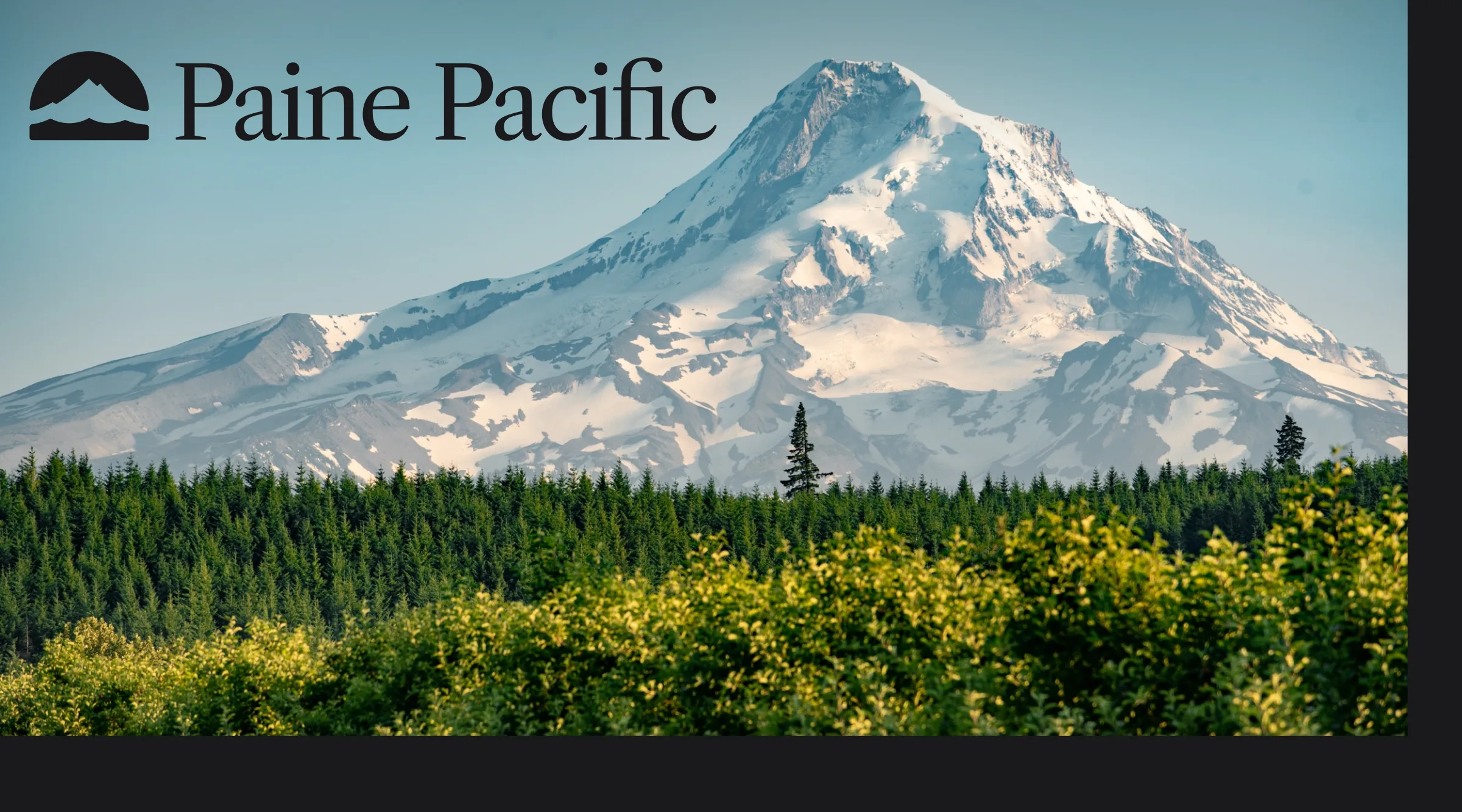
I made share cards for the site and social, all using the same photo of Mt. Hood.



More share cards and the social profiles




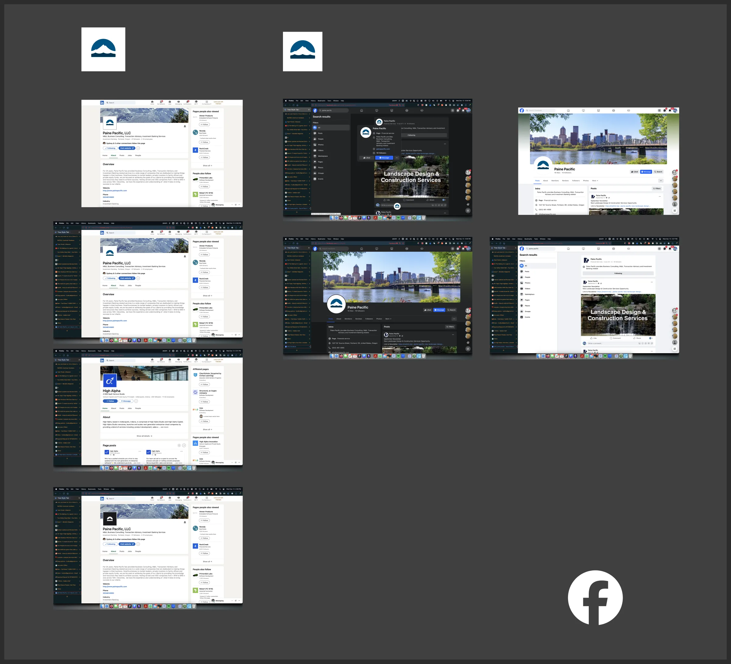
Site
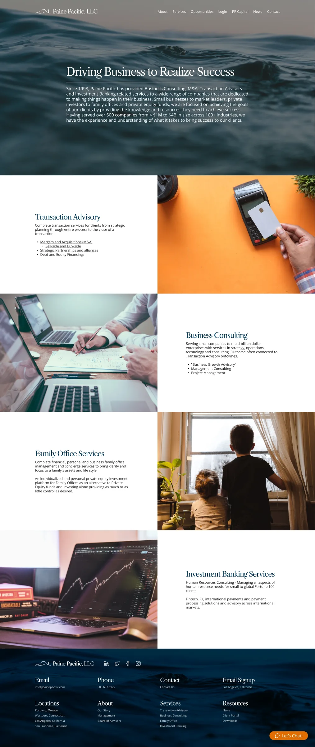
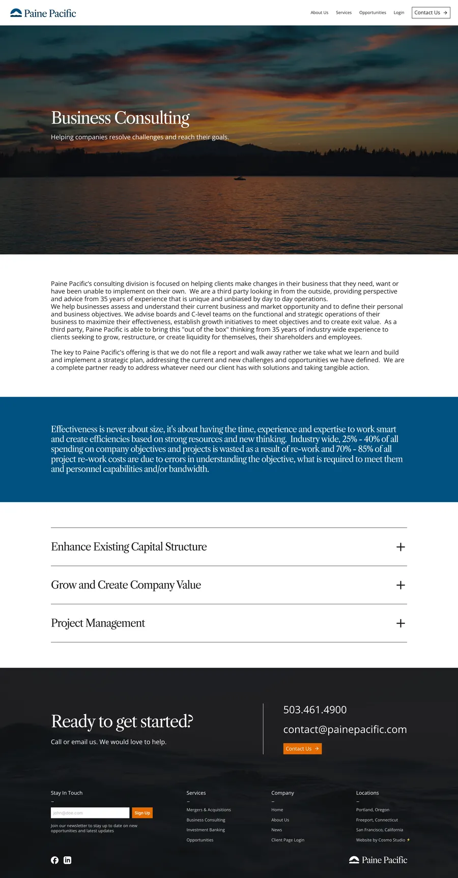
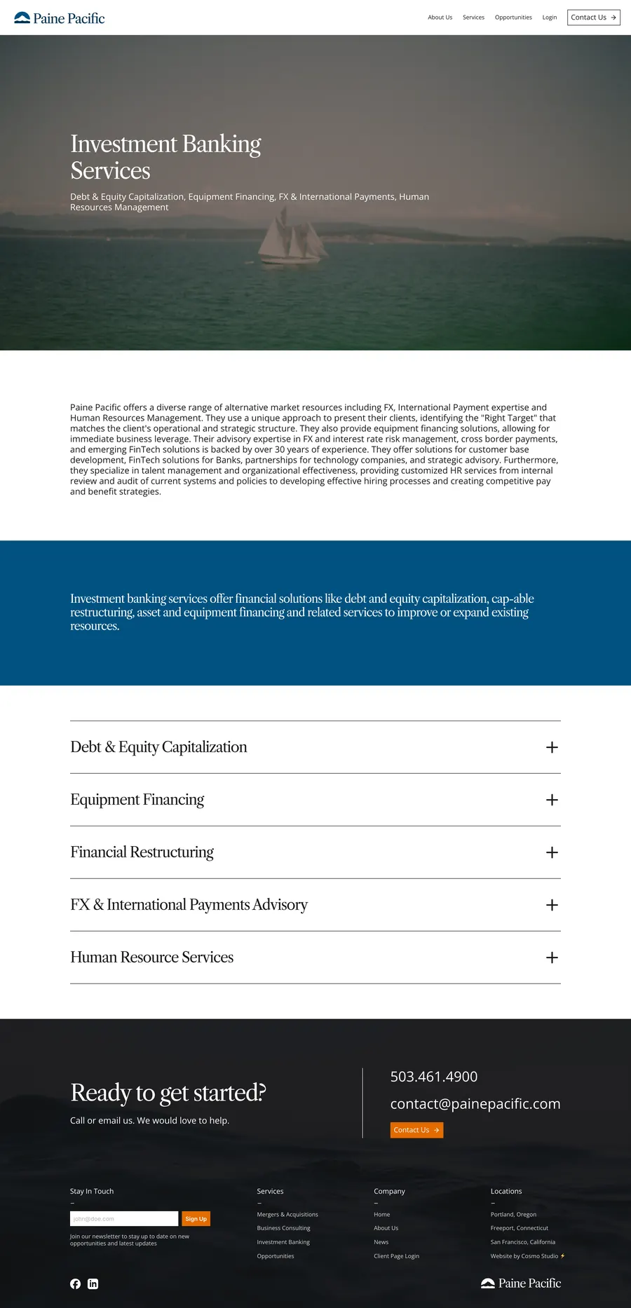
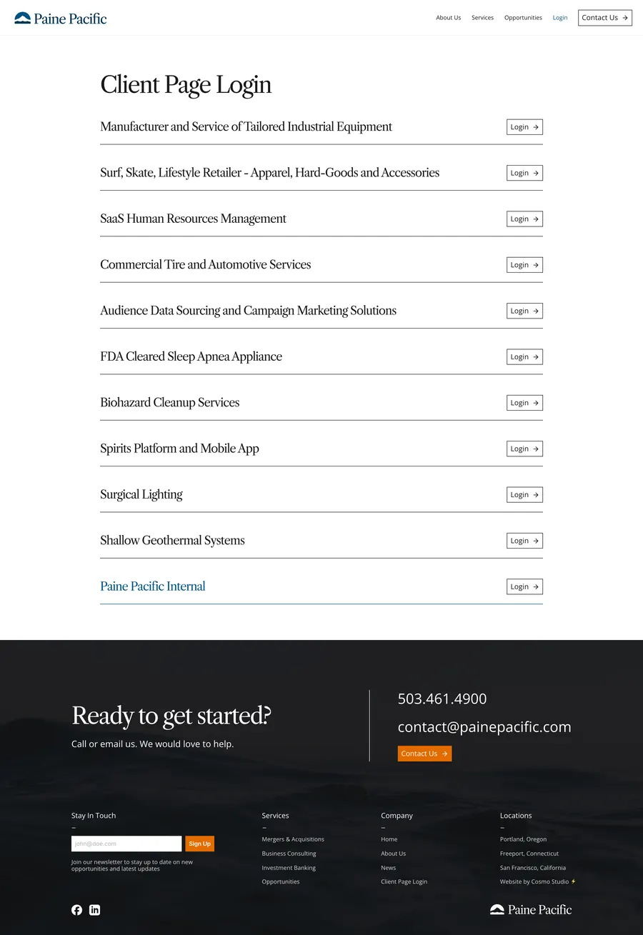
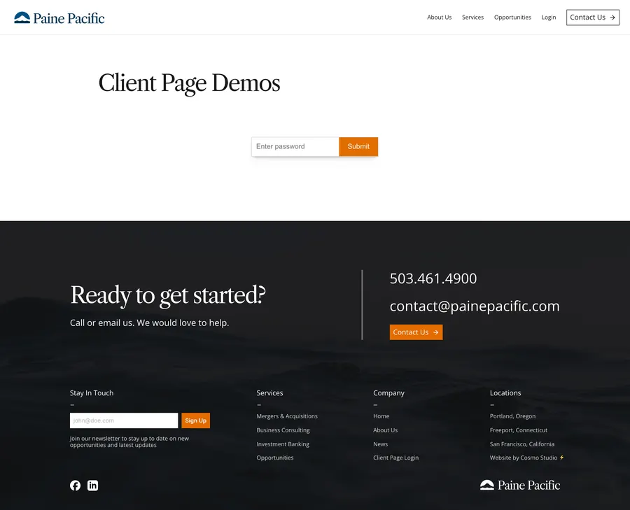
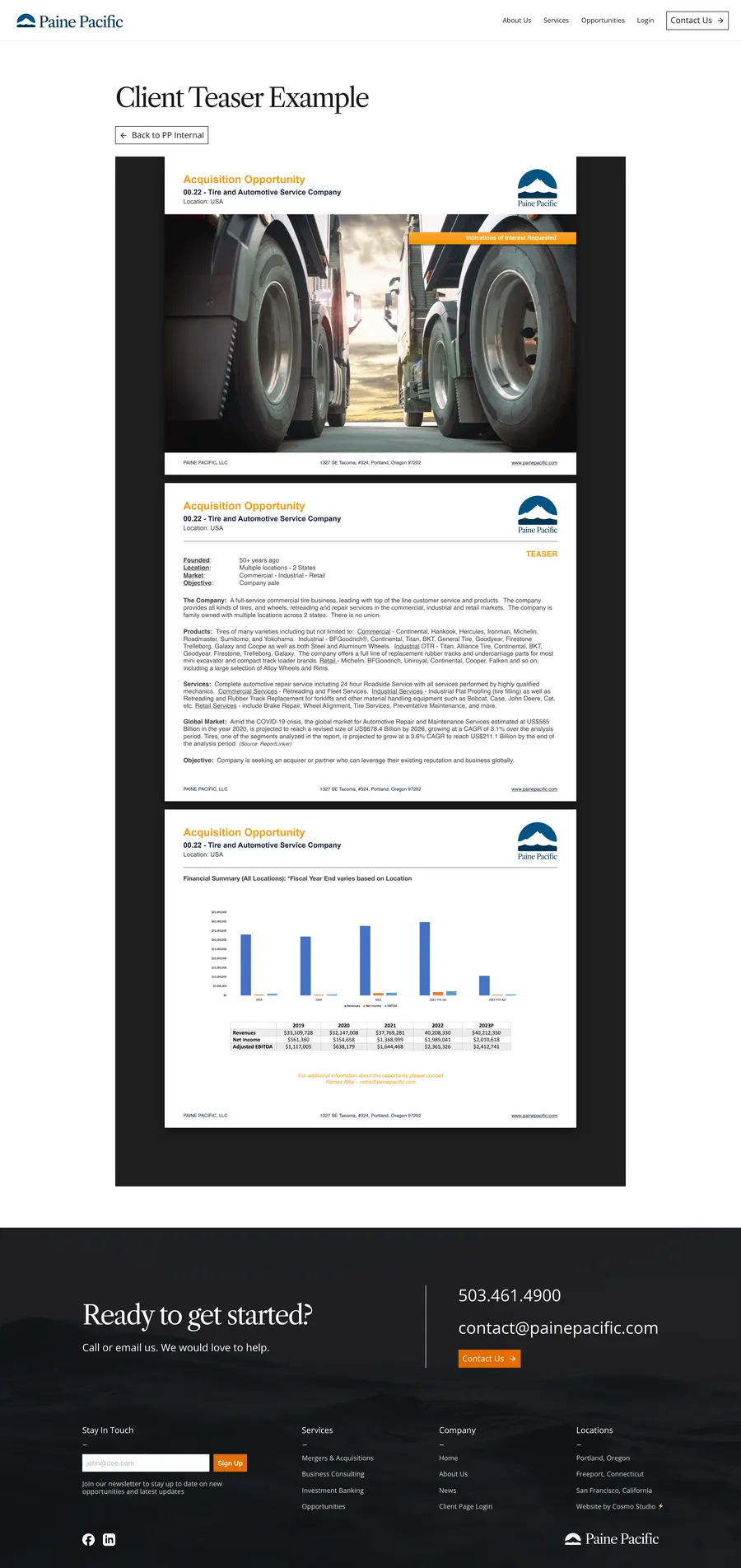
I designed and built the site in Framer through Cosmo Studio. Mt. Hood is at the top of the homepage, current deals are easy to find, and each active client gets their own login.
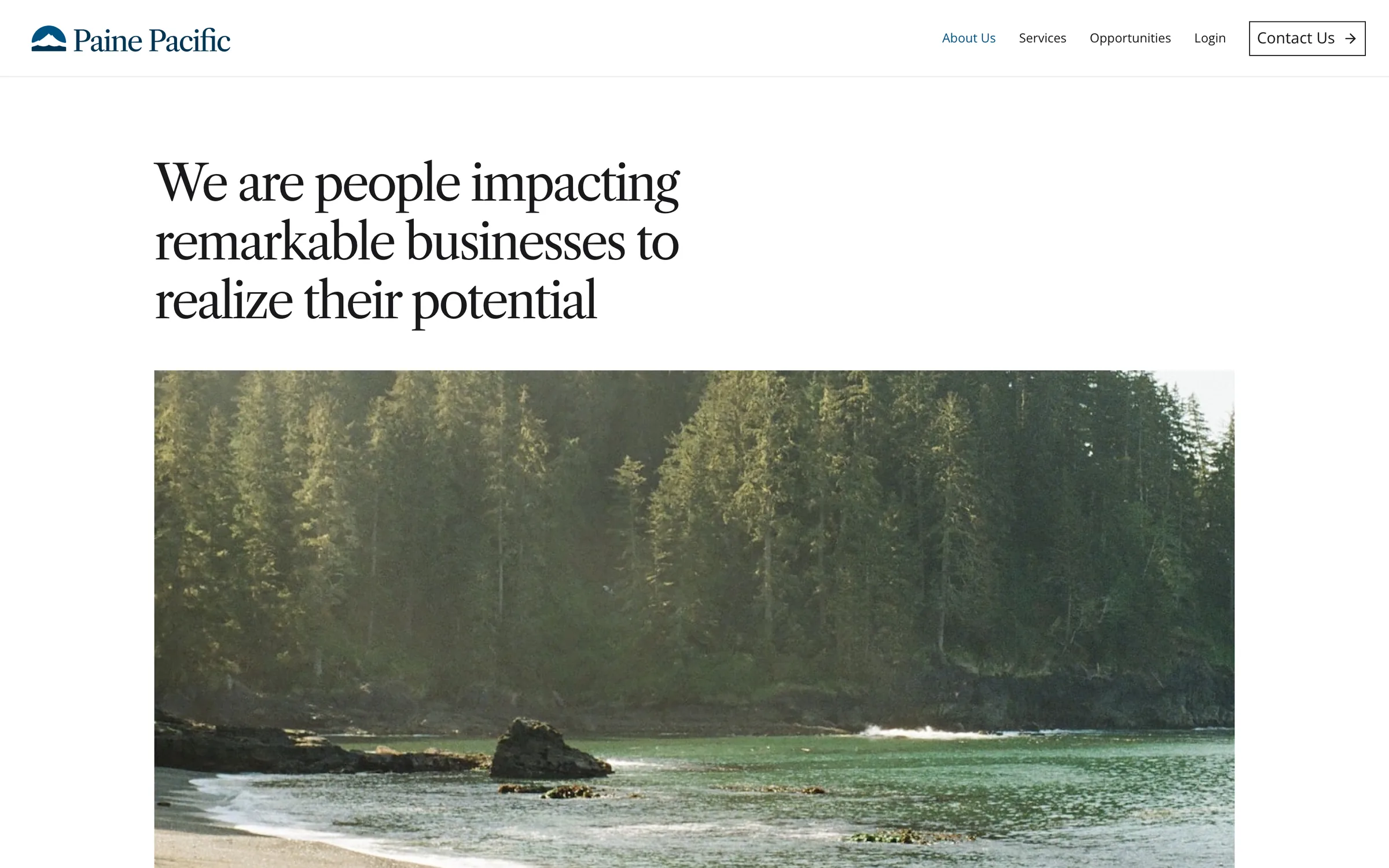
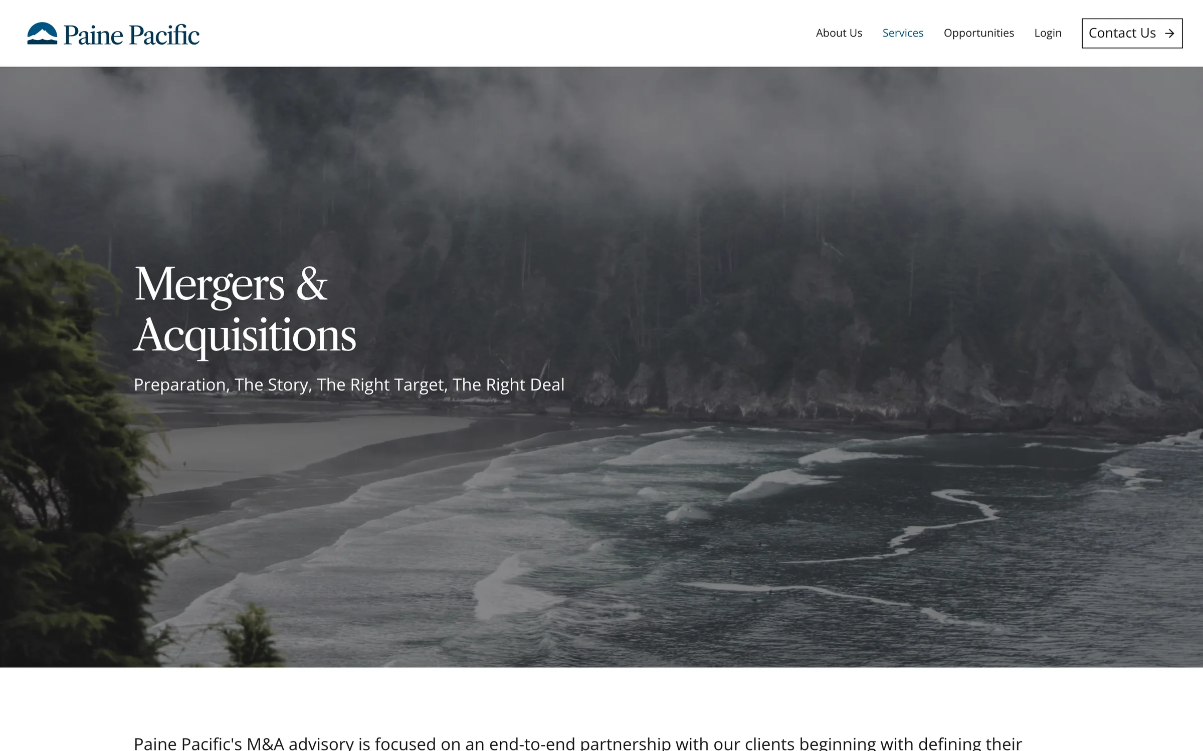
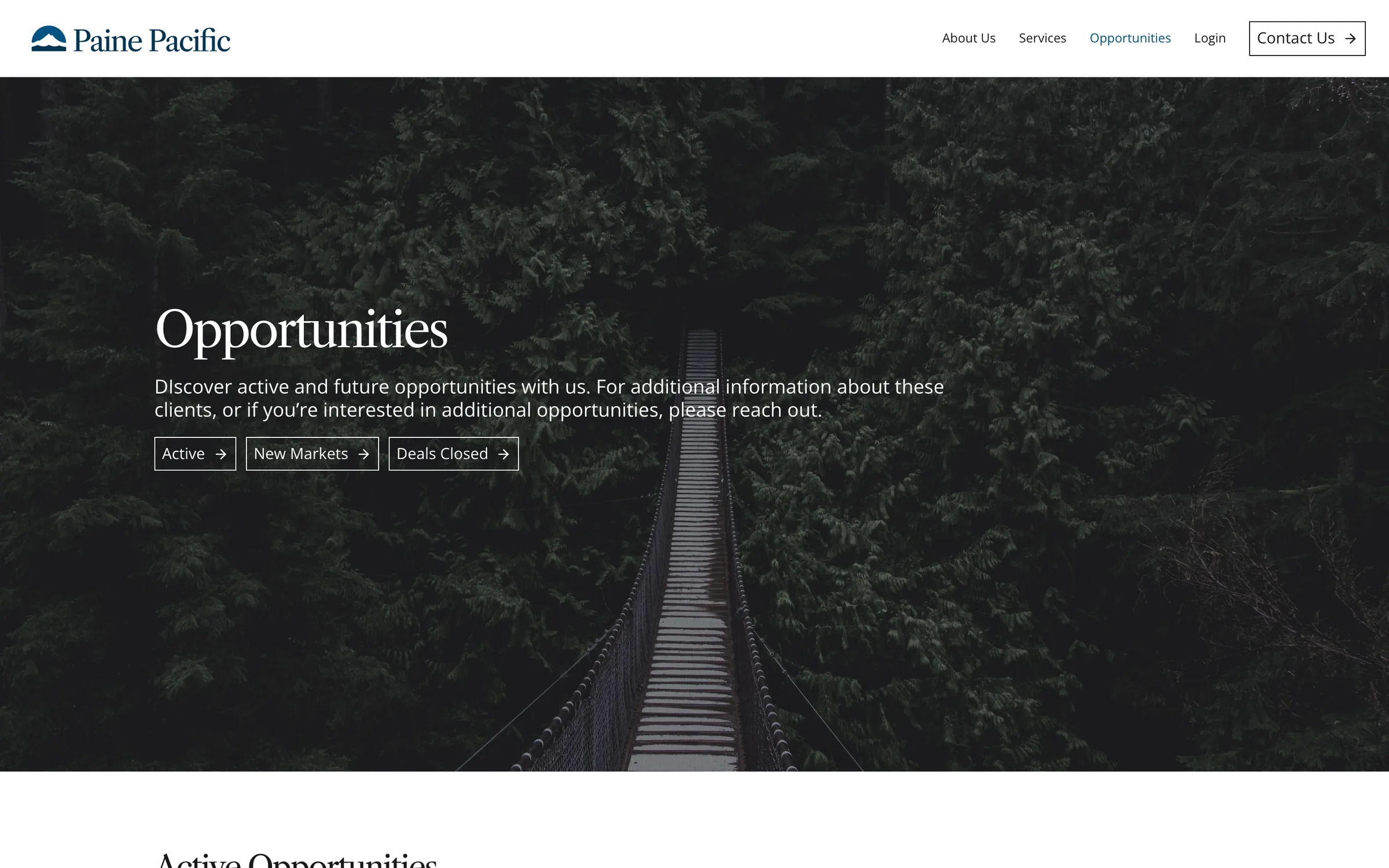
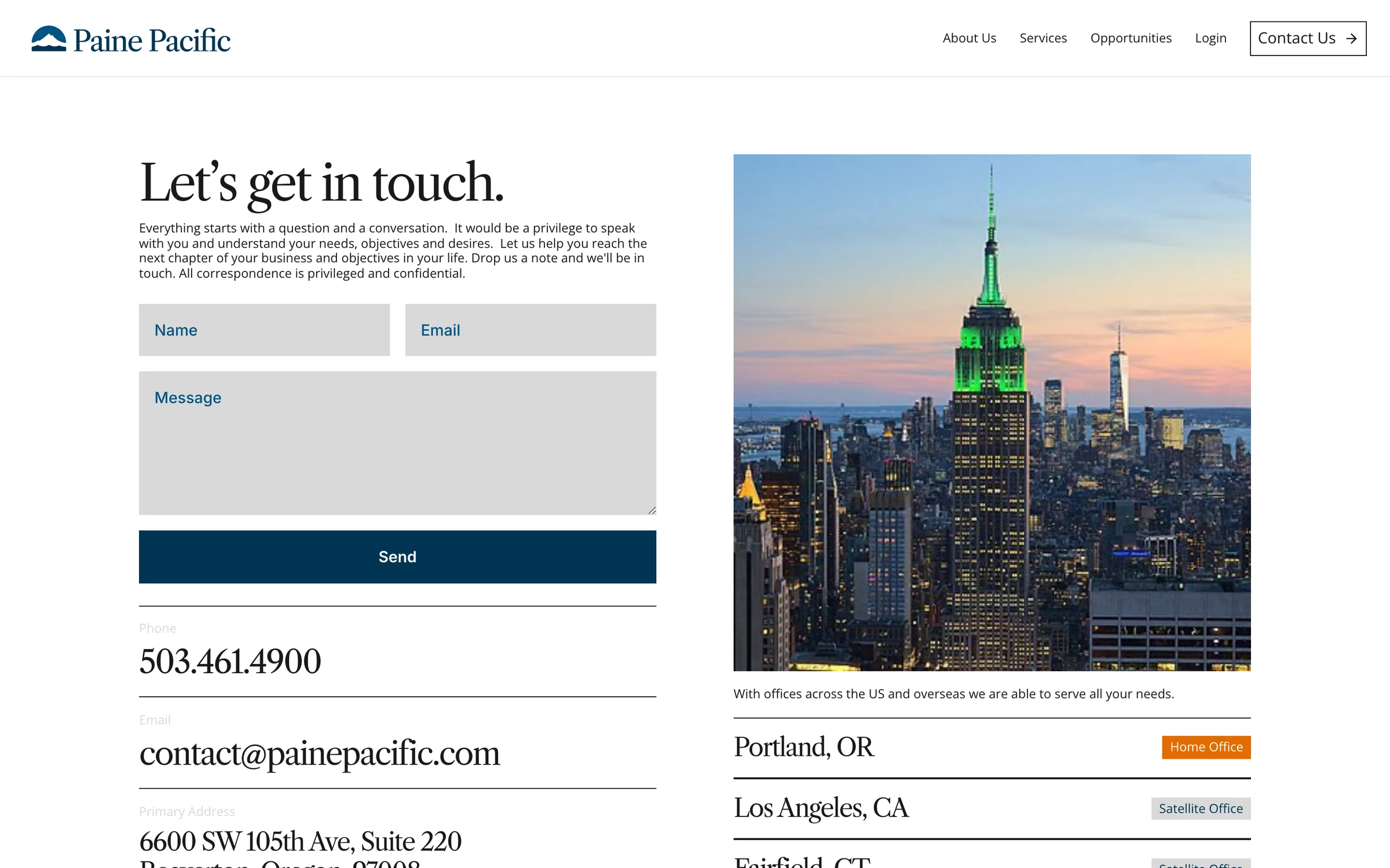
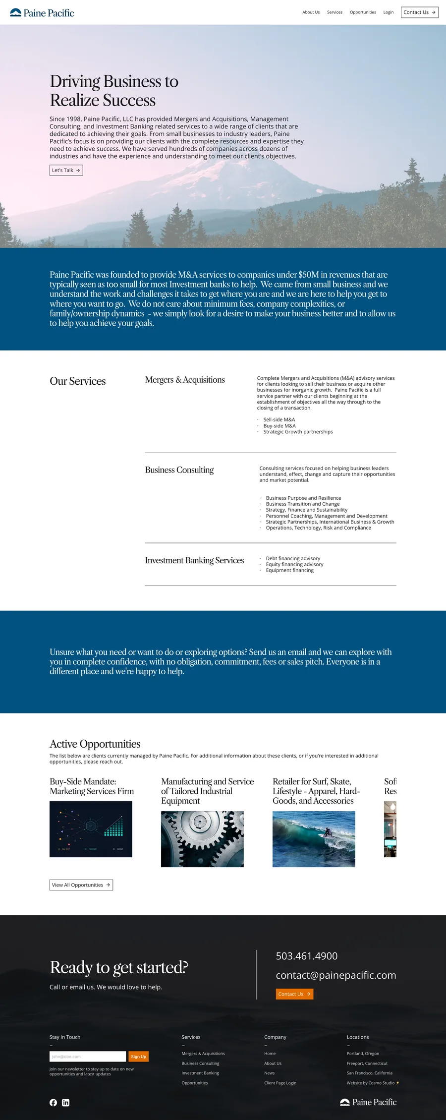
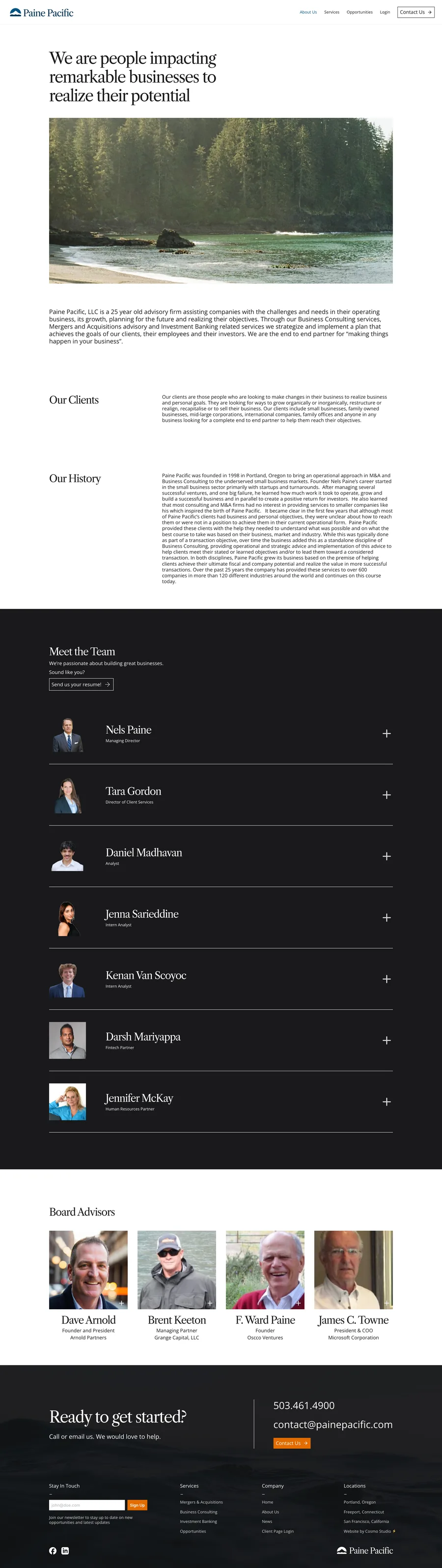
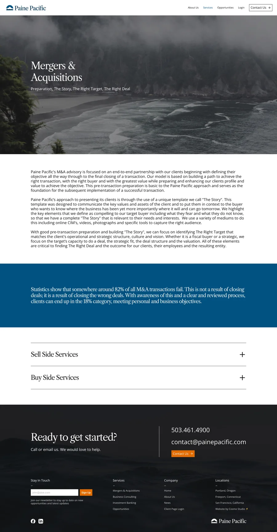
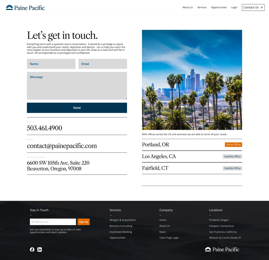
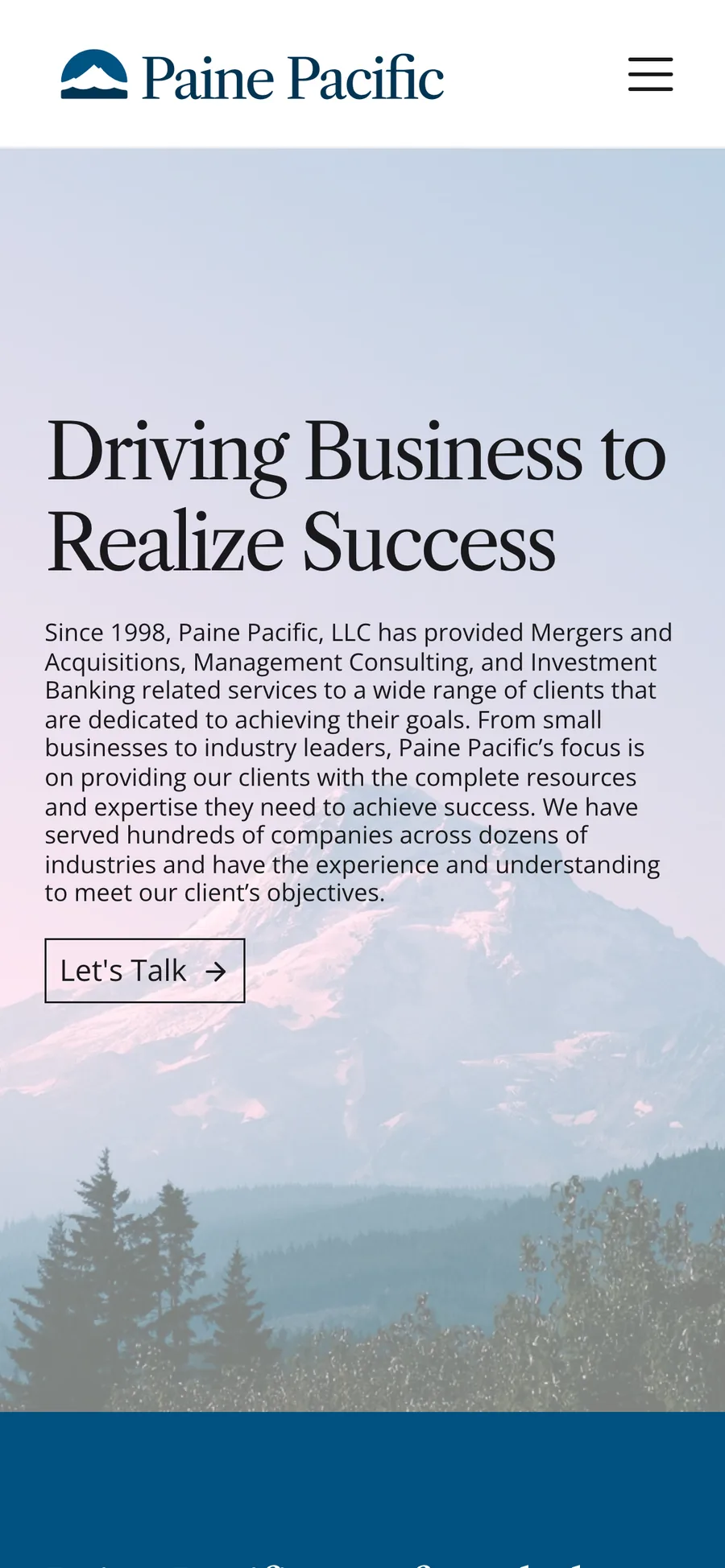
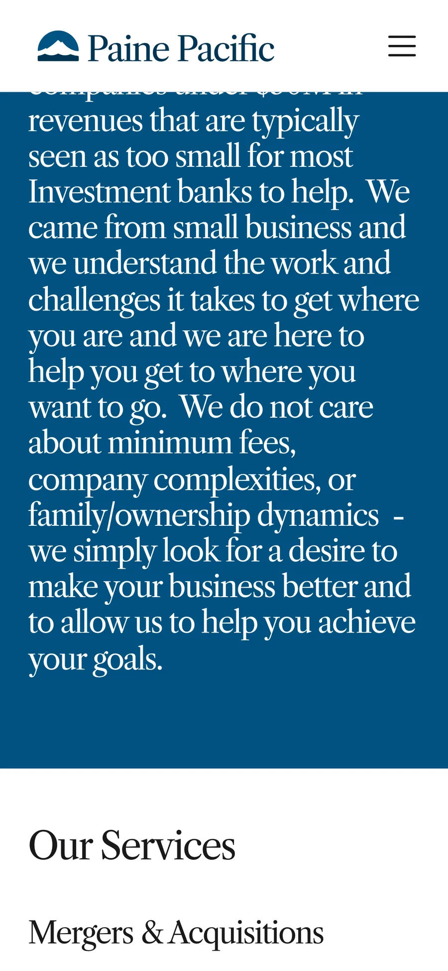
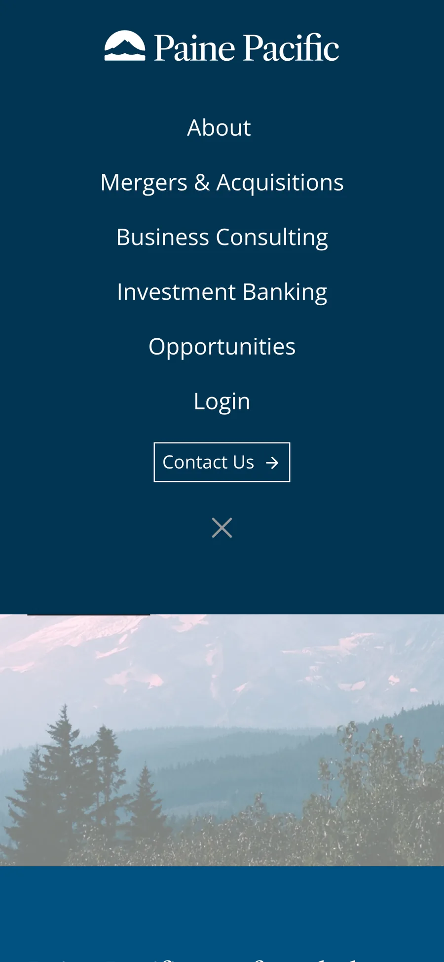
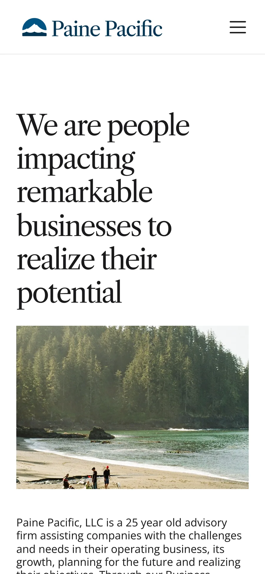
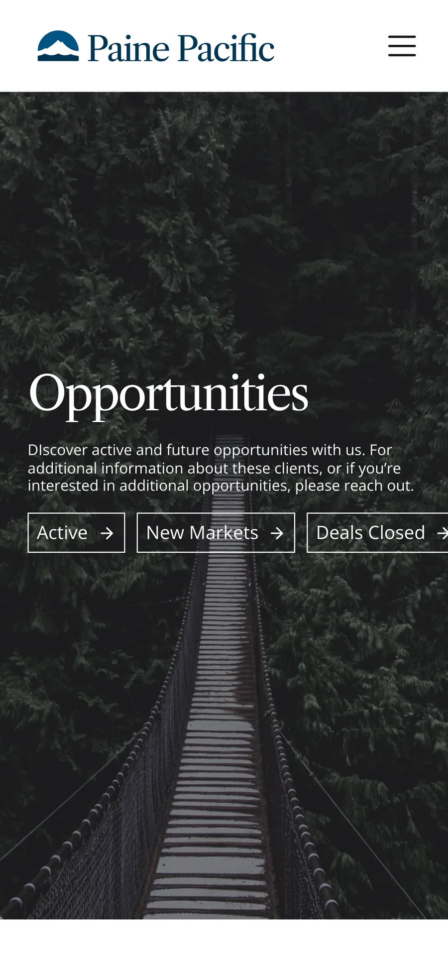
Figma comps and an earlier ocean concept
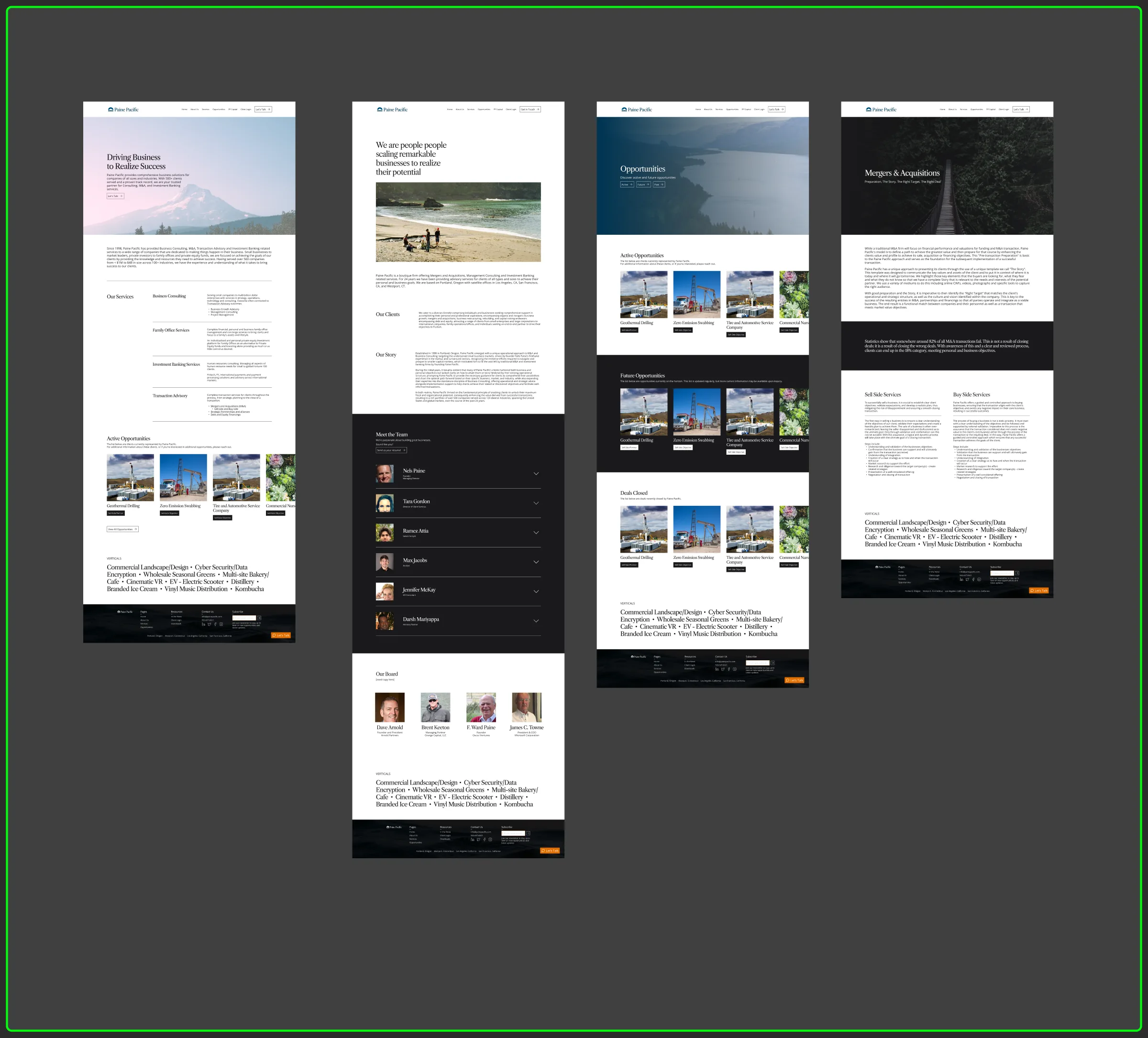
The rest of the site

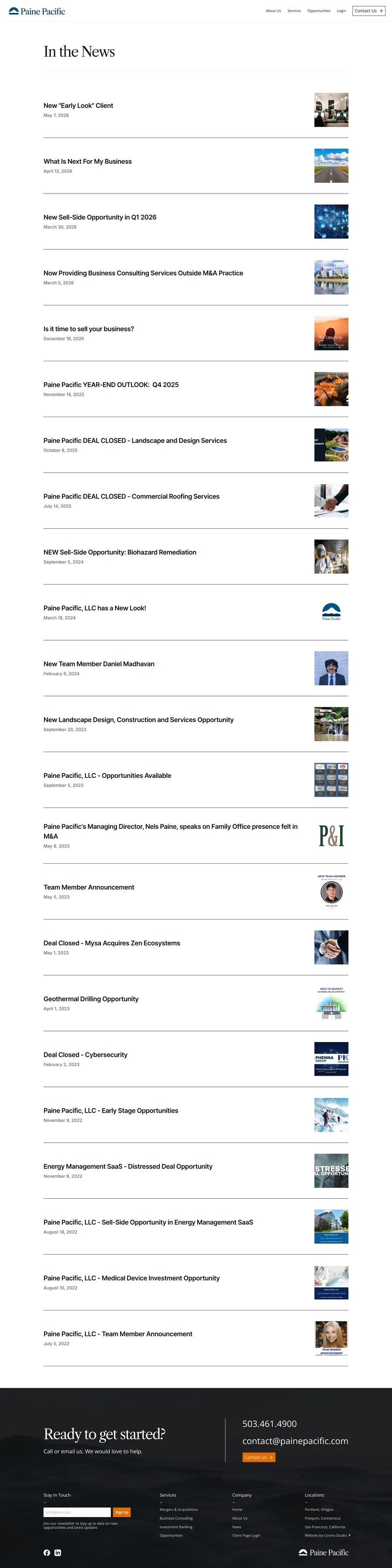
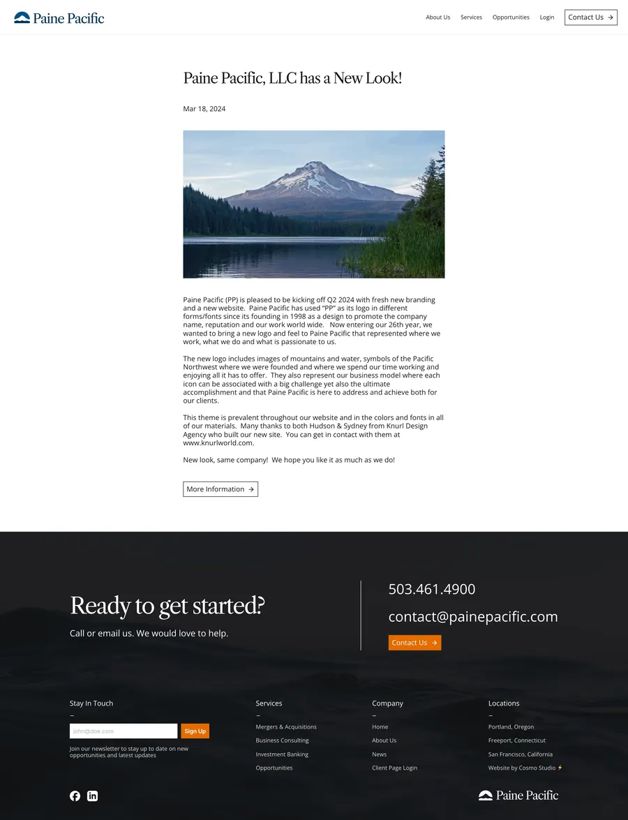
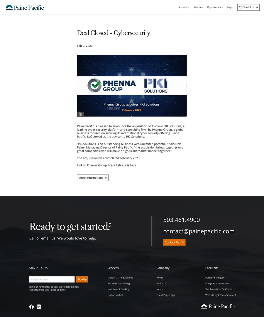
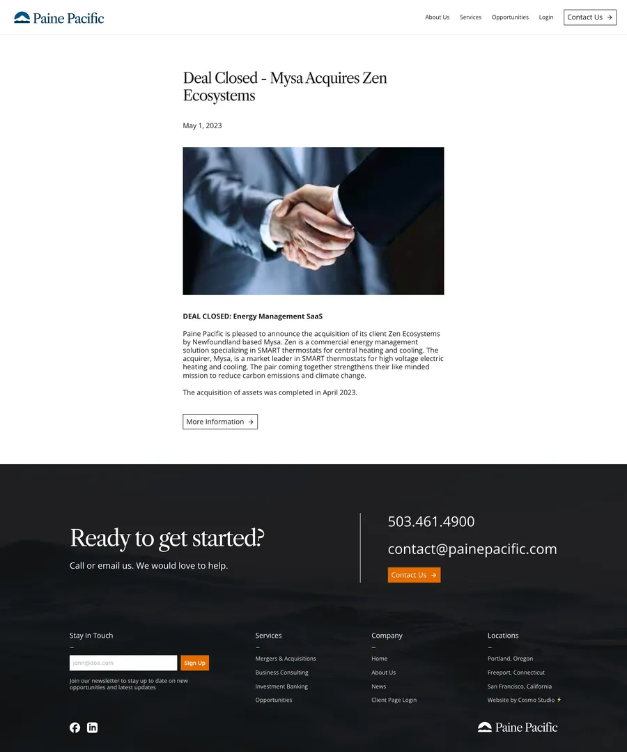
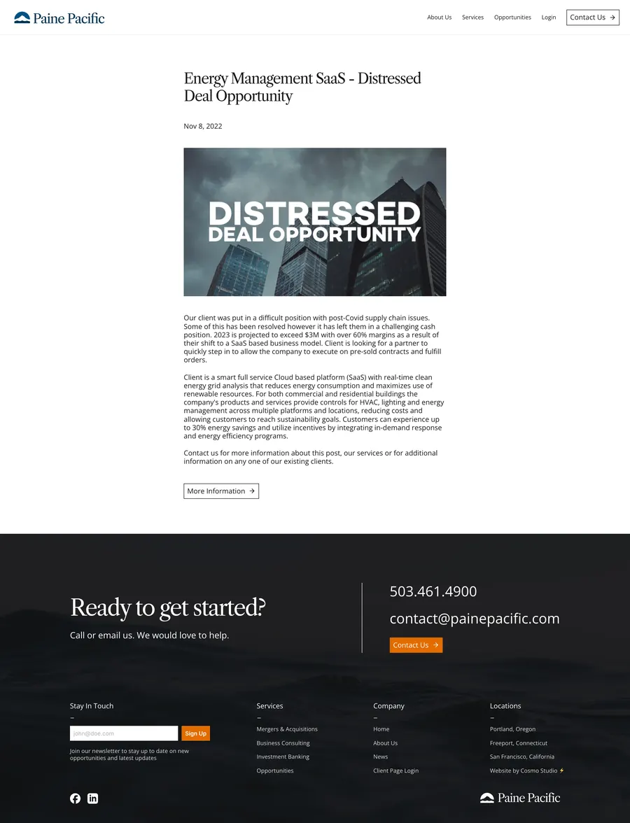
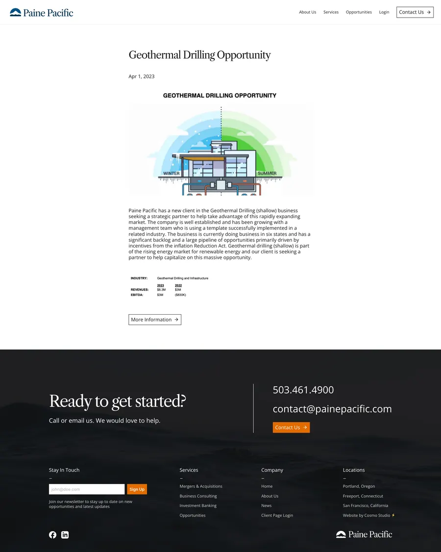
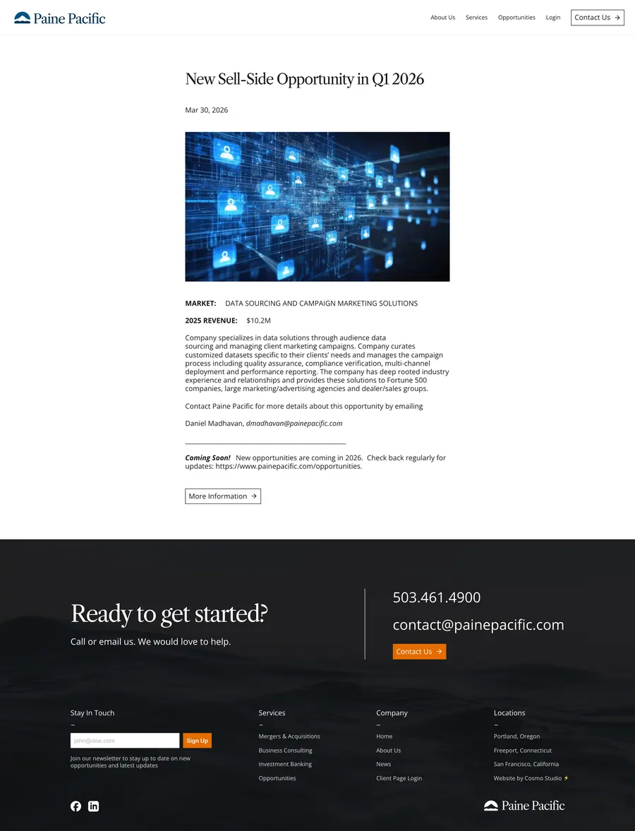
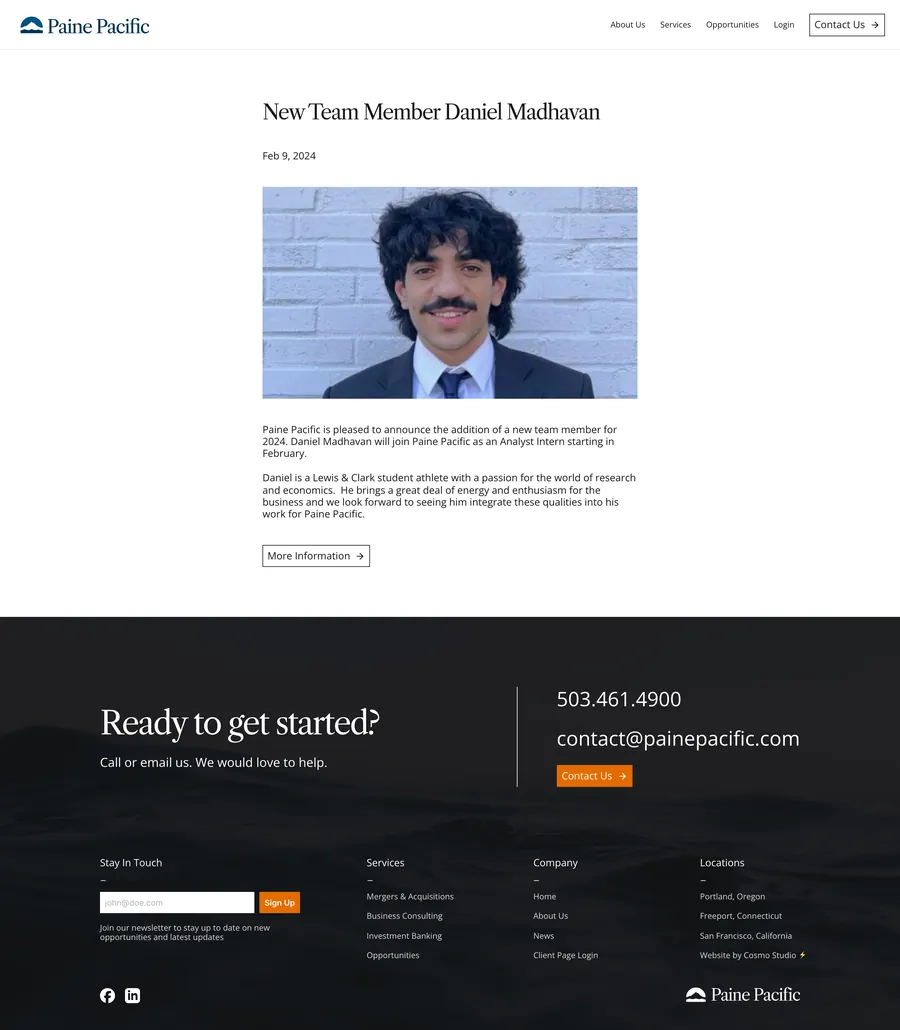
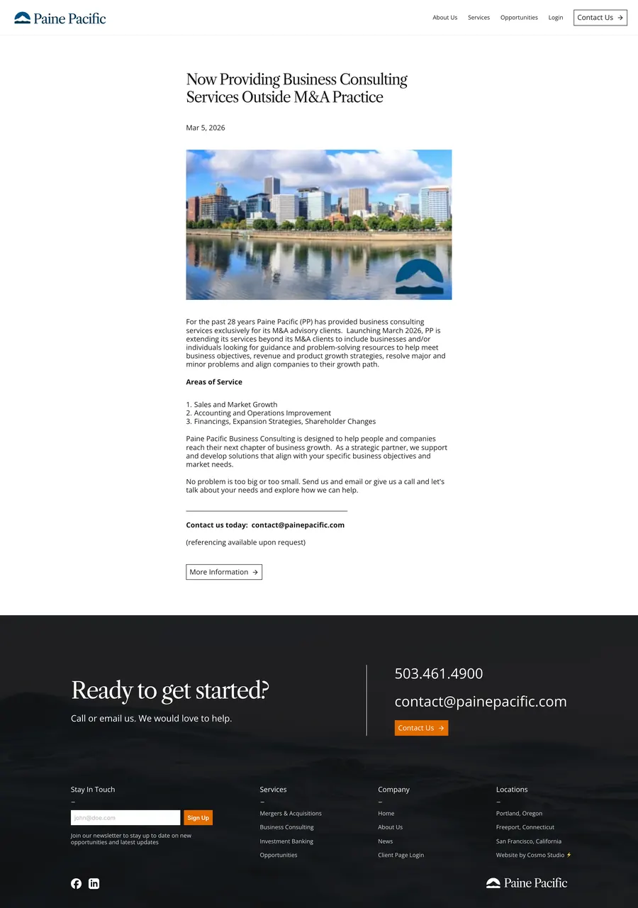
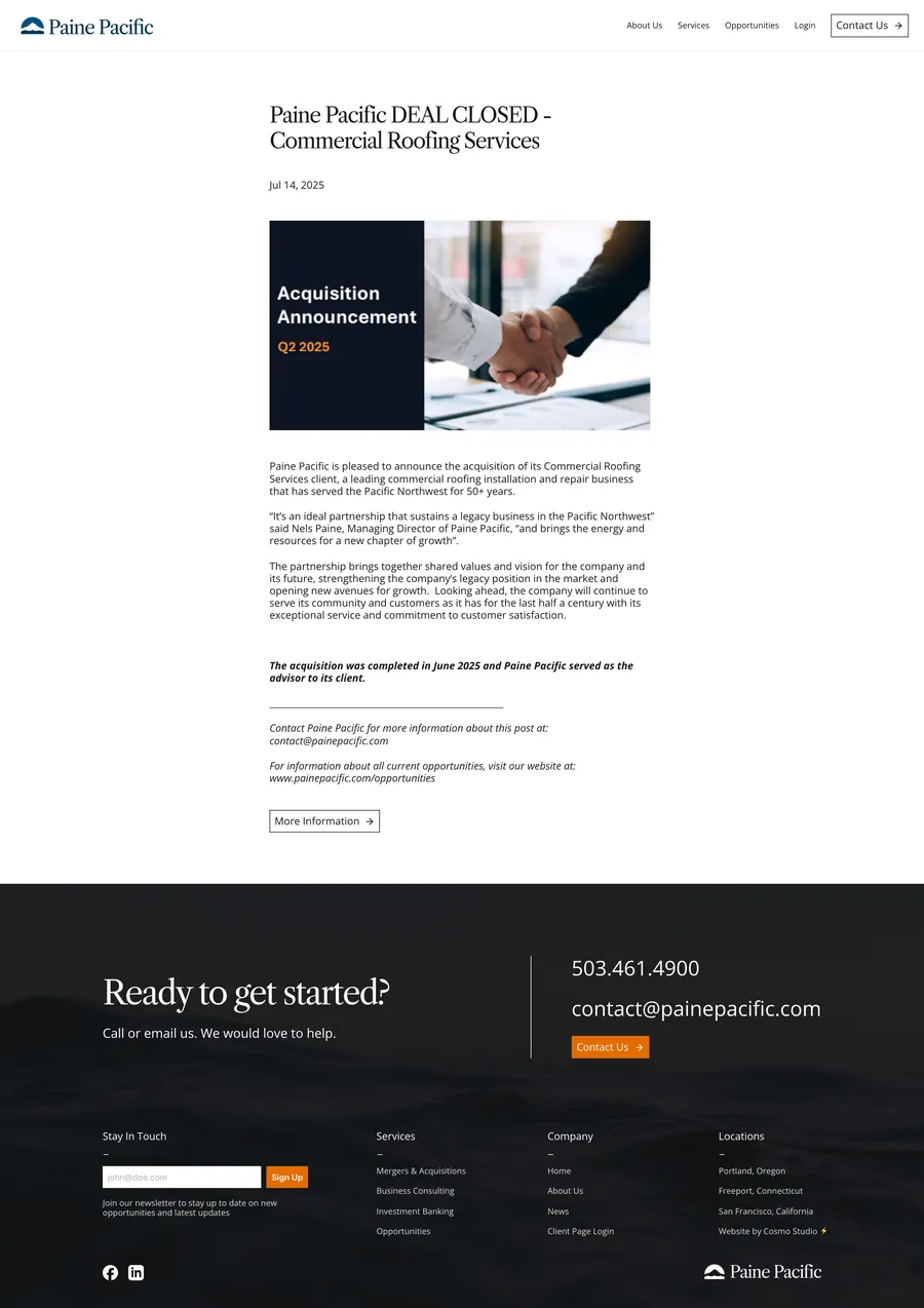
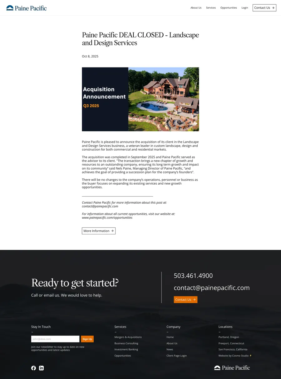
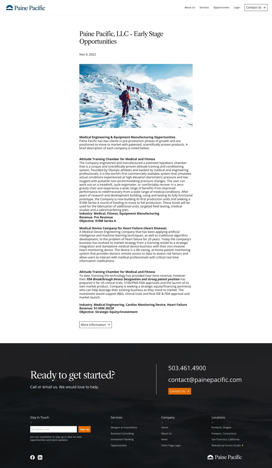
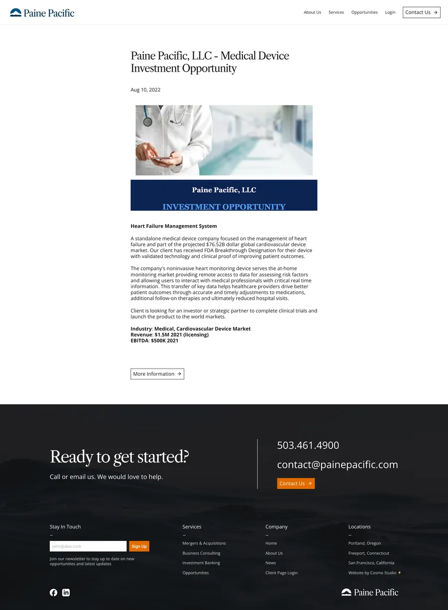
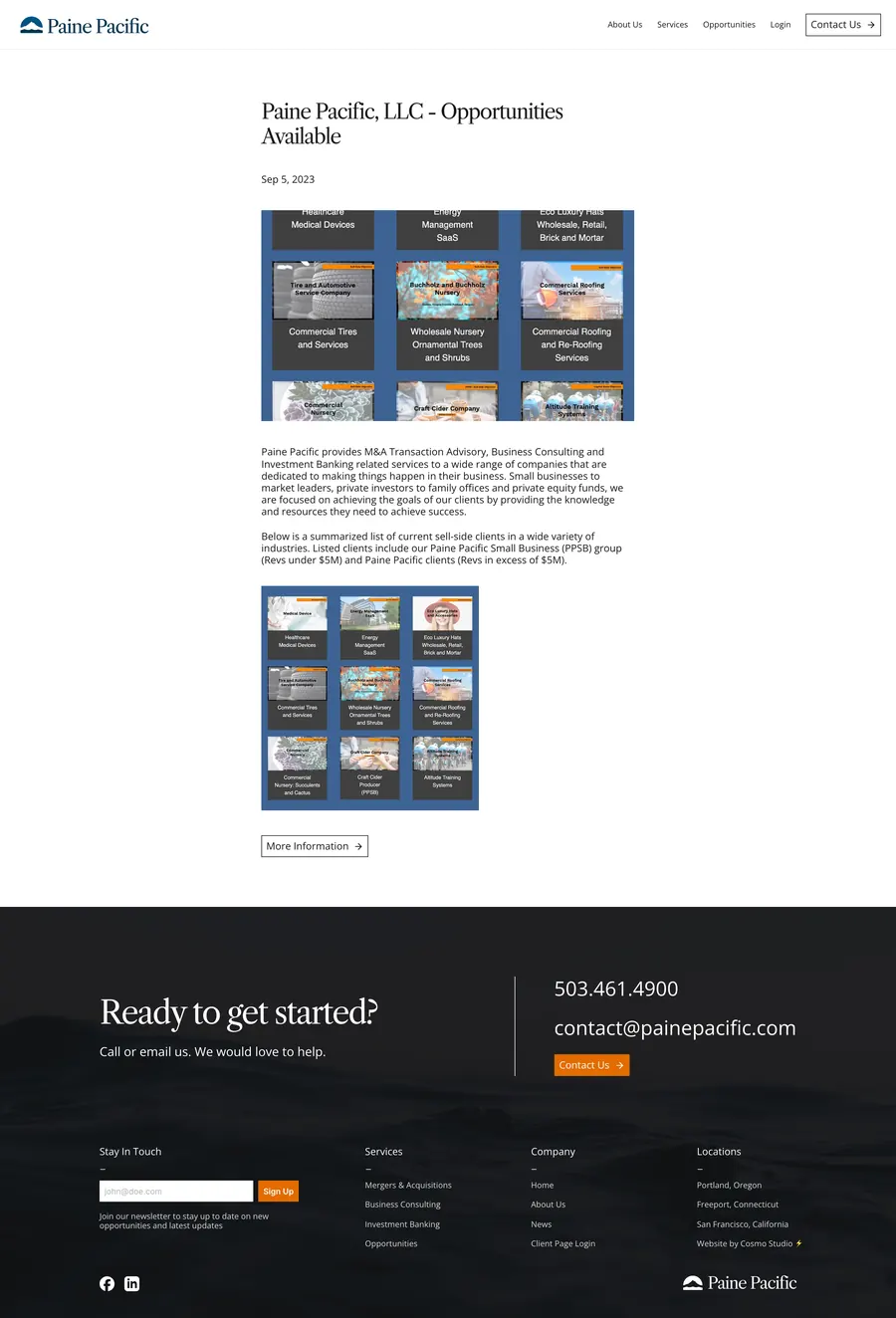
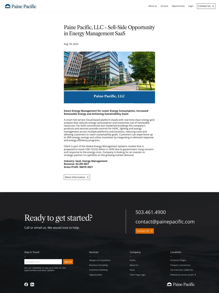
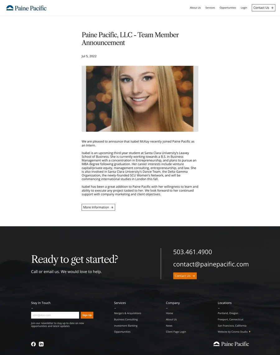
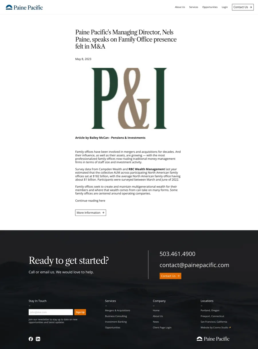
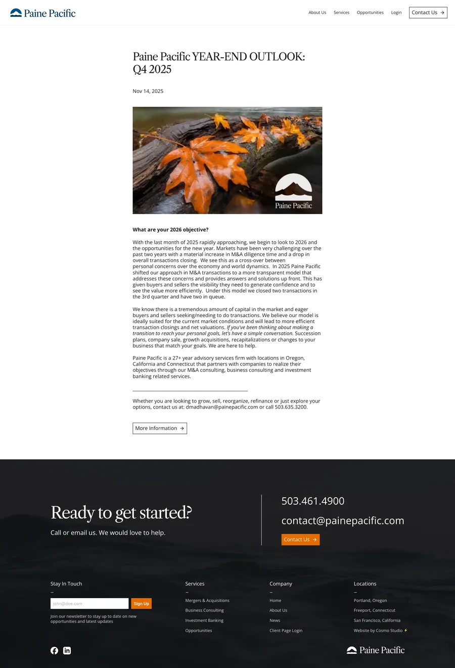
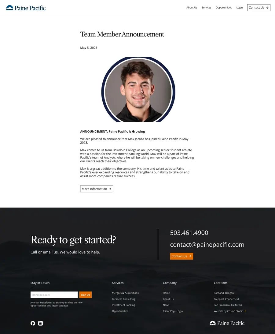
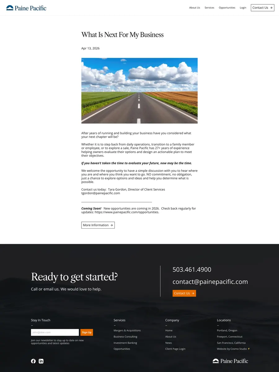
All 23 news posts
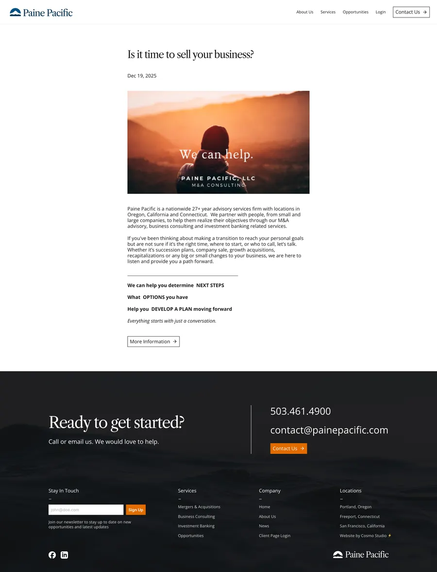
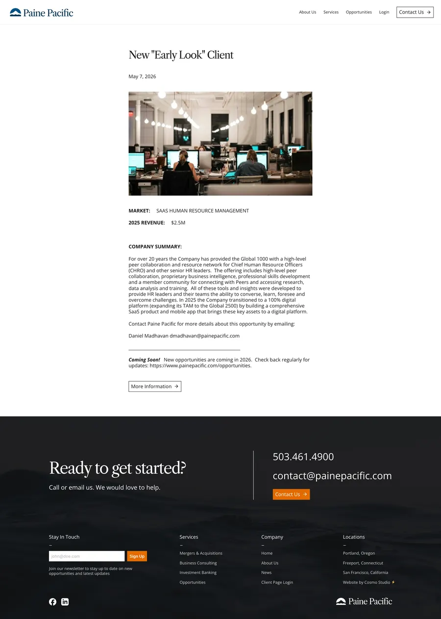
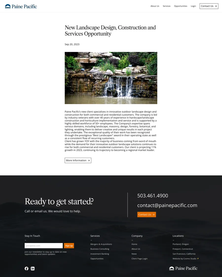
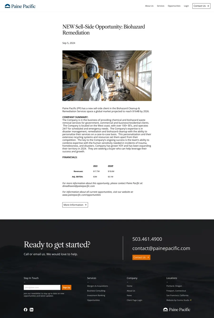
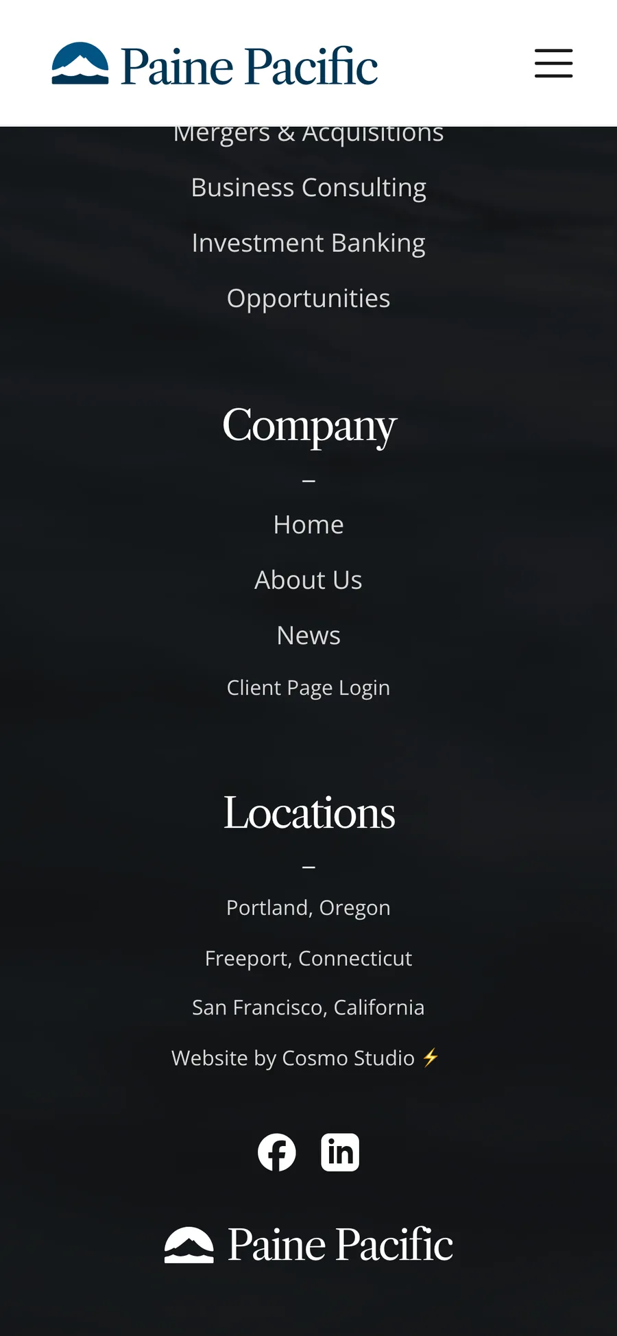
Every page on a phone

































