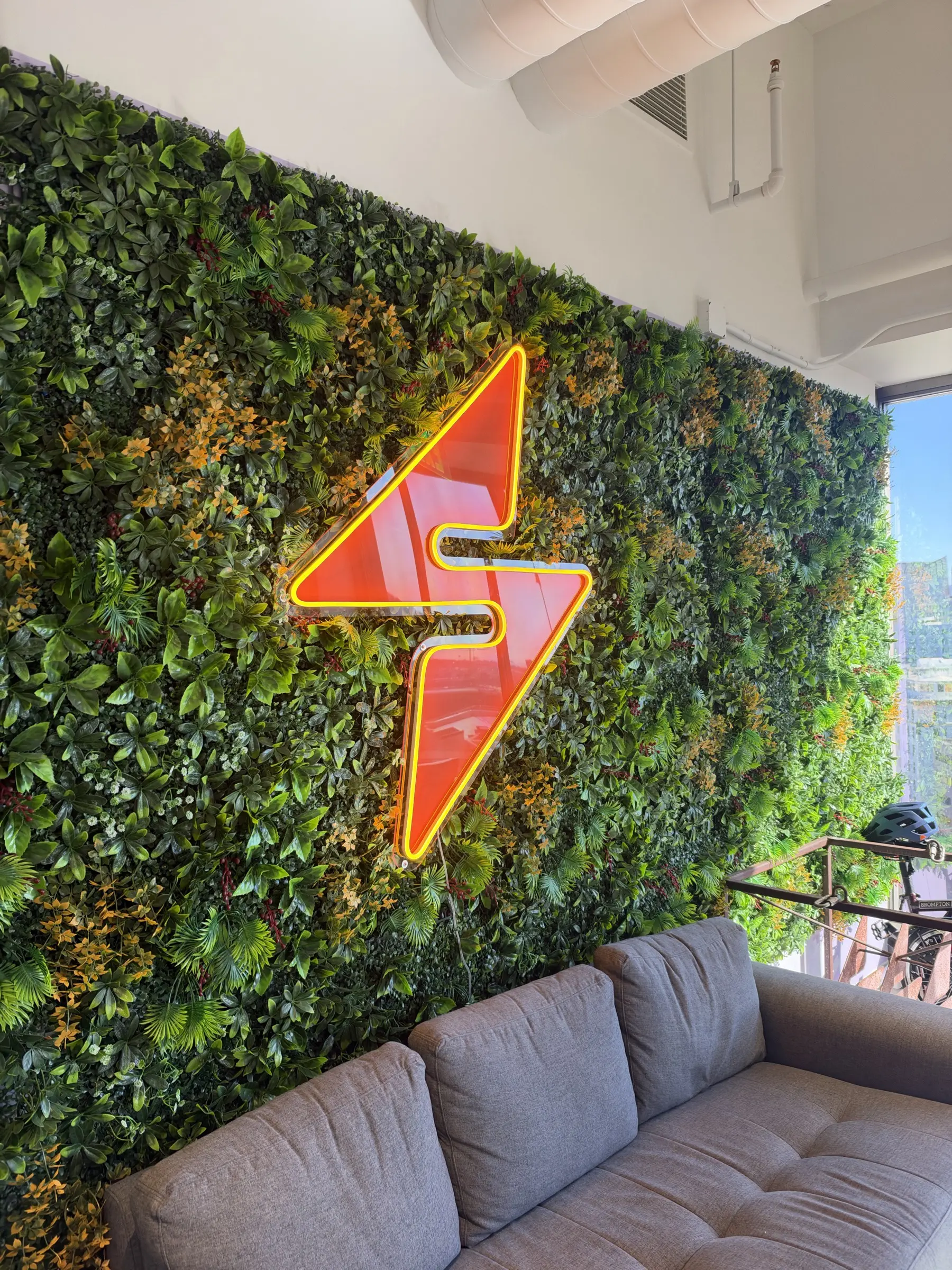
A three-year-old procurement platform, nineteen engineers, no designer. I came in first. Eighteen months later it had a brand, a design system, a rebuilt core workflow, and a design team that works the same way.
Legacy, then the redesign. Same page, same data.
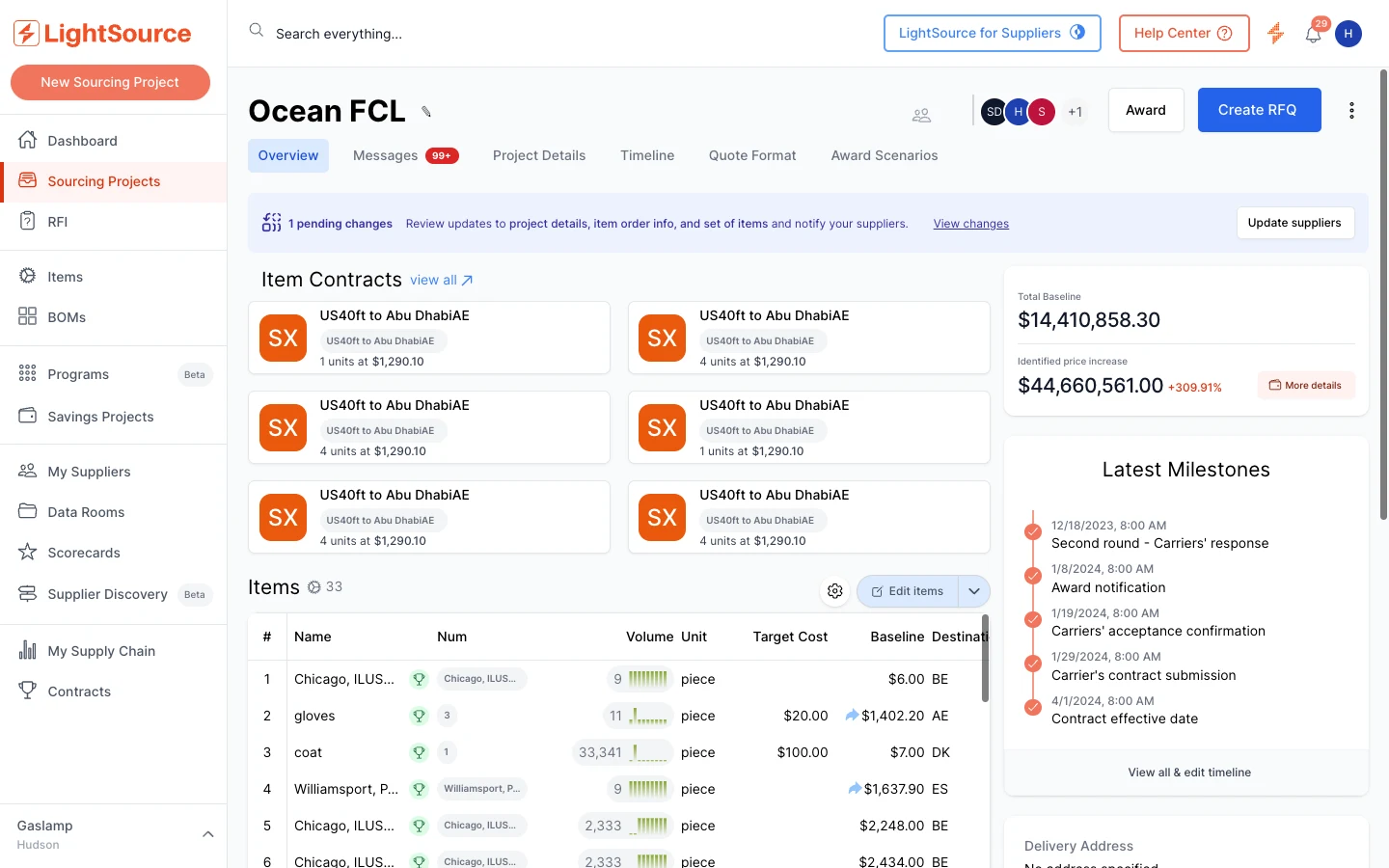
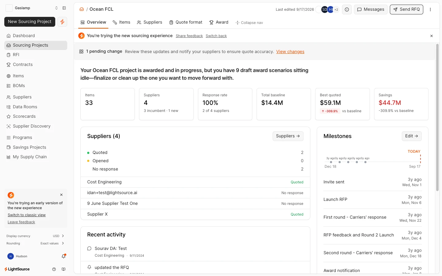
Brand
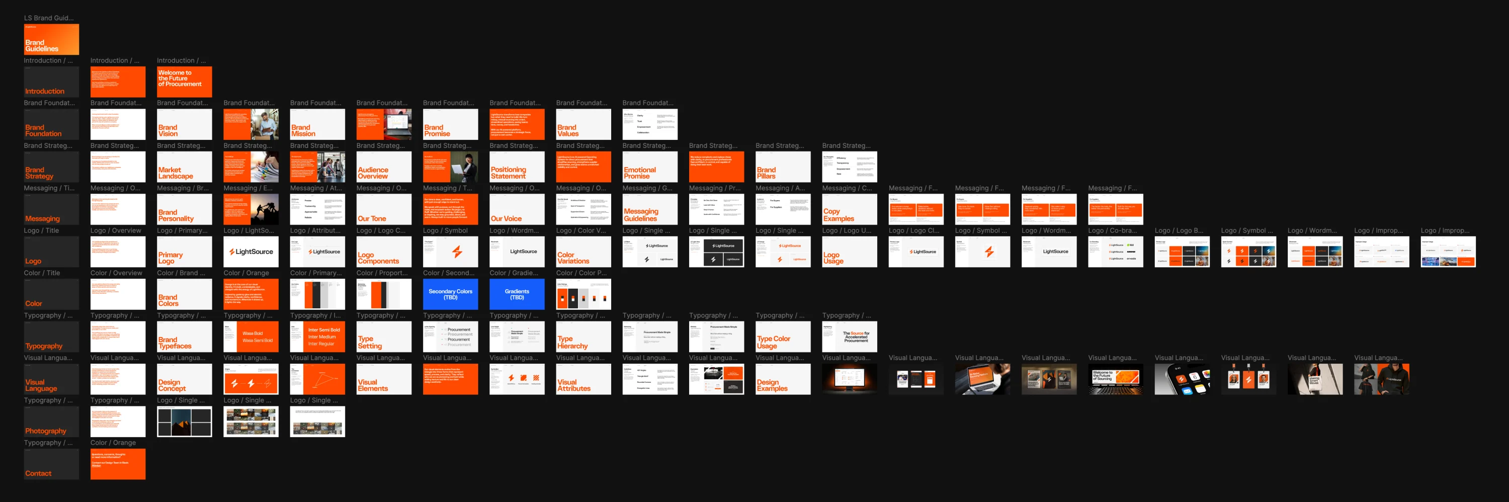
Fifteen oranges to one. The company asked for a design system and had a PNG logo and a near-empty Notion page for guidelines, so the brand came first: no sense encoding a palette into hundreds of components and changing it later. One #FF4B00, Wasa for display, Inter for everything else, a 27-page book, a new site and every piece of sales material.
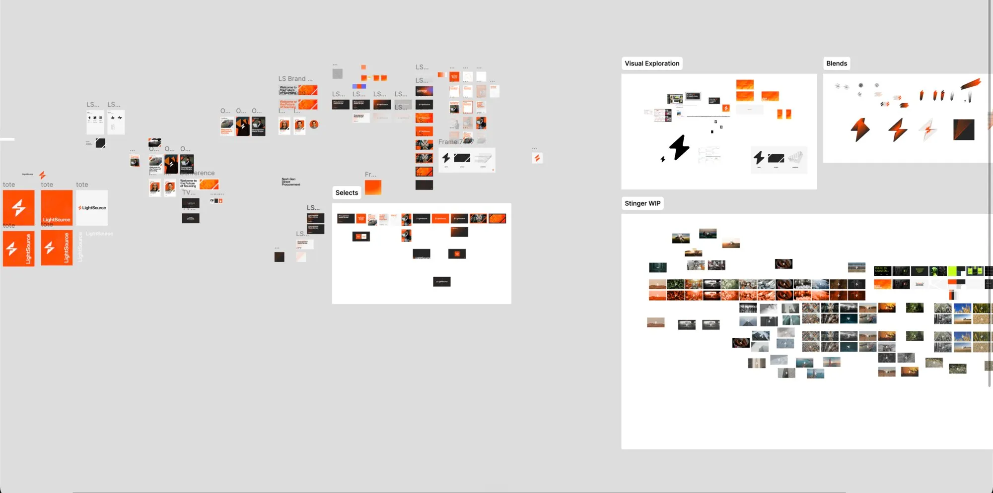
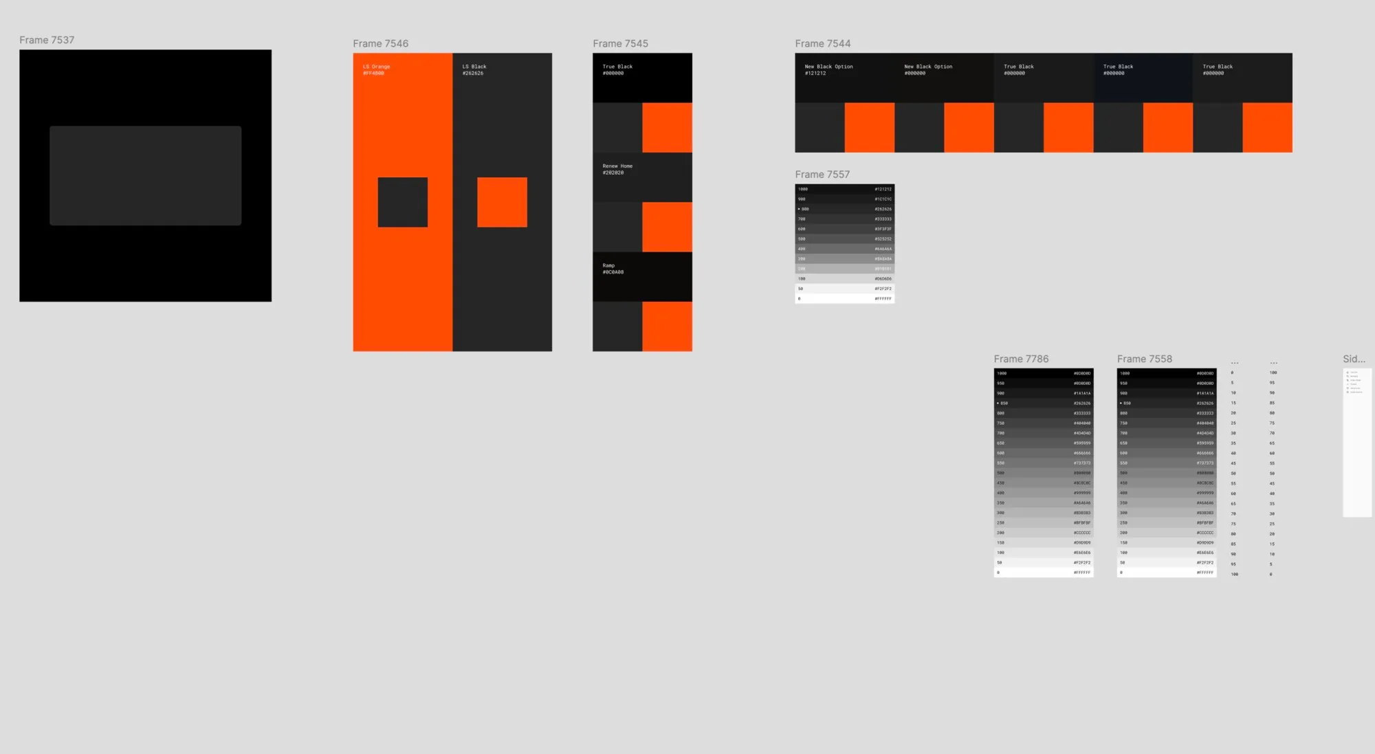
Black got the same care as orange. True black, a new black, and the #262626 that stuck.
System
Learn one page, learn them all. A small, engineering-first system in Tailwind, cut straight from the brand: one header, one toolbar, one table, on every list page.
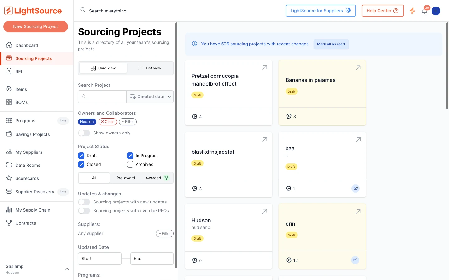
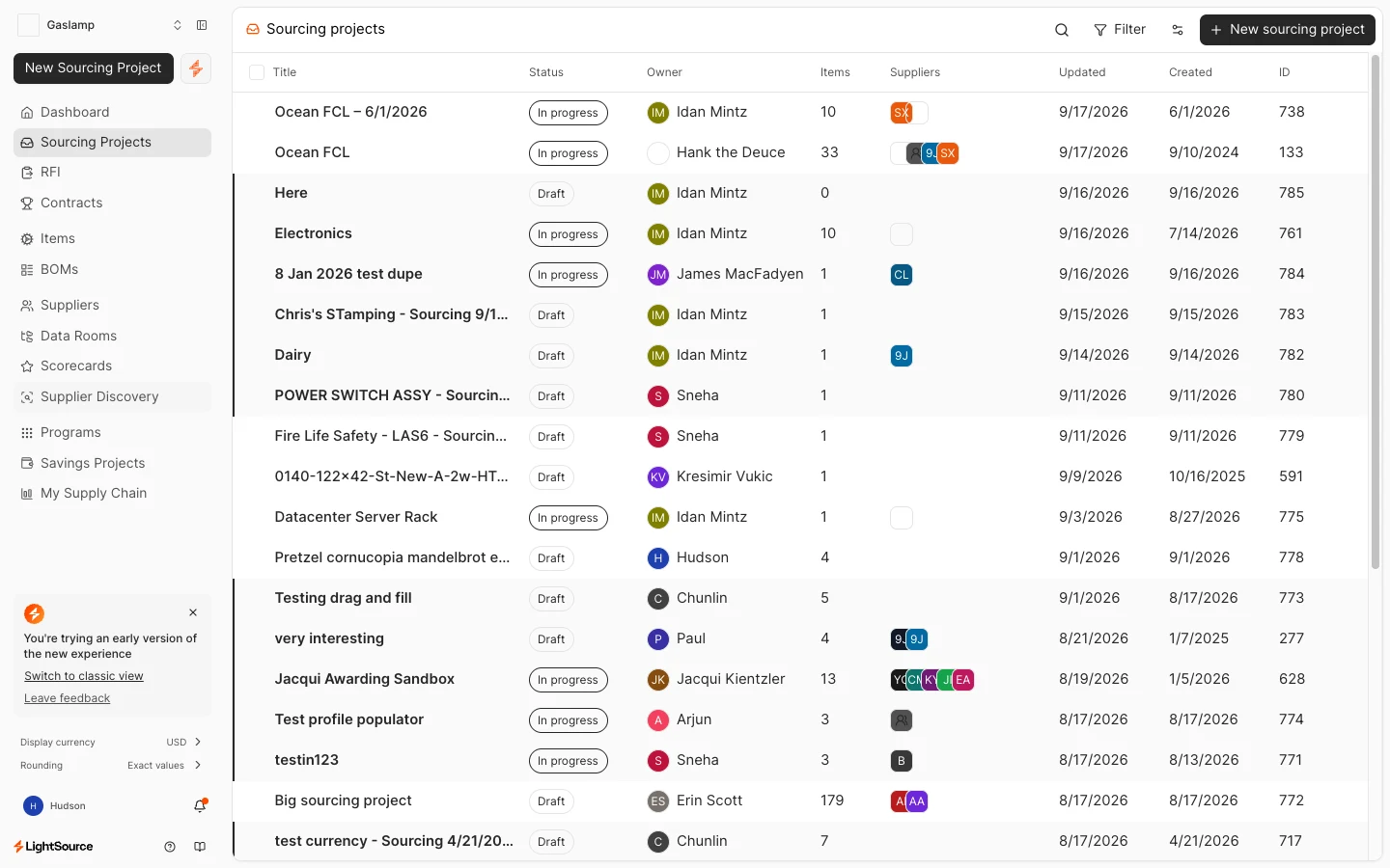
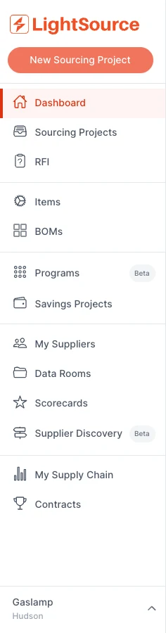
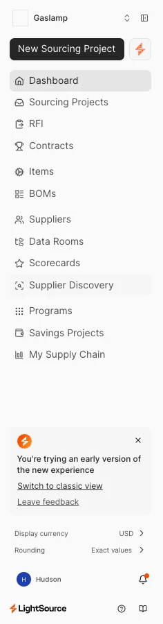
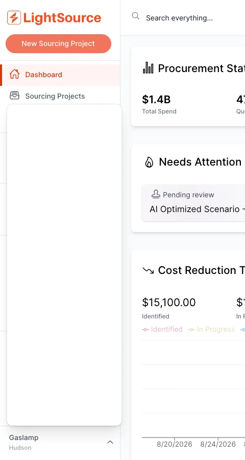
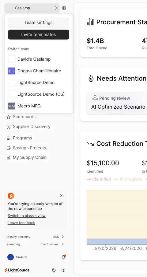
Two navs became one. Switching teams used to hide in a menu at the bottom; now it’s the first thing in the sidebar.
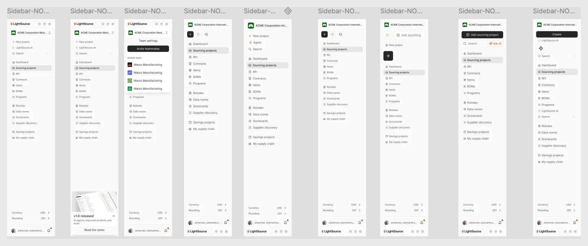
“I get really good feedback on the table views. This table is just more useful.” Customer-facing team, after launch.
Workflow
“The platform requires way too many clicks.” A senior buyer at an aerospace manufacturer.
Sourcing projects are where a buyer’s day happens: spec, quote, compare, award. The whole thing went up on a wall first, with engineers, for months.
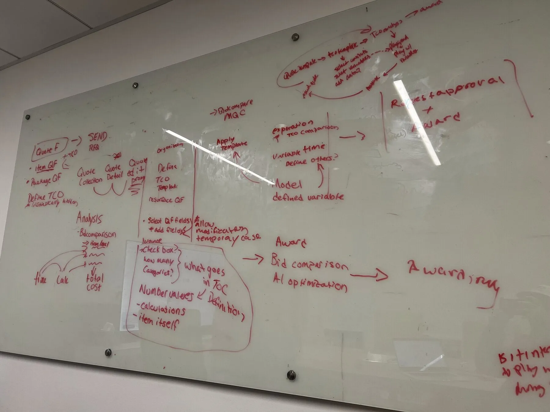
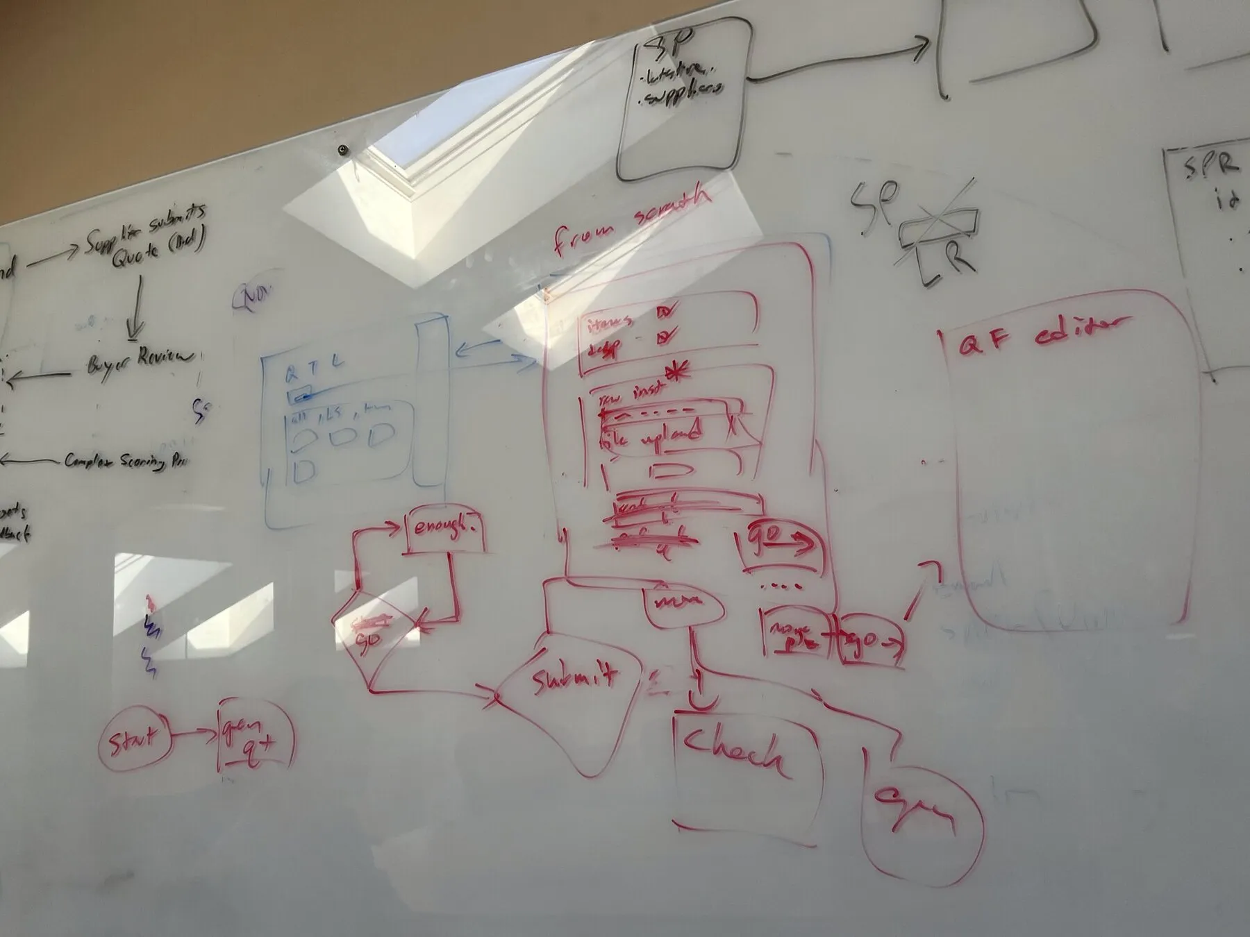
Then Overview became mission control, and items and suppliers, the two nouns the old UI buried, got tabs of their own. Compare bids, pick a scenario, award.
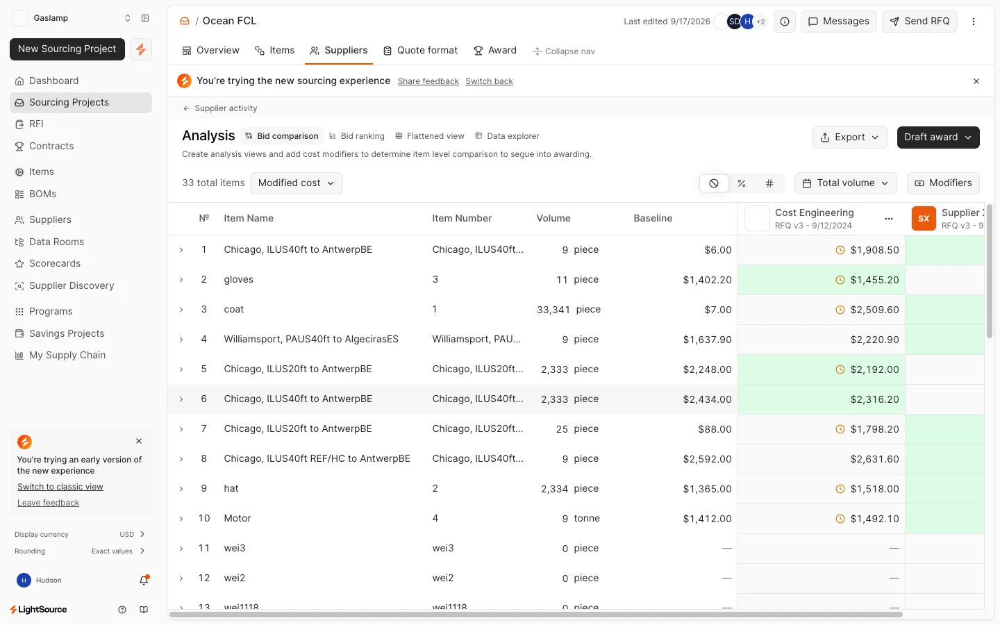
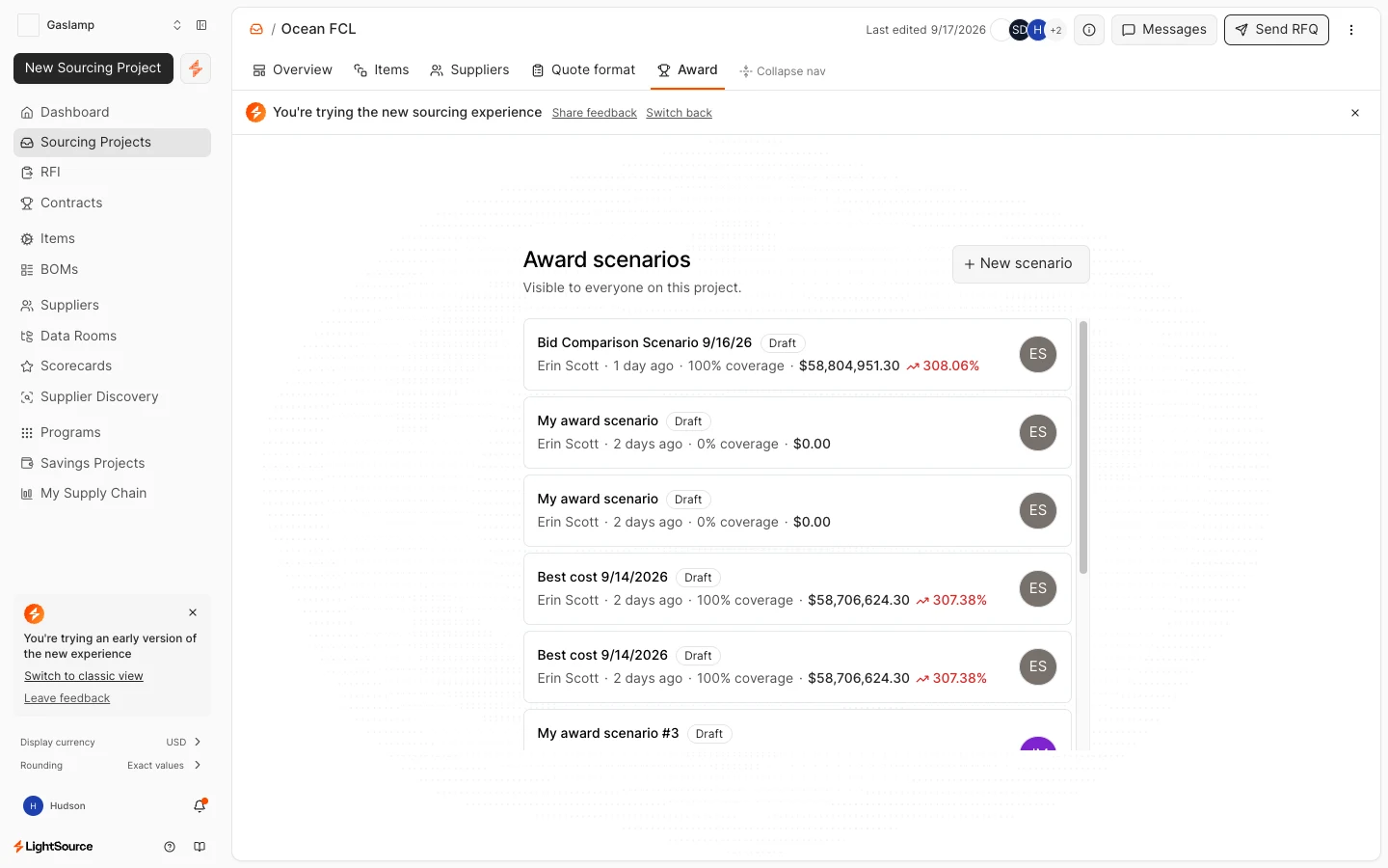
It shipped opt-in, so real buyers could steer it before it became the default.
Team
It started with me.
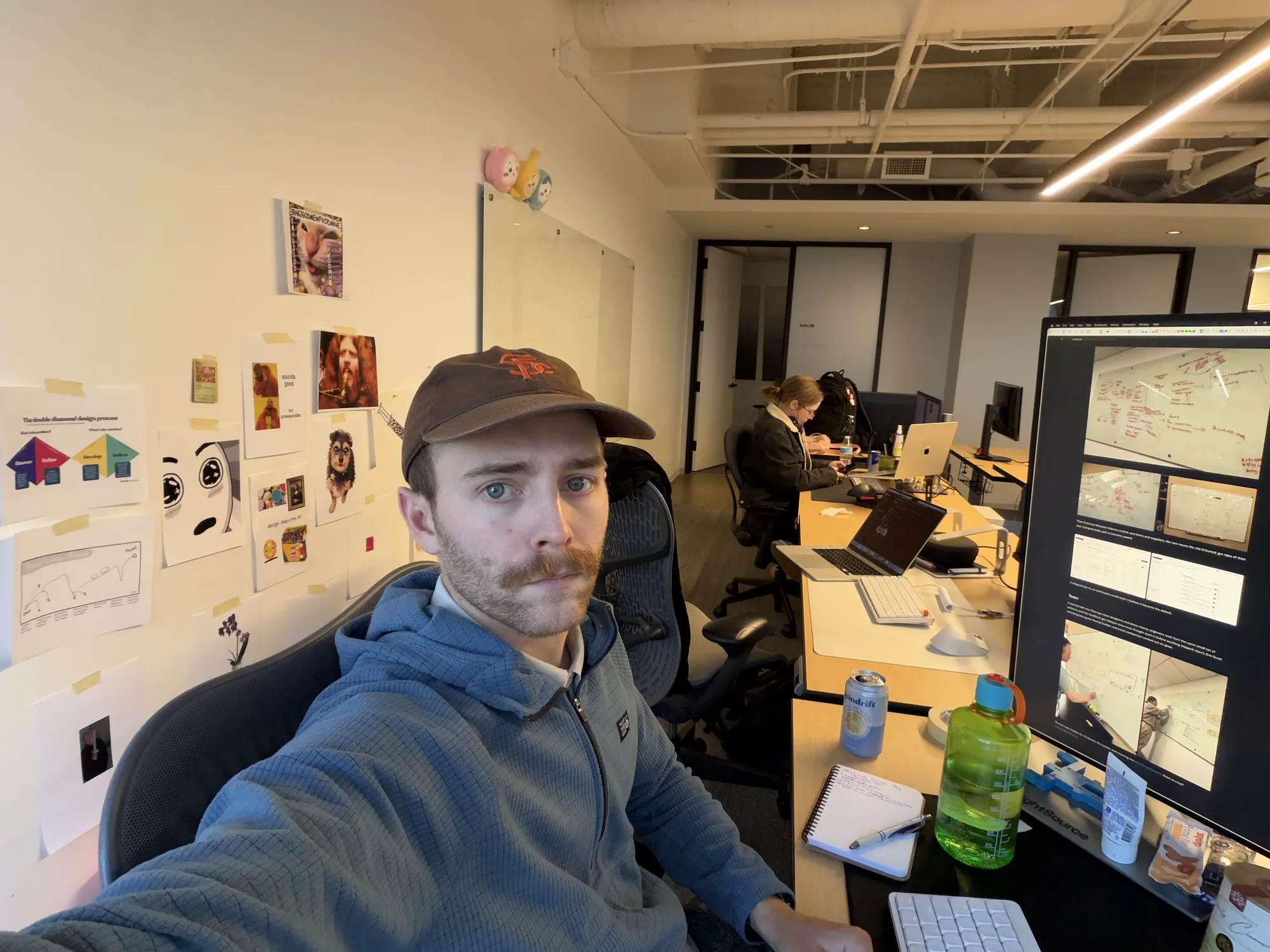
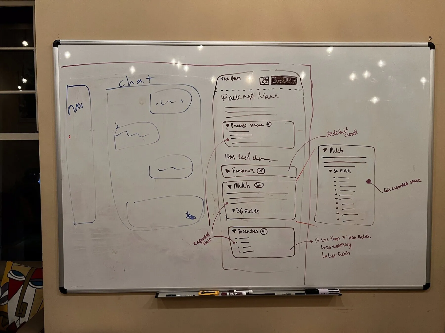
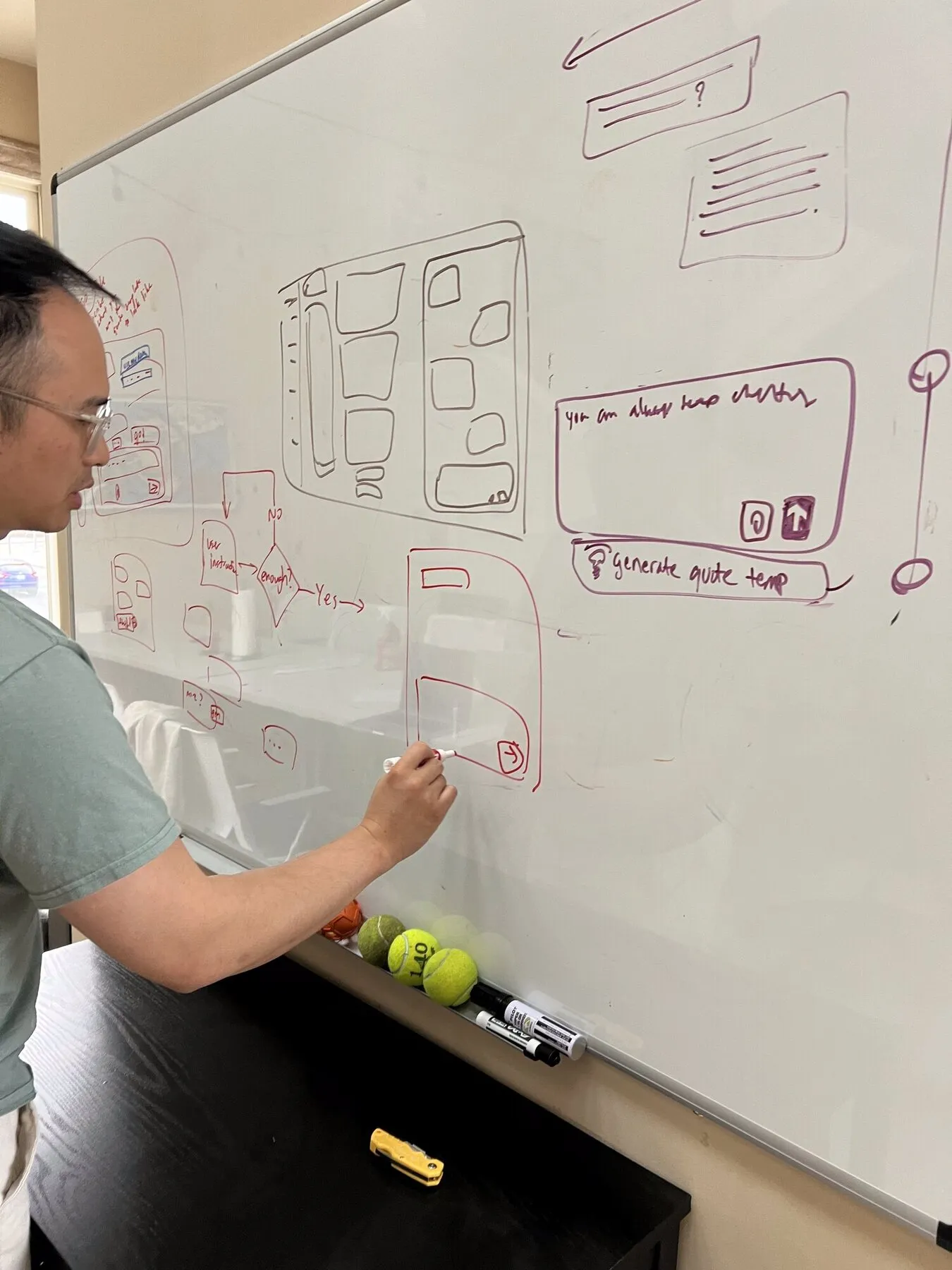
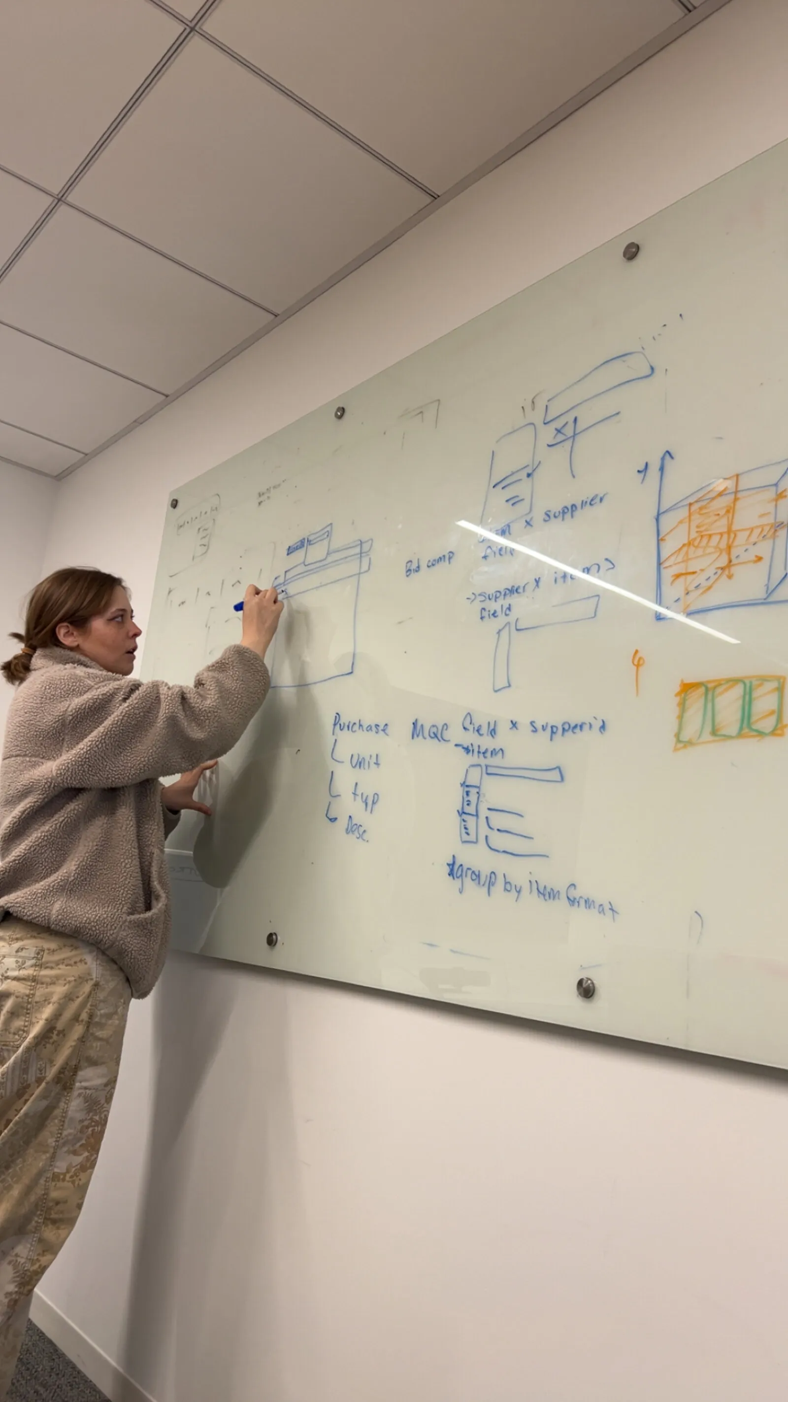
Now two more designers and about twenty engineers work from the same small set of patterns, and the feedback got sharper once more thought went in before anything shipped. Here’s Erin Scott sketching the quote-format builder, and a bid comparison worked out on glass.
The full case studies for the brand, the system and sourcing are behind a password. Need access? hudbud@gmail.com.